Canadian PM Stocks Analysis: SLW & AEM
 share
share
 share
share
 share
share
 share
share
 share
share
Silver Wheaton Corp (SLW)
Silver Wheaton Corp (SLW) is the largest precious metals streaming company in the world and is listed on the Canadian Stock Exchange (TSX) with a market capitalisation of over CAD$6.5b. The company generally focuses on low cost, long life gold and silver assets and currently has 19 operating mines around the globe. Price last traded at $20.41. To learn more about the company, please visit its website at www.silverwheaton.com
Let’s investigate the technicals beginning with the yearly chart.
SLW YEARLY CHART
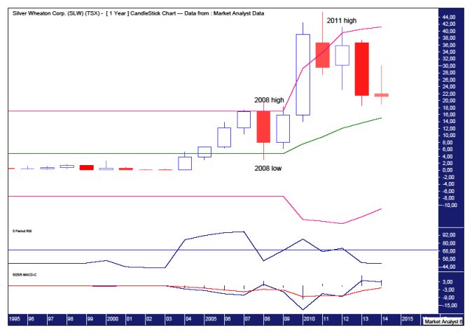
Despite some lean times over the last few years, price is still in a big bull market characterised by higher highs and higher lows. Price now appears to be searching for the next higher low and as long as the next major low is not below the 2008 low then the bull trend will remain in force.
The Relative Strength Indicator (RSI) is in weak territory and the 2011 high shows a bearish divergence with the RSI reading lower than that shown at the 2008 high. However, I suspect a new price high may be in store further down the track that may possibly be accompanied by a triple bearish divergence. Time will tell.
The Moving Average Convergence Divergence (MACD) shows a bullish bias with the blue line above the red line so that augurs well for higher prices in the coming years.
I have added Bollinger Bands which show price moving away from the upper band and seemingly headed for the middle band. The middle band is currently around $15 and putting in a higher low at the middle band is normal fare for a bull market.
The Parabolic Stop and Reverse (PSAR) indicator also shows a bullish bias with the dots underneath price. The dots currently stand at $11.74 and next year will be around $13.50 so the bulls wouldn’t like to see price crack below there.
Let’s move on to the monthly chart.
SLW MONTHLY CHART
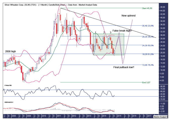
I have drawn a green highlighted rectangle which shows the trading range that price has traded in for over a year now. The period starts with the low set in June 2013 at $18.59 while the high of the trading range was set shortly thereafter at $30.65 in August 2013. Price has not traded higher or lower than these levels since.
The top of the trading range looks to have a triple top in place while price has recently bounced off the bottom of the trading range which looks to have set up a double bottom. Neither of these patterns are commonly found at the end of trends but they are great for traders who play the expected reactions.
So what is price likely to do from here?
It is my opinion that price will now head up to test the triple top. Price may turn down at the top of the trading range or even break out to the upside but I suspect any breakout will be fleeting. A false break before turning back down. Then price can come back down and bust the double bottom and eventually put in the final pullback low.
The Bollinger Bands show price toing and froing between the bands which is typical during corrective phases. Price now looks like it may be bouncing off the lower bands so perhaps it is headed for the upper band.
The lower indicators, the RSI and MACD indicator, are not that conclusive although they are at low levels and seemingly trending up from the lows made at the start of the trading range. So a move up in price would not look out of place here.
I have added Fibonacci retracement levels of the move up from the 2008 low to 2011 high. Price looks to be finding support at the 61.8% level while the top of the trading range is right around the 38.2% level. Perhaps the final pullback low will be down close to the 76.4% level which stands at $13.08. Let’s see.
Old tops often provide support in the future and interestingly price is now down around the 2008 top level which is denoted by the horizontal line.
I have drawn a black down-trending line across tops and breaking above there would look bullish. I suspect that is a while off yet.
SLW WEEKLY CHART
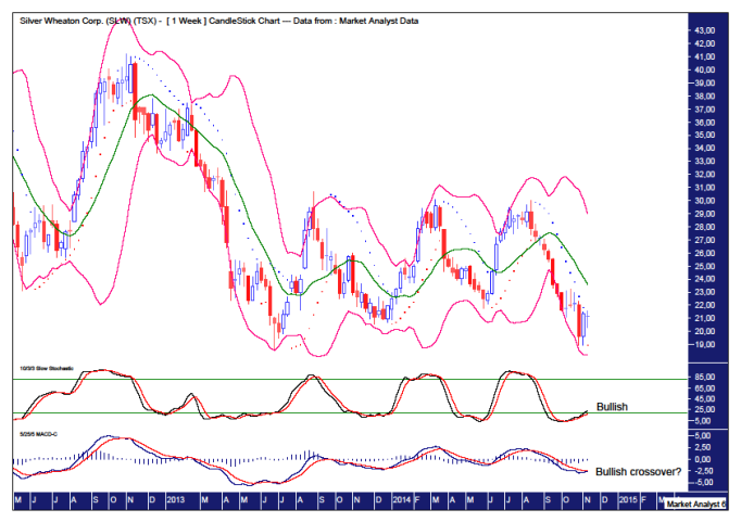
The Bollinger Bands show price just starting to edge away from the lower band suggesting a rally is indeed at hand.
The PSAR indicator shows price recently busting the dots to the upside so a bullish bias is now in force here.
The Stochastic indicator is looking bullish while the MACD indicator looks to be threatening a bullish crossover.
So everything on the weekly chart looks fairly rosy for the bulls.
Let’s wrap things up by looking in close on the daily chart.
SLW DAILY CHART
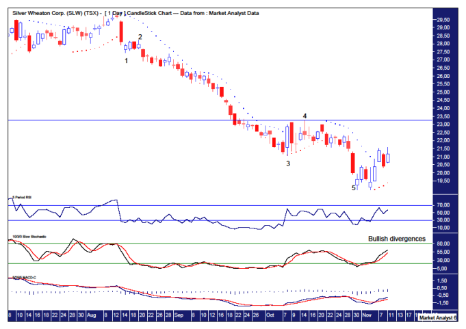
I have added simple Elliott Wave annotations which appear to show a completed 5 wave move down. I have drawn a horizontal line at the wave 4 level and price rising above here will be a bullish sign. This level stands at $23.25.
Price recently cracked the PSAR resistance so a bullish bias is now in force.
The lower indicators, being the RSI, Stochastic and MACD indicators, are all showing bullish divergences on the recent low and all are now trending up and looking in bullish form.
So the bulls look to have this one in the bag for the time being. Things should get interesting if and when price gets back up to the top of the trading range. After that some more headwinds may arrive. Until then the Silver Wheaton bulls looks set to make hay while the sun shines.
Disclosure – I have no financial interest in SLW.
Agnico Eagle Mines Ltd (TSX)
Agnico Eagle Mines Limited (AEM) is a gold and silver producer listed on the Toronto Stock Exchange (TSX) with a market capitalisation of over $5b. It has operations in countries including the US, Canada, Mexico and Finland. Price last traded at $27.27. To learn more about the company, please visit its website at www.agnicoeagle.com
Let’s take a top down approach beginning with the yearly chart.
AEM YEARLY CHART
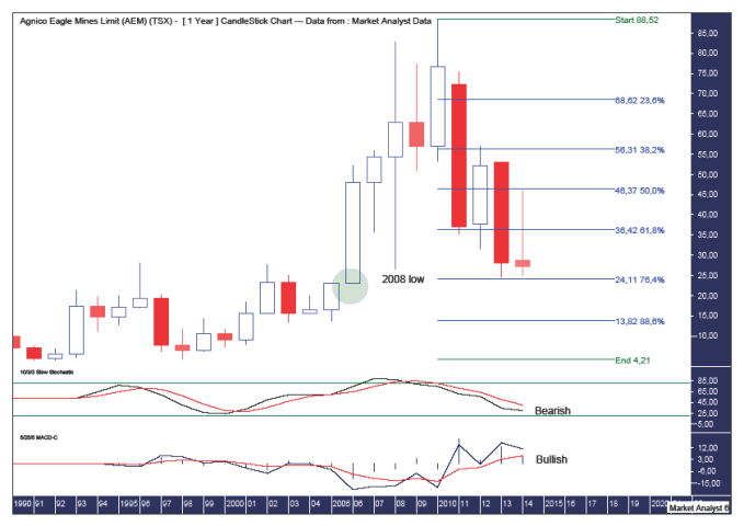
We can see price has been hammered since its all time high at $88.52 in 2010. Price has come all the way back and breached its 2008 low. Price looks to be finding support around this level.
I have added Fibonacci retracement levels of the move up from the 1998 low to 2010 high. Price looks to be finding support at the 76.4% level which stands at $24.11.
So is this the likely ending point for the correction?
While I believe price can rally from here I expect it to be only fleeting and eventually price will turn back down and make new pullback lows. Why?
I have drawn a green highlighted circle which shows where price exploded higher in a parabolic move. When correcting, price often returns to this level. This level stands around $23 so while price is close it hasn’t actually reached this level.
The Stochastic indicator is still bearish but the averages seem to be hinting that they might start to converge soon. Either that or I’m going cross-eyed!
The Moving Average Convergence Divergence (MACD) indicator is still showing a bullish bias with the blue line above the red line.
AEM MONTHLY CHART

The lower indicators, the Stochastic and MACD indicators, both appear to be showing bullish divergences and generally trending up. While this doesn’t mean the final price low is in, it means things may finally starting to look up.
I have drawn two horizontal lines close together which denote the 2002 high and 2008 low levels. It is no surprise to see price finding support around these levels. A rally would look appropriate here in my opinion.
I have added Fibonacci retracement levels of the move up from the 2005 low to 2010 high. The last level of support here is the 88.6% level which stands at $22.17. So one possible scenario is price rallies now before coming back and putting in its final pullback low around that level. Let’s see.
Also, it appears as if we may have a 5 point broadening top in play which I have denoted by the numbers 1,2,3,4 and 5. I still suspect we are yet to see point 4 and I expect a rally before that happens. Then a big move up to new all time highs and point 5 could be expected to occur. Well, that’s how I’m viewing it anyway.
AEM WEEKLY CHART

I have added an Andrew’s Pitchfork which shows price generally trading within the higher downtrend channel. It is only recently that price has busted out of this channel which is a bullish sign. This doesn’t mean the downtrend is over but it does suggest the bear trend may be nearing its end.
A common bottoming pattern consists of three consecutive lower lows. I like to call this a “three strikes and you’re out” low formation. It appears we already have the first two lows in place and so all that awaits now is the third and final low.
The current low looks to have set up a double bottom with the second low denoted by 2. Double bottoms are great for traders that buy the expected bounce. However, double bottoms generally don’t end trends and so when the bounce is finished price could be expected to come back down and break to new lows and set up the third and most likely final pullback low.
The Relative Strength Indicator (RSI) is in oversold territory so a bounce in price would fit right in here.
The MACD indicator is showing a bullish divergence and trending up so once again a bounce in price would not look out of place here.
AEM DAILY CHART
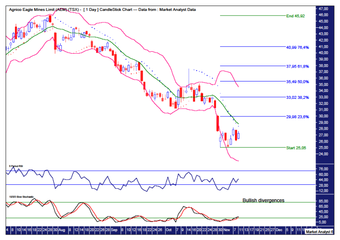
Both the RSI and Stochastic indicator are showing bullish divergences on this recent low.
The Bollinger Bands show price moving away from the lower band and now verging on the middle band. Perhaps it can keep motoring up to the upper band. Time will tell.
The Parabolic Stop and Reverse (PSAR) indicator still shows a bearish bias but price looks to be threatening that picture. Price seems to be zeroing in on the dots to the upside and I suspect that resistance is about to be blown away. Let’s see.
As for where any rally may end, I have added Fibonacci retracement levels of the recent move down. Personally, I’m looking for a rally up to at least the 61.8% level at $37.95 and quite possibly the 76.4% level at $40.99. All in good time.
So the short term picture looks to be bullish while it is still uncertain whether or not the final pullback low is in. Obviously considering my analysis undertaken, I suspect it is not.
Disclosure – I have no financial interest in AEM.
********
© 2014 Copyright The Voodoo Analyst - All Rights Reserved
Disclaimer: The above is a matter of opinion provided for general information purposes only and is not intended as investment advice. Information and analysis above are derived from sources and utilising methods believed to be reliable, but we cannot accept responsibility for any losses you may incur as a result of this analysis. Individuals should consult with their personal financial advisors. Put simply, it is JUST MY OPINION.
share
share
share
share
share
More from Silver Phoenix 500


