Final Top Of US Bond Bull Market Set For 3rd Qtr Of 2016
 share
share
 share
share
 share
share
 share
share
 share
share
The 30-Year US Treasury Bond market has been trending up since 1981. This massive bull market is set to reach its conclusion next quarter if my analysis is correct.
Let’s analyse the technicals of both price and yield of the 30-Year US T-Bond. We’ll begin with the longer-term quarterly chart of price.
30-YEAR US T-BOND QUARTERLY CHART
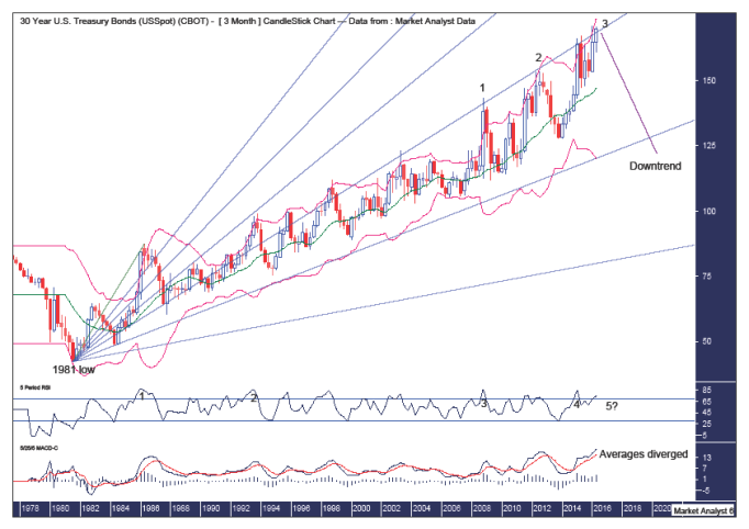
We can see a “three strikes and you’re out” top forming with the final third strike high still playing itself out. Once this third and likely final high is in place, then a new long-term bear market can trace out its initial steps.
We can see this quarterly candle is still trending up -- and price should eventually break the previous quarters high at 170 13/16. I expect next quarter will see a bearish reversal candle with a relatively long wick to the upside. That means I am looking for price to spike up into high most likely in July or August and closing out the quarter in September in the red. A doji candle is also a possibility with price closing out the quarter relatively unchanged.
The Bollinger Bands show price is back up at the upper band. Therefore, I expect price to push up further into this band to set up the final high.
I have drawn a Fibonacci Fan from the 1981 low to first major high. This shows the majority of the 35 year bull market has taken place between the 61.8% and 76.4% angles with the former providing solid resistance for most of that move.
We can see all the recent tops have stopped abruptly as soon as they reach the 61.8% angle. Price is currently back at this angle. Consequently, I favour price to stage a little fake out move by popping a bit above the angle before resistance reasserts control and price drops back down and eventually makes its way down to the 76.4% angle which should provide initial support.
The RSI looks set to throw up a fifth bearish divergence. A triple bearish divergence is often seen at major highs. However, we have here a rare quintuple bearish divergence.
The MACD indicator shows the averages have diverged signifying this move up pushing the limits. This indicator is also showing an all-time high reading, which is not uncommon for this indicator at the end of big bull markets.
Now let’s look in a bit closer with the weekly chart.
30-YEAR US T-BOND WEEKLY CHART

We can see this third and final strike high is forming within itself its own “three strikes and you’re out” top formation with price now on its way to set up the third and final strike high. So this really does appear to be the final stages of the bull market with the final high only weeks away.
The Bollinger Bands show price is back up at the upper band, where I expect it to surge higher as it clings to this band.
I have drawn a Fibonacci fan from the January 2014 low to first strike high. This shows the second strike high was at resistance from the 38.2% angle, while price seems to have found subsequent support around the 50% angle. I expect one last surge high that may fall short of reaching the 38.2% angel again. Subsequently, price should trade back down and start to bust through each angle that represents support.
The RSI should get back up into overbought territory…and will likely show a bearish divergence before turning back down while the MACD indicator is currently marginally bullish.
Now let’s turn our attention to the yield.
30-YEAR US T-BOND YIELD QUARTERLY CHART

The Bollinger Bands show price recently being rejected at the middle band. Moreover, one last crack at the lower band looks in store.
I have drawn a Fibonacci Fan from the 1981 high to first major low. This shows price making its way through the angles. We can see the 76.4% angle provided support for price at the 1993 low. Price then drifted back down as it made its way to the final hurdle – the 88.6% angle. Price has reached this angle and has been crawling down along this angle. Price now looks set to give this angle, which now looks more like support, one final test. I expect blast off after that test holds.
The RSI looks set to show a triple bullish divergence, which is often seen at major lows.
The MACD indicator is currently bearish signifying this bear market isn’t over just yet.
30-YEAR US T-BOND YIELD WEEKLY CHART

The horizontal line denotes a double bottom that formed from the 2008 and 2012 lows. Double bottoms generally don’t end trends. Once again that has proven to be true.
I am counting that double bottom as the first strike low in a “three strikes and you’re out” low formation. Price is now headed to the third and final low.
The Bollinger Bands show price is back at the lower band, where I expect price to push into this band over the coming weeks to set up the final low.
The RSI looks set to show a bullish divergence at the final low while the MACD indicator is bearish so lower prices are likely over the coming weeks.
I’ll be looking to pinpoint the final high. And once we get closer to that eventful moment, I will switch focus to the intraday charts including right down to the 15 minute and 5 minute charts.
Summing up, the sand in this bond bull market hourglass is down to the last few grains. It is nearly time to turn it upside down and start a new trend. Time is ticking…
********
© 2016 Copyright The Voodoo Analyst - All Rights Reserved
Disclaimer: The above is a matter of opinion provided for general information purposes only and is not intended as investment advice. Information and analysis above are derived from sources and utilising methods believed to be reliable, but we cannot accept responsibility for any losses you may incur as a result of this analysis. Individuals should consult with their personal financial advisors. Put simply, it is JUST MY OPINION.
share
share
share
share
share
More from Silver Phoenix 500


