Market Turning Points
 share
share
 share
share
 share
share
 share
share
 share
share
Current position of the market
SPX: Very Long-term trend – The very-long-term cycles are in their down phases, and if they make their lows when expected (after this bull market is over), there will be another steep decline into late 2014. However, the Fed policy of keeping interest rates low has severely curtailed the full downward pressure potential of the 40-yr and 120-yr cycles.
Intermediate trend – Probably tracing out an ending diagonal pattern.
Analysis of the short-term trend is done on a daily basis with the help of hourly charts. It is an important adjunct to the analysis of daily and weekly charts which discusses the course of longer market trends.
THIS WEEK COULD BE CRITICAL
Market Overview
Last week, I suggested that the DJIA appeared to be making a terminal pattern which, if correct, was forecasting an important market decline. Nothing has happened in the past week to change that perception! Because of its cyclical configuration, next week will be crucial in determining whether or not this is a valid forecast.
Last week, stocks benefited from a short-term cycle low on Monday with the various indices responding according to their individual technical conditions. DJIA closed at a fractional new high on Wednesday -- an event which generated some excitement on CNBC -- but there was no follow through, and by Friday it had retraced nearly a hundred points from that high.
All leading indexes remained weaker than SPX, with the Russell 2000 -- after re-testing the support of its 200-DMA -- having the poorest rally of them all. RUT has now breached its MA twice, managing to close above both times, but the poor nature of last week’s bounce strongly suggests that it should be decisively broken the next time that cycles turn down again. A short-term peak due over the next few days could trigger the larger pattern and, at the same time give the DJIA a chance to make a quick new high outside of its upper trend line before completing its bearish triangle pattern and reversing its trend.
The daily indicators appear to be nearing the top of their cycles, while hourly oscillators call for one more potential rally.
Let’s look at the charts.
Chart Analysis
In the DJIA daily chart below (courtesy of QCharts.com), the purple trend lines delineate the price action of the index since October 2011, the date on which the second phase of the bull market started. Whether or not this index is making an ending triangle, one has to admit that, over the intermediate term, the DJIA has been creating a weak pattern. Since January, while other indices were making new highs, this index was not able to surpass its high -- except fractionally. The pattern that it is making is one of deceleration and it is best observed in the MACD which has been making lower and lower tops. But is the DJIA making a bearish distribution pattern, or a bullish accumulation pattern in the form of an ascending triangle? We should get a definite answer to that question next week.
Although the MACD has a series of declining tops, it has remained positive since it recovered from its February low. Turning negative again would give us a definite answer. As of Friday, the other two oscillators at the bottom of the chart were showing negative divergence, and since a cycle high is expected over the next few days, retaining that divergence through this high would add to the negative picture. Confirmation that a decline is starting will come when the index breaks below the ascending red trend line.

I am going to show you another chart (courtesy of QChart.com) which is also in the process of confirming the bearish pattern that is being made by the DOW. It is a chart of the 10-yr treasury yield which appears ready to break below some important support levels. If it does, it would most likely confirm a top in the market. This chart runs in the same direction as the DJIA and appears to be already more advanced.
Lower yields in bonds means a rising bond market. Later on, we’ll take a look at TLT which is already in an established uptrend that started from a base from which we can derive substantially higher price projections than the levels already attained.

 Next, we’ll look at the SPX hourly (also courtesy of QChart.com) to see where we stand over the short-term.

On the hourly chart, there is also some deceleration forming in the price pattern. Even though the index made a low a week ago, it has not been able to make substantial headway above its former high -- even after breaking above a wide (red) channel. This has caused the oscillators to turn down after developing some negative divergence. With the SRSI now oversold, there is a chance that we could still try to move higher early next week, especially since a short-term cycle is due to peak in the next two or three days. Afterwards, prices should be vulnerable to declining, once again.
If we are to reverse from here, we will need to break below the uptrend line as well as the various MAs, all of which are converging at approximately the same level. The forcefulness of the decline will indicate whether or not we are starting something important. A break below 1851 would be significant, since it would indicate that all the activity above that level was distribution. On the Point & Figure chart, we can already measure about eighty points across, enough to take the SPX below the 1814 low, as well. And with the distribution process still incomplete, more points could be added to the projection with the possibility that the SPX could reach about 1740 before regaining its footing.
Of course, this is all speculation until the decline is confirmed but, since the signs are there, one should be ready for it in case it does happen. It’s a little bit like watching a storm approaching. It could dissipate before it reaches your location, but you should be prepared to take shelter in case it does reach you.
Cycles
“More important cycles are expected to top in the first couple of weeks of May. This would allow DJIA to complete its diagonal pattern before starting a protracted decline.”
Erik Hadik is one of the most comprehensive cycle analysts I know. He had warned that an initial top could take place during the March 3-7 period and this proved to be correct since this is when the NASDAQ and Russell 2000 made their highs. He is also warning that a secondary period of highs could come between May 5 and 9, which is next week. Since the charts that I have posted above tend to confirm this prediction, it is another good reason to be on the alert next week.
Breadth

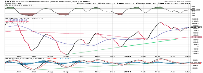
The McClellan Oscillator and the Summation Index appear above (courtesy of StockCharts.com).
Last week’s 40-point rally in the SPX has not made much of an impression in the McClellan Oscillator. It remained well below is former high, while SPX made a slight new high. That is negative divergence.
NYMO managed to crawl upward but remains below its March high. That leaves both breadth indicators showing negative divergence to the price; a bearish sign fully compatible with the diagnosis being made for next week’s market action.
Sentiment Indicators
After a two-week period of lower readings, the SentimenTrader (courtesy of same) long-term and short-term indicators for last Friday remain at slightly above average. This is not a reading that is suggestive of a bull market high, so any decline from here would be expected to be of intermediate nature, at best – even if it continues into the Fall!
VIX (CBOE volatility Index)
VIX continues to trade in a pattern inverse to that of the DOW. It is expected to break out at the same time that the DJIA breaks downward.

XLF (Financial ETF)
XLF continues to lag behind SPX and appears to be making a pattern which is almost ready to continue the decline that started in March.

TLT (20+yr Treasury Bond Fund)
TLT has almost reached the top line of its downtrend channel where it could find some temporary resistance. However, the base that it has formed calls for a projection to 126 and perhaps even 129.

GLD (ETF for gold)
GLD continues its consolidation and may soon be ready for an upside break-out. It is not possible to determine the extent to which the 25-wk cycle will affect its ability to resume its uptrend, but if another, larger cycle is behind the move, the interference should be minimal. The original base called for a pause at about 134-135 and then a move to about 141.

UUP (dollar ETF)
In spite of the fact that it has not been pushed back severely by its downtrend line, UUP is making a pattern which looks bearish and which could send it down to about 21. If so, this would help GLD to reach its stated objective.

USO (US Oil Fund)
USO has broken its trend line, but may find support on the 200-DMA and, a little lower, on its lower channel line. Moving below that would not help a chart pattern which is already looking somewhat bearish.

Summary
Next week could be a decisive time period for the stock market. According to Erik Hadik, a cycle analyst who is widely followed and has a good track record, this is when indices will be coming into a cyclical period of intermediate and major cycle peaks. This analysis is consistent with the long-term Kress cycles which are scheduled to bottom around October, and which are long overdue in creating negative pressure on the market.
The technical work that I do and which is detailed in this newsletter substantiates the view that important topping patterns are appearing in the DJIA and SPX, while the Russell 2000 and NDX have already given indications that they have started a downtrend of intermediate proportion.
For good measure, I should also add that astrologers such as Raymond Merriman and others are warning that we are in an astrological period which often leads to important reversals.
Andre
********
FREE TRIAL SUBSCRIPTON
Market Turning Points is an uncommonly dependable, reasonably priced service providing intra-day market updates, a daily Market Summary, and detailed weekend reports. It is ideally suited to traders, but it can also be valuable to investors since highly accurate longer-term price projections are provided using Point & Figure analysis. Best-time reversal estimates are obtained from cycle analysis.
For a FREE 4-week trial, send an email to: info@marketurningpoints.com
For further subscription options, payment plans, weekly newsletters, and for general information, I encourage you to visit my website at www.marketurningpoints.com. By clicking on “Free Newsletter” you can get a preview of the latest newsletter which is normally posted on Sunday afternoon (unless it happens to be a 3-day weekend in which case it could be posted on Monday).
The above comments and those made in the daily updates and the Market Summary about the financial markets are based purely on what I consider to be sound technical analysis principles. They represent my own opinion and are not meant to be construed as trading or investment advice, but are offered as an analytical point of view which might be of interest to those who follow stock market cycles and technical analysis.
share
share
share
share
share

When Andre Gratian was a stock broker years ago, a friend introduced him to technical analysis of the market. Consequently, it is not an exaggeration to say that Andre fell in love with this approach! Ever since then, it has become an increasingly important part of his professional life. Gratian has studied the works of Wyckoff, Edwards & Magee, Edward J. Dewey (cycles) and many others. However, one of my most profitable undertaking has probably been to study Point & Figure charting, which he finds invaluable in analyzing stocks and indices. If he were restricted to one methodology, this is the one that he would choose. This well-rounded background has given him what he feels to be a special insight into the stock market, facilitating the recognition of meaningful patterns and the ‘turning points’ in all trends, whether they be short or long term. Andre feels very comfortable discussing the stock market and passing on meaningful information to others. His subscribers include individuals and money managers throughout the world. Moreover, his Newsletters are currently published on several financial sites, here and abroad.
More from Silver Phoenix 500


