Silver Market Price Travesty Gold Bulls Tormented Since August 2011 - Mr. Bear Failing To Break Bulls Stock Market Uptrend
 share
share
 share
share
 share
share
 share
share
 share
share
 The step sum is a single item Advance –Decline Line based on the daily closing prices of a market series. If today’s closing price is higher than yesterday’s the step sum advances by 1, if it’s below yesterday’s the step sum declines by 1. Amazingly, there are about the same number of up days as down whether bull market or bear. The step sum plots below show the net A-D in the Dow Jones, gold, and silver since January 3, 1969 (11,625 trading sessions). Silver has the most net advances, peaking at 476 in the spring of 2012. That’s a remarkably small number after five decades of daily trading. But why is silver’s step sum leading the Dow Jones and gold in net advances when they’ve both experienced smaller bear markets and better bull markets than silver?
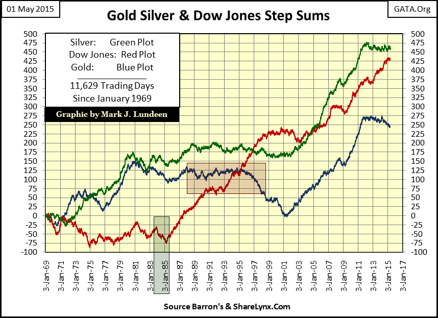
The answer is that the step sum is a better indicator of market psychology than the market’s trend itself. From 1966 to the early 1980s, the Dow Jones attempted to rise and stay above the 1,000 level five times. For over sixteen years, Dow Jones 1,000 was a line of death for the bulls. Then came 16 December 1982, the last day the Dow Jones ever closed below 1,000 as the stock market took off into market history. As the Dow Jones continued rising in the months to come, one would have thought the bulls were happy, and they were. However as we see in green box (above and below), the stock market was rising with fewer up days than down, forming a step sum bull box.
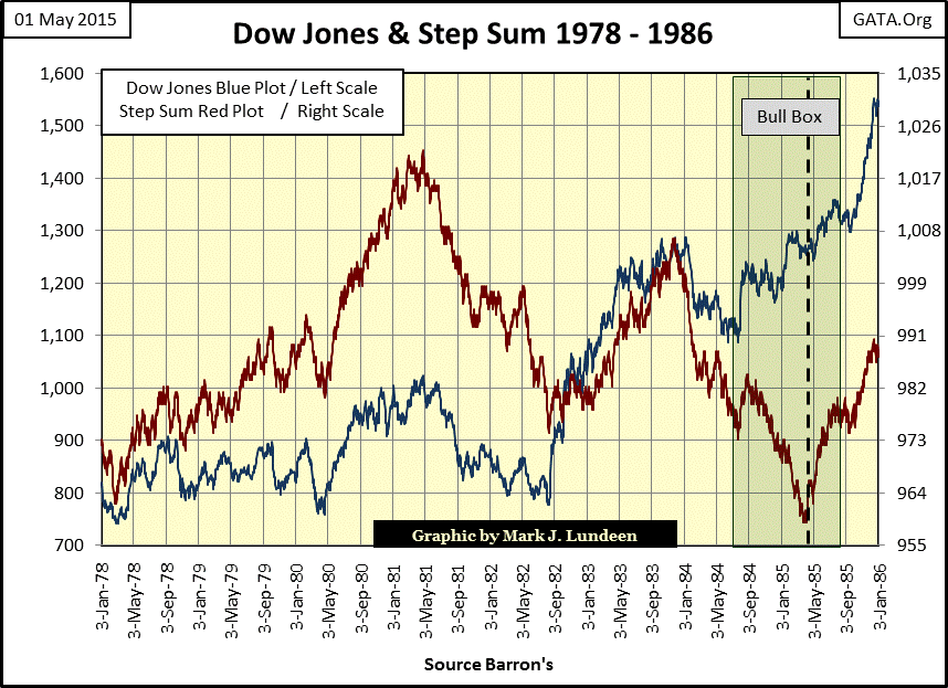
Market bulls in 1984 and 85, still traumatized by the 1960s & 70s, were selling into rallies as the Dow Jones rose above 1000; within the bull box they were keeping one eye on the exit. It wasn’t until spring 1985, (almost three years into the bull market with the Dow Jones firmly above 1,200) that the bulls became true believers (accepting that the Dow Jones could possibly stay over 1,000 and rise up to 2,000). The Dow Jones step sum finally began to advance upward with its price trend. The vertical dashed line marks the termination point for the bull box, where the step sum plot’s trend once again synchs up with the Dow Jones’ rising price trend. Typically when a box is terminated the primary trend (this time a bullish trend) receives a little boost.
This illustrates an important point in step sum analysis: when trends in price and the step sum conflict with each other always trust the price trend, not market sentiment (step sum).
To understand gold’s step sum chart below a little historical background is needed. Following the end of World War Two the US government continued printing paper money in excess of the US Treasury’s gold reserves causing some investors to become bullish on gold. The financial media would report monetary aggregates (M1&2) as regularly during the late 1970s and early 1980s as they report GDP or home starts today. Gold bulls believed this monetary inflation MUST flow into the price of gold and silver, and they were correct until gold peaked at $873 in January 1980.
After gold price peaked in January 1980 (Terminal Zero of the 1969-80 bull market) we see the price of gold (Blue Plot) plunge 43% on only a slight decline in the step sum. This tells us that the bulls saw daily declines as an opportunity to buy cheap gold. This continued for the next ten years, as the price of gold declined 65%, yet there was still no proper bear market collapse in market sentiment (step sum).
A massive six-year bear box (1990-96) eventually formed in the gold market which finally terminated in 1996 when the gold bulls could no longer deny what was happening. Alan Greenspan’s monetary inflation had been flowing into NASDAQ high-tech shares, not gold and silver. Cursing their favorite metal, the gold bulls one at a time, finally exited the market and took what was left of their money as the step sum collapsed for five straight years.

Interestingly, the price of gold actually bottomed in July 1999, but market sentiment (the step sum) continued declining for another three years. Then, in 2001, both the price of gold and its step sum reversed their trends upwards, marking the start of our current bull market. Note also the difference in the step sum’s response to the decline in gold in the early 1980s compared to the period from 1996 to 2001. The difference is market psychology. In the early 1980s gold bulls saw lower prices as a reason to buy, but from 1996 to 2001 they saw higher prices as a reason to sell.
So much for market history; now let’s see what the Dow Jones and its step sum have been telling us for the past two decades: stubborn bullishness as Mr Bear does his best to break them. There is no rule of thumb giving us any guidance on how many net down days a step sum should see down during a bear market, but my studies strongly suggests the thirty-four month 38% high-tech bear market of 2000-02 should have seen a greater net step sum decline than 41 days.
The sub-prime mortgage crash saw even more entrenched bullishness in the face of apocalyptic market disaster. This was a classic example of an extreme bear box; in its first year (October 2007-08) the Dow Jones declined 40% as its step sum completely ignored the first Dow Jones 40% decline since 1974. This tells us that no matter how large the losses the bulls suffered the previous day, they came back the next day to buy more. And the collapse in the step sum after the bear box was terminated (dashed line) is pathetic. The Dow Jones’ second deepest bear market decline since 1885 occurred on only 25 net down days in its step sum! The bulls were fearless in the face of potential trillion dollar losses.
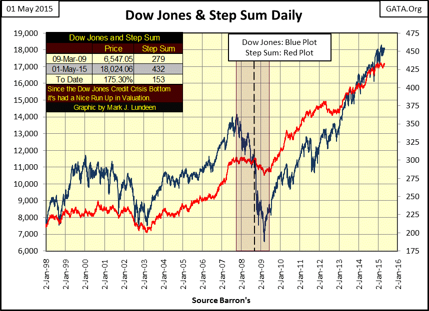
Who were these bulls? Central banks, of course. Looking at the Federal Reserve’s balance sheet below we see the horrific inflation the “policy makers” created to prevent the Dow Jones step sum from declining more than 25 net down days during the entire credit crisis. Had the Fed not “injected” the financial markets with this massive “liquidity”, the Dow Jones and its step sum would certainly have collapsed to shocking levels not seen since the 1930s. However, it would be a mistake to believe that blue-chip stocks, and other financial assets have escaped their day of reckoning. The huge increase in the Fed’s balance sheet may have succeeded in rescuing financial markets back in 2007 to 2009, but six years later those rescue efforts have placed today’s financial markets at even greater risk.
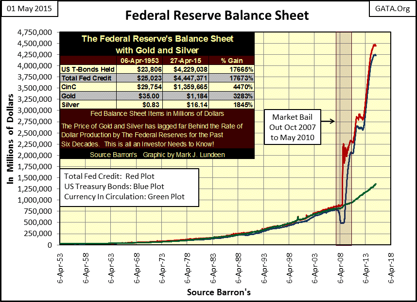
Think of “liquidity injections” from a central bank as ammo fired from their big guns, but once fired the central bank can’t fire these same rounds again. The Federal Reserve used up a lot of ammo against Mr Bear over the past six years (chart above), but today this huge increase in inflation is more akin to spent brass casings, absent of powder and slugs as far as the Fed is concerned. However these aren’t bullets, but units of credits called dollars that now circulate in the global-financial markets controlled not by the Federal Reserve, but by money managers and individuals, (assuming they haven’t already been wiped out by past Fed’s shenanigans at the NASDAQ and mortgage markets). When the next crisis arrives, how many trillions of dollars of “liquidity” will they have to “inject” into the financial system? Sixteen trillion? The US Treasury market isn’t that big.
Here is a link to CNN Money video reporting how many billionaires exist today, and notes that Michael Jordan joins Forbes’ list of billionaires. CNN reports that Mr. Jordan joined this exclusive list because of his part ownership of a professional basketball team, which I’m sure is true. But let me tell you the only reason a basketball team could make anyone that “wealthy” is the trillions of dollars created during and since the credit crisis are now flowing into presumed inflation hedges such as 19th century impressionist art and professional sports teams.
Which is fine with Janet Yellen and the FOMC as it allows clueless network news organizations, like CNN, to report on the growing numbers of billionaires in today’s “growing” economy. But all of these dollars flowing into today’s popular “inflation hedges” are just creating new bubbles and bubbles don’t expand forever. I expect that eventually, even Michael Jordan’s billion dollars will flow out of his basketball team and end up where all units of inflation, throughout history, have: in gold and silver. The “policy makers” are very concerned about this, so have taken extreme action in containing the price of gold and silver.
"Joint intervention in gold sales to prevent a steep rise in the price of gold was not undertaken. That was a mistake." - Paul Volcker, Chairman Federal Reserve: 1973
In 1973 Volcker said central banks should have sold gold bullion in order to prevent a bull market from developing; they didn’t. Today, in 2015 you can be sure that central banks have already sold most of their gold in complete secrecy. Double accounting, leasing, lack of transparency, and other gimmicks prevent this from being disclosed.
Since 1969 gold has seen two bull markets and one bear market. The first bull market (1969-80) took the price of gold from $43.50 to $834.00 (daily closing price basis) with several significant corrections in between. Notably, there was the 47% decline in 1976 that proved to be a bottom to the final bull market advance to over $800 in 1980. When a market sees such an extreme correction during a bull market, it’s not surprising that the bulls ignored gold’s initial bear market decline in 1980 (43%). It was actually smaller than the previous bull market’s correction in 1976.
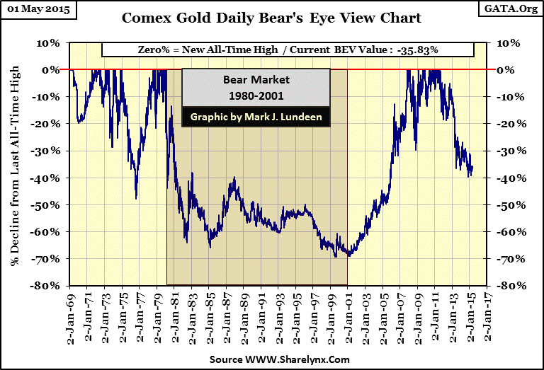
Moving on to our current bull market, gold has recouped all its bear market losses and has risen a thousand dollars above its 1980 highs (last BEV Zero = $1888 / August 2011) in the chart above. Since 2011, we’ve seen gold decline 39.64% from its last all-time high, but so far it’s refused to break below the BEV 40% line. This correction in gold has now gone on for almost four years. It’s reasonable to assume the central bank bears have exhausted most of their ammo, including selling off their gold monetary reserves to Asian buyers at inflation adjusted prices so low that future economists will have a field day analyzing and commenting. The next significant move in the price of gold will certainly be up; it’s only question of when. But expect rising gold and silver prices to be accompanied by deflationary chaos in financial markets.
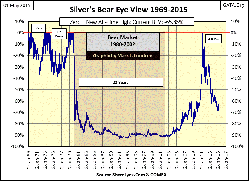
Next we see silver’s long term BEV chart. The amazing thing about the silver price is that its last all-time high is still $48.70, a price exceeded since January 1980. It came close to breaking above that in late April 2011 ($48.58), but fell twelve cents short and since then has suffered a bull market correction of almost 70%, deeper than all but the most severe bear markets!
If you believe the way to make money is to buy low and sell high, in a world where central banks continually create trillions of new dollars, euros and yen every year, silver is very cheap. It’s even cheap in terms of the price of gold; currently one ounce of gold can purchase 73 ounces of silver. Back when the precious metals bull market peaked in 1980 the SGR ratio was 15, yet as the SGR bottomed in April 2011 it still took 31 ounces of silver to purchase one ounce of gold.
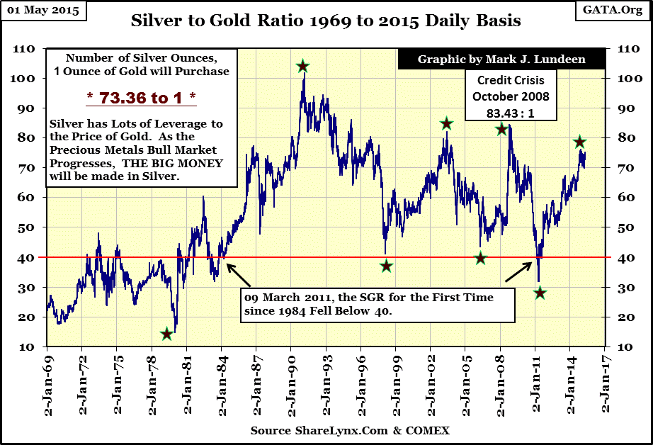
Historically, bull markets in the old monetary metals have narrowed the gap between the market price of gold and silver, meaning that silver is a leveraged play on the price of gold (in both bull and bear markets). Due to the gross incompetence of the global central banking cartel, I expect to see many historical records broken as assets once again find their true free market value. Currently, market prices are about as free as in the old USSR, and we all know how that ended. One of these records I expect to see smashed is seeing the SGR fall below 10, but we’ll have to wait and see.
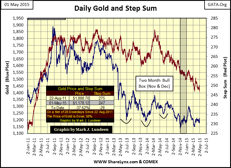
Here’s gold BEV chart since the beginning of 2011. Its step sum is trending down, a good indication that the market’s “speculative excesses” are being squeezed out of the market with tons of paper gold dumped into the COMEX gold market. However if you go back to this article’s first chart and compare this four year plot of gold’s step sum with its long term plot (1969 to 2015), you’ll see that the bulls are actually standing firm as the central bank bears have tormented them since August of 2011. There are so many problems (bubbles) the world’s central banks past “policies” have created, that today they must deal with yet more monetary inflation for fear of deflation, all of them are good reasons for standing firm on your gold positions.
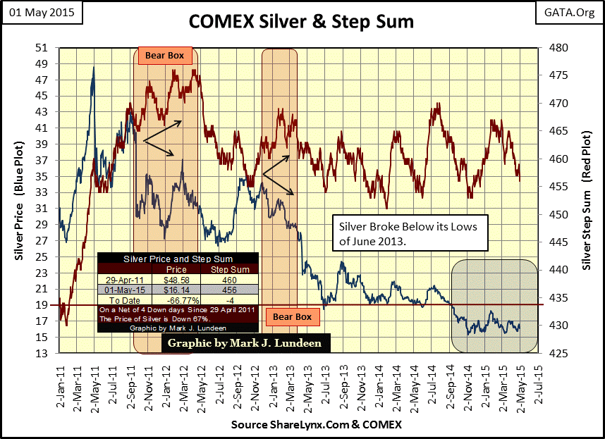
Today’s silver price is a market travesty. We all do what we must to survive today’s failing banking system, and for silver investors since April 2011 that means taking our losses. Take a moment to study this next chart. After silver’s April 2011 high its step sum continued to rise for another year; it even saw an eight month bear box. Since then silver’s step sum has stubbornly refused to follow its price plot down, even after a 67% decline in price. Again going back to my first chart, compare this with silver’s long term step sum. Since 1969 silver’s market sentiment (the step sum) has refused to become bearish, even during its 90% bear market of the 1980s and 90s. After all these years, and devastating market declines, silver has still seen more up days than the Dow Jones or gold have since 1969.
What does this all mean? Since silver was demonetized by act of Congress in 1873, silver hasn’t seen a free market. At first it was hoarded by governments to prevent it from circulating as money to prevent price inflation. However in the 20th century silver became an important industrial commodity due to its unique physical properties (chemical, reflective and electrical). Huge multi tonne hoards of government held silver were sold gradually over many years, suppressing prices and satisfying industrial demand until the US, and other national treasuries supply of silver became completely exhausted. The US Treasury sold its last ingot of treasury silver in 2002.
Back in the 19th century gold was about 15 times more expensive than silver, as miners found approximately 15 ounces of silver for every ounce of gold they mined. But today, we see the Silver to Gold Ratio (SGR) pricing silver as if there were 73 ounces of silver available for every ounce of gold. This is absurd as we live in a world where gold is still hoared while the silver production of thousands of years has been consumed and not recycled.
Here’s a 1965 quote from President Johnson on the topic of silver.
“Our uses of silver are growing as our population and our economy grows. * The hard fact is that silver consumption is now more than double new silver production each year. * So, in the face of this worldwide shortage of silver, and our rapidly growing need for coins, the only really prudent course was to reduce our dependence upon silver for making our coins.”
- President Lyndon Baines Johnson remarks made on signing the Coinage Act on July 23, 1965
Silver has been horribly mispriced for decades. One day we will see why the silver bulls have been so optimistic about the long term prospects for silver. I’m not making any predictions about just how far down the SGR could go. I mentioned previously it might go down below 10, but I wouldn’t be surprised to see it approach 1.00, which would price it the same as gold. Everyone should have a position in physical silver before the next monetary fiasco erupts.
Someday, somewhere, something unexpected by most investors will happen; this will most likely occur in the fixed income or derivative market and the repercussions will change the world we live in. Expect to see the Dow Jones collapsing along with its step sum, just as it did in the early 1930s. And expect to see gold, silver and their step sums break out of their current funk, a rise which will make market history.
********
share
share
share
share
share
More from Silver Phoenix 500


