What’s With The Mining Shares?
 share
share
 share
share
 share
share
 share
share
 share
share
When Obama first entered the White House four years ago, CinC was at $881 billion dollars. Today it is approaching $1,200 billion dollars, an increase of 35%. This is just for the number of paper dollars and pocket change circulating in the global economy. The real inflationary action has occurred with the Federal Reserve’s holdings of US Treasury debt, which is up 545% since January 2009. That is banana republic rate of inflation.
With inflation like this, one would expect that gold and silver should have taken off towards the moon, so what is wrong with the precious metals? Nothing that time won’t cure. As far as going to the moon, the metals attempted their blast-offs after their October 2008 credit crisis bottoms. Unfortunately, in 2011 the “policy makers” bushwhacked them in the paper futures markets, and continue to do so to this day – well they are! However, gold and silver have never benefitted directly from inflation; financial assets the banking system favors directly benefits from inflation, at least they do at the start of an inflationary cycle.
Banks create credit (bank loans) that are targeted at individuals who the banks believe can pay it back with interest. During the gold standard this meant that businessmen received bank loans while others did not. Today, lending standards are so low that even students taking college courses that everyone knows will never allow them to pay back their student loans are eligible for $100,000 or more for a four year degree. The college system is devouring our young with their “education loans.”
As long as the expansion of credit (inflation) is serviced by debtors, and the financial markets have faith that debtors,( be they governments, corporations or private individuals) can continue making payments on time, the global central banking system will maintain control of key market prices. But historically, credit expansions continue until debtors, overwhelmed by debt service, go bankrupt, and stop servicing their debts to the banking system. At this point in the inflationary cycle, debt backed assets become shunned. Gold and silver, assets with no counterparty risks, come into their bull markets as wealth flees financial assets like stocks and bonds as their valuations deflate in a bear market.
The key to gold and silver is the same as for the stock market – interest rate trends. Declining bond yields are good for stocks and bonds but bad for gold and silver. Rising bond yields are bad for stocks and bonds but good for gold and silver. Since last summer, yields for US Treasuries reversed to the upside as prices fell, as we see in red box in the chart below. Since June of 2012, owners of this bond have lost 14%. T-bonds are not supposed to do that. This is a major move in the T-bond market that doesn’t appear to be reversing even as Doctor Bernanke’s QE program continues in full force. If this trend in rising yields and falling bond prices continues, and I suspect it will in the years to come, future higher bond yields will have major implications for stocks, bonds and the precious metals, as well as for the general economy.

Central bankers like Doctor Bernanke understand this, so they fantasized that if they continue expanding credit during a deflation, such as the 2007-09 credit crisis, they can correct any “imbalances” their past “policies” are responsible for in the financial system. Well they were wrong, and their current actions have only compounded the pending difficulties the financial system will have to endure to become viable again. During this period of difficulties to come, gold and silver will finally see their moon-shot in price, riding on rising bond yields.
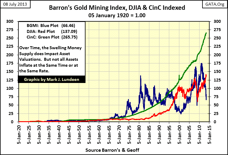
Let’s look at the Barron’s Gold Mining Index (BGMI), an index containing large established gold miners. Below we see the indexed values of the BGMI (Blue Plot), the Dow Jones (Red Plot) and CinC (Green Plot), with January 1920 = 1.00. So, if one of the plots hits the 100 line, this means that it has increased by a factor of 100 since 1920. Since 1965, it is obvious that the BGMI has frequently outperformed the increase in CinC, as well as the Dow Jones! Note: we’ll return to this chart (#3) later in this article.
So why are the gold miners such an out of favored stock sector today? Well, Washington and Wall Street have done much to make them unattractive to professional and retail investors since the 1990s. During the 1990s, these companies' “investment bankers” had them “hedge” their production, locking in metal prices in a declining gold and silver market. On the face of it, this seems like a good idea. But in fact what Wall Street would then do as part of the “hedging', was borrow gold by the many tons (representing the future production of a mining company’s hedged metal still in the ground) from a Central Bank’s gold reserve and sell this gold into a soft market to make the price of gold go down even more.
Wall Street made a lot of money shorting the gold and silver markets as they manipulated the metal prices down during the 1990s! The theory behind these hedges and gold loans was that when the mining companies finally mined and delivered its gold to the market, Wall Street would return the gold to the central bank to repay its gold loan. But as Germany discovered just this year, many thousands of tons of gold sent to Wall Street have yet to be returned to the central banks who made these gold loans, and most likely never will be. Currently, all Western Central Banks’ gold inventory figures should be taken with a grain of salt. One day this will make front page news, but currently the main-steam media isn’t interested.
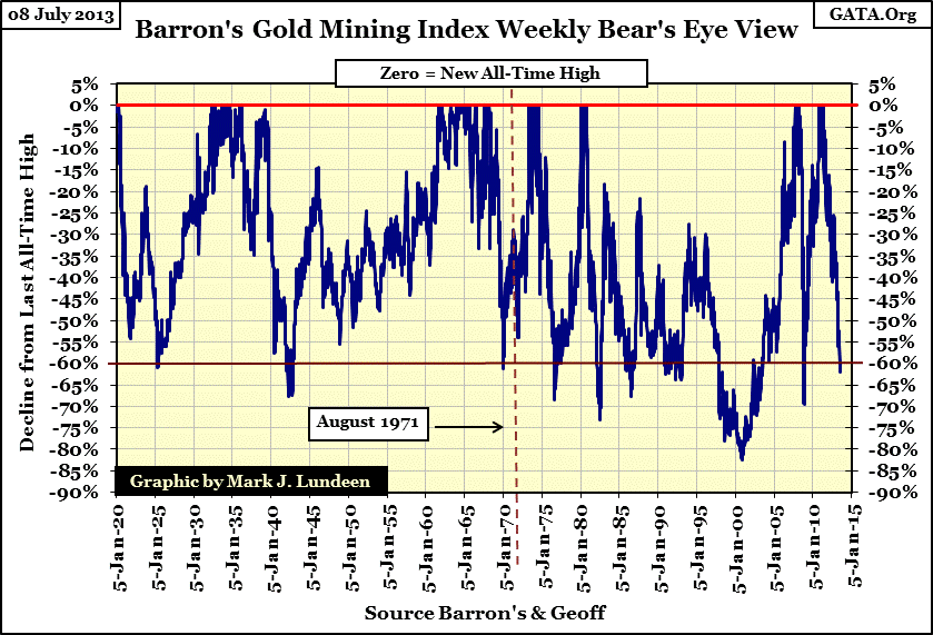
But putting that aside for now, since the 1920s the BGMI (gold mining shares) have always been extremely volatile, as is apparent in its BEV chart below. Historically, the BGMI makes relatively few new all-time highs, and then only for some months or a few years, before it crashes down over 60%. The BEV chart below places the gold mining stocks current correction into its proper historical perspective; 60% declines are business as usual in the gold mining business since 1920.
So why would anyone want to risk their money in gold mining companies? Because there is big money to be made, when conditions are right. And what might those conditions be? When politicians, bankers and academics inflict damage on the US Dollar, the gold mining stocks become very profitable in the aftermath.
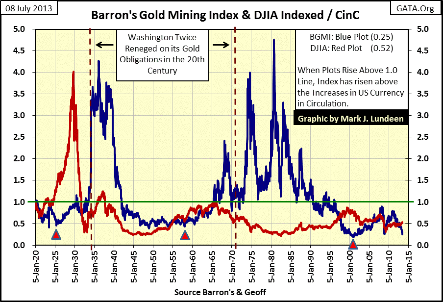
My next chart uses the same data seen in my third chart of this article, but instead of plotting CinC, I plotted two ratios with the BGMI and the Dow Jones in the numerator, and CinC for the denominator.
Dow Jones / CinC & BGMI / CinC
This displays the performance of the Dow Jones and the BGMI relative to the rate of CinC inflation. When the red or blue plots are increasing, it indicates that the gains for BGMI or Dow Jones are increasing at a faster rate than increases in CinC. Declines in the plots indicate they are falling behind the rate of CinC inflation. The 1.0 line (Green Line) is the rate of CinC. Anytime a plot is above 1.0, it has increased in value more than the rate of CinC inflation.
For example, look at the 1920s & 30s in the chart below. We see how in September 1929 the Dow Jones increased 4.02 times above the rate of CinC inflation. A solid after-inflation gain; a gain never again repeated by the Dow Jones in the past eighty-four years. The BGMI reached 4.2 times CinC inflation in January 1936; better than the Dow Jones September 1929 high, and note that the BGMI actually exceeded this high in 1980 after some solid gains (and vicious corrections) beginning in 1958. An interesting fact that we should all note is how the BGMI remained above the rate of CinC inflation from 1965 to 1991, and really didn’t decline below it until 1995.
This is remarkable: had someone purchased the BGMI in 1958 (which they could not, but Homestake mining would have done the job), they would have protected their capital from the ravages of monetary inflation for four decades even with the huge volatility we see above. Bonds couldn’t make that claim, or blue chip stocks, such as those in the Dow Jones. And like bonds and the Dow Jones, the big mining companies yield an income to their investors. But I admit there were many opportunities to buy gold mining shares high and then sell them low from 1965 to 1995, just as there were plenty of times to buy them low and sell them high!
The trick is to know when to buy and hold them. To see when I placed on the chart three little triangles on the chart above that identify historical events that triggered a buying signal for the BGMI. The first was in 1925, when the US Treasury and Federal Reserve (those guys again) decided to help England return to the gold standard with massive loans and access to credit. That sounds familiar, doesn’t it? Financial historians discussing the 1920s note this event, and usually blame the excesses of the Roaring 20s Dow Jones bull market on this inflationary milestone. Note what benefitted first from this massive “injection” of inflation; the Dow Jones did. The BGMI took off after the Dow Jones had deflated.
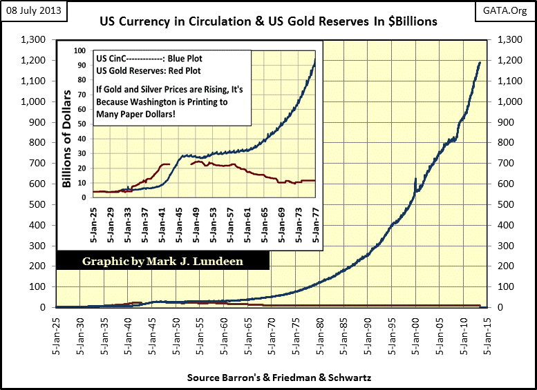
The next inflationary milestone occurred in 1958, when the monetary printing presses at the US Treasury and Federal Reserve finally produced a run on the US Treasury’s gold reserves. This run on US gold can be seen in my first chart’s insert. From 1958 to 1971, the US Treasury lost half of it gold because it kept printing more paper dollars than the law allowed; 35 paper dollars for each ounce of gold held at the US Treasury. The Dow Jones, as well as the BGMI saw inflationary appreciation from 1958 to 1966, but after 1966 there was no comparison between the two! For someone investing in the market in 1958, gold mining companies protected their wealth for the next four decades, something the Dow Jones and bonds completely failed to do. To see the inflationary disaster (rising money supply) that occurred from 1958 to 1995, go back up to my chart (#3) and take a look at it again.
The third inflationary milestone occurred in 2001, when in the wake of the deflating high-tech stock market Washington and Wall Street once again had another inflationary bright idea. No one likes bear markets (deflation). Wall Street sees rising unemployment and smaller end of the year bonuses; Washington’s entrenched political class has to deal with a surly electorate. So they decided to repackage the “American Dream” from liberty from the intrusions of big government, to a big six digit dollar, 30 year loan, guaranteed by the federal government and target this inflation towards “home ownership.” This scheme sounded good in 2001, but I also note that in 2001 for the third time since 1920, the BGMI began rising from a very hard bottom in the chart above.
Nothing truly spectacular has yet happen after the 2001 bottom in the BGMI, but if you note the 1925 and 1958 bottoms, their spectacular bull markets took time (years) to develop too. But as big as the coming bull market in the BGMI could be, smaller gold and silver mining companies and precious metals exploration companies will do much better if history is any guide, and it usually is.
But nothing is going to happen in the precious metals mining sector until the price of gold and silver turns around and begins going up again in a big way. So how is gold and silver doing? I think we are near their bottoms in the current correction. Look at gold and its step sum below. From January 2011 to its last all-time high in August 2011, the price of gold and its step sum were moving up briskly to the upside. Since then, the price of gold has seen a repeating pattern of lower highs and lows. Beginning last September when the price of gold began its collapse, we see there were more downs than ups in the gold market. Now look at gold’s step sum (market sentiment). Since August 2011 the gold bulls have been in denial, as seen with the gold step sum’s trend confined in a trading range
from August 2011 to just last month. But now gold’s step sum has finally broke below its two year trading range, and that is a good indication of capitulation by the bulls.
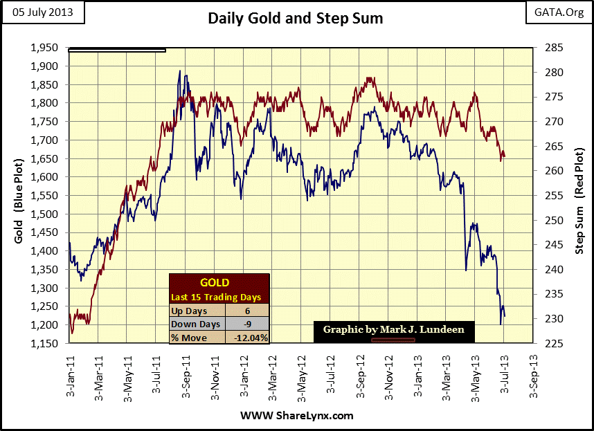
We should know when gold is ready to go up in earnest again; when gold’s price and step sum trends both reverse sharply to the upside. But I’d like to see gold’s step sum trend come down more before I’m willing to be really bullish. There is nothing like a good collapse in investor confidence to set up the bottom in a correction. But I don’t see that collapse in gold’s step sum (Red Plot above) just yet. The gold bulls are still fighting (unsuccessfully) the two year decline in the price of gold, but they are losing confidence if the step sum is to be believed.
Silver and its step sum are in a class of their own. From January to the beginning of May 2011, both silver’s price and step sum trends were tracking with each other as silver almost made a new all-time high. Then the price of silver got whacked. By early July of 2011 silver’s price and step sum trends were going up again until both gold and silver’s price trends got whacked again just a month later in August 2011. But since May 2011 the silver bulls were always ready to become bullish as the price of silver declined, as seen by silver’s frequently rising step sum as the price of silver fell.
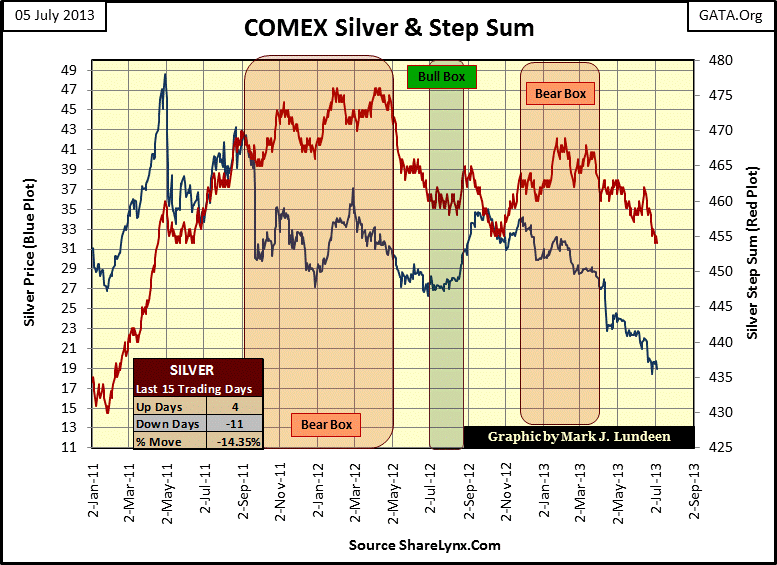
Silver’s step sum has been collapsing since early March of this year, with more down days in the silver market than up days. That’s good. Of the two metals, silver’s step sum chart above appears more constructive than gold’s. But I’d still like to see silver’s step sum continue down for a bit more to set up a situation like we see from January to April 2011 (left side of chart), where silver’s price and step sum trends reverse sharply to the upside. All and all, I’m very optimistic for the near term future for gold, silver and the mining companies.
share
share
share
share
share
More from Silver Phoenix 500


