The 10-Year Yield Is Still Going Sub 1.00%...Why The Fed Bubble Is Likely To Burst


At this time last year, most big bank analysts and strategists were calling for the 10-year yield to climb above 3.50% in 2014 as rates rose on the Fed’s plan to taper its bond buying program.
Well clearly the Fed did taper, but rates only went lower as bonds rallied to prove true one part of last December’s Peak Prospector titled, 2013: Year of the False Initial Reaction? The publicly released part of that note focused on the idea that the 2013 stock rally would turn out to be an incorrect or false assessment on the part of investors as equities reversed back down in an equal and opposite manner.
Clearly this has not happened – or at least yet – but the portion of that note reserved for PTR subscribers discussed what the “most significant false initial reaction of 2013” may prove to be and one that is in effect.
 Specifically with the weekly chart to the left chart offered last year:
“All of this brings me to what I think will prove to be the most significant false initial reaction of 2013 and this is around Treasury yields with the 10-year yield appearing technically vulnerable to declining back below 2.0% and even going sub-1.0% and perhaps by the end of 2014.”
This portion of the note went on in a similarly bold manner:
“Overall, I believe the long-term chart of the 10-year yield suggests any taper attempt made in 2013/14 would likely prove to be an unsuccessful exit for the Fed from its aggressive accommodation of recent years and one that may actually cause the Fed to add after a possible taper trial.”
“Should the 10-year yield rally in this manner, it will prove beyond a doubt that the 2013 reaction in the bond markets was, in fact, an untruth that investors told themselves about the possibility that the system could handle higher rates on a sustained basis and that the Fed could walk away from its promise to support the financial markets forever and with whatever it takes.”
Well the 10-year yield has not quite cracked 2.00% – let alone 1.00% - but at its recent low of 2.07% made December 16, 2014, there is absolutely no question that the 10-year yield is much closer to the 2.00% discussed in last December’s Peak Prospector note than to the 3.50% discussed more widely by most market watchers.
Behind this dramatic difference in view? It’s impossible to know for certain, but I suspect it has to do with the likelihood that most observers are working strictly off of the fundamentals and were expecting the Fed to normalize interest rate policy as is fitting to a typical economic cycle.
My view, on the other hand, is based mainly on chart analysis with the long-term monthly chart of the 10-year yield below showing not one severe downtrend but a sub-downtrend to the roughly 35-year downdraft with each very likely to remain in effect.
In fact, it has been the simple charts of the 10-year yield that were behind my sub-2.00% call back in 2010 and my ongoing sub-1.00% call made first in 2011 and one that I did not veer from at all during the somewhat gut wrenching 140 bps move up between May and December 2013 on all of the taper talk.
Why? Because my conviction was simply that strong around the likelihood that the 2013 back-up in rates was a false initial reaction on the part of investors who were assuming that the taper would push the 10-year yield higher over the longer-term as it somehow bled into the Fed raising rates in 2014 or 2015.
Twelve to twenty months later and it is very clear that this was an incorrect assessment on the part of investors who initially pushed the 10-year yield higher only to have the bulk of that move reverse back right back down and something that proves a false initial reaction in the 10-year is underway.
It will be proven entirely, perhaps, if the 10-year yield drops back down to its pre-taper talk low of 1.61% and a possibility that most market watchers may think is improbable at best.
As is so often the case, I will take the seemingly improbable case – again - and one that is consistent with my multi-year view to argue that the 10-year yield is going lower yet as rates decline significantly before there is even a remote shot of rates rising in a healthy manner.
Before turning to one last chart that supports this less than mainstream view, let me just say that this is one case where I truly hope I am right and something that was less true on gold, silver and corn among other macro long-term calls made and not really true at all on my 60% stock correction call.
The reason I say this is because the long-term monthly chart on the previous page is starting to make a wild case scenario for rates to spike dramatically higher in a very short period of time and in a manner that would probably mean the Fed had lost all control of the bond markets as all of the leverage on its balance sheet is somehow disrupted or unleashed. Let’s hope that does not happen because it would probably mean that a stock market crash was underway as the global financial system cracked.
Turning to the more optimistic reaction scenario to nearly six years of aggressive central bank accommodation on the back of the 30 years of extreme private sector leverage is the 10-year yield dropping lower and on first a flight to safety and then policy.
This daily chart shows the post-2008 part of the 10-year yield’s downtrend with its Death Crosses, or when the 50 DMA slices below the 200 DMA, signaling periods of extreme momentum to the downside. With yield trading inverse to price, these Death Crosses have come ahead of big bond rallies on flights to safety out of stocks as was discussed in detail in both the April and the August Peak Prospector notes.
At a minimum, this current 10-year yield Death Cross within the context of the downtrend born of the last financial crisis suggests that the 10-year yield will skim 1.0% if not drop well below that level. This is true so long as the 10-year yield is below about 3.00% with few technicals outside of the dangerous wild card set-up for a dramatic spike higher discussed above supporting any sort of move higher.
Rather, the 10-year yield’s charts all support the sub-1.00% case as does a longer-term weekly chart of the Dow Jones Industrial Average considering its breached bull market uptrend.
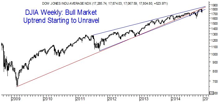
Gyrations of the sort shown around the DJIA’s uptrend typically end in big reactions to the downside also known as corrections and crashes. It is the truly fragile, frothy and, ironically, bearish skeleton of the Dow Jones Industrial Average’s bull market that suggests this index’s flimsy uptrend may produce a massive downside reaction as investors flee from risk and fly toward safety.
In fact, this risk-off scenario is supported by the confirmed bear market in the commodity complex with these two risk asset segments likely to “reconnect” as has been detailed in several of this year’s Peak Prospector notes. It is almost impossible to think that the equity and commodity markets can exist as isolated islands on the risk spectrum and far more possible to believe that U.S. stocks will slide into a bear market as well.
Overall, then, there are many reasons to think that the 10-year yield is still going sub-1.00% on bearish-for-risk financial market trading action.
As always, thank you for taking the time to read this week’s piece and Happy Holidays!
********
DISCLAIMER
Peak Theories Research LLC (“PTR”) is not a registered broker-dealer and PTR’s reports, including Peak Prospector, do not constitute recommendations to purchase or sell any securities and do not involve an offer to sell or a solicitation of an offer to buy any securities discussed in any PTR reports. Opinions expressed herein are strictly that of the author and are subject to change without notice and may differ or be contrary to the opinions or recommendations of any professional associations held by the author. The opinions contained herein should not be taken as specific recommendations to be acted upon. Any prices or quotations contained herein are indicative only and do not constitute an offer to buy or sell any securities at any given price. No representation or warranty, either expressed or implied, is provided in relation to the accuracy, completeness, reliability or appropriateness of the information, methodology and any derived price contained within this material. The securities and related financial instruments described herein may not be eligible for sale in all jurisdictions or to certain categories of investors. The author may have or have had interests long or short positions in the securities or related financial instruments referred to herein, and may at any time make purchase and/or sales in them. Neither the author or any person or entity related to the author nor the author’s professional associations accept any liability for any loss or damage arising out of the use of all or any part of these materials.
More from Silver Phoenix 500


