$50 Silver Will Make History


The Dow Jones saw a new all-time high on Monday (#62 since entering scorning position in November 2023), and then took a bit of a rest for the duration of the week, closing Friday with a BEV of -0.29%.
So, what should we make of this week’s market action in the Dow Jones BEV chart below? As a Bear’s Eye View chart converts market data published in dollars, into a range of percentages, spanning from 0.0% for each new all-time high, to -100% for a total wipeout in valuation, bull markets can easily be identified whenever a BEV plot becomes range bound between its BEV 0.0% and -5.0% lines.
This range of BEV values; from 0.0% to -5.0% is called scoring position. During a bull market advance, the index will make new all-time highs, but most daily closes during a bull market advance will close somewhere in scoring position. That is just how it goes. For the Dow Jones below, it saw daily closings below its BEV -15% line last April, well outside of scoring position. I don’t hold that against this advance in the Dow Jones, as it soon recovered above its BEV -5% line, and has made eight additional new all-time highs.
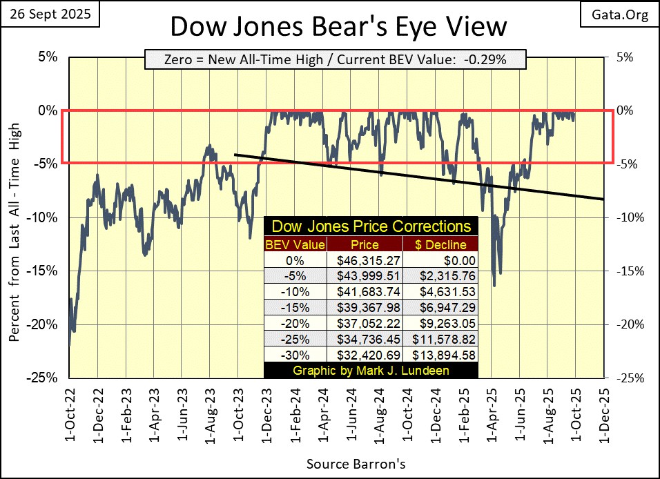
Looking at the Dow Jones BEV plot above, since November 2023, the Dow Jones BEV plot has for the most part closed within the Red Rectangle; between the 0.0% and -5% lines, aka scoring position. The Dow Jones entered scoring position almost two years ago, and during that time, it has made only sixty-two new all-time highs.
That is just how things have gone for the Dow Jones in its BEV chart above since November 2023. Now look at the Dow Jones in the dollars it is published in below. I enclosed the period seen in the BEV chart above, with a red square in the price chart below. Same data, two different views of it.
Since entering scoring position twenty-two months ago, the Dow Jones has advanced by 11,096 points, or 31%. Not bad for an Average of thirty, old fogey, dividend yielding blue-chip stocks.
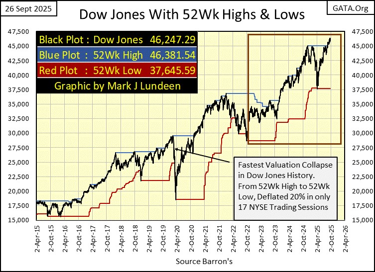
Next is my chart for the Dow Jones in daily bars, giving us a little bit more information on this bull-market advance. The Lows of last April are still there, but will be missing in next week’s chart. The Dow Jones saw a nice advance from April to the end of June, but since July, its advance, which includes eight new all-time highs, has been something less than enthusiastic.
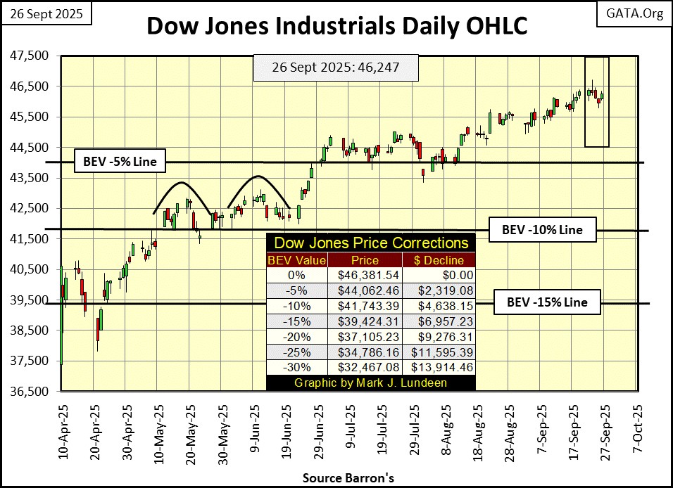
I’m not making a prediction here, as I don’t know what tomorrow will bring. But bull markets end in exhaustion, and since July, the Dow Jones while still advancing, is trading as if it was getting damn tired of going up. This is not the type of market to commit new money in, but one that reducing one’s exposure to, could be the best thing an investor could do.
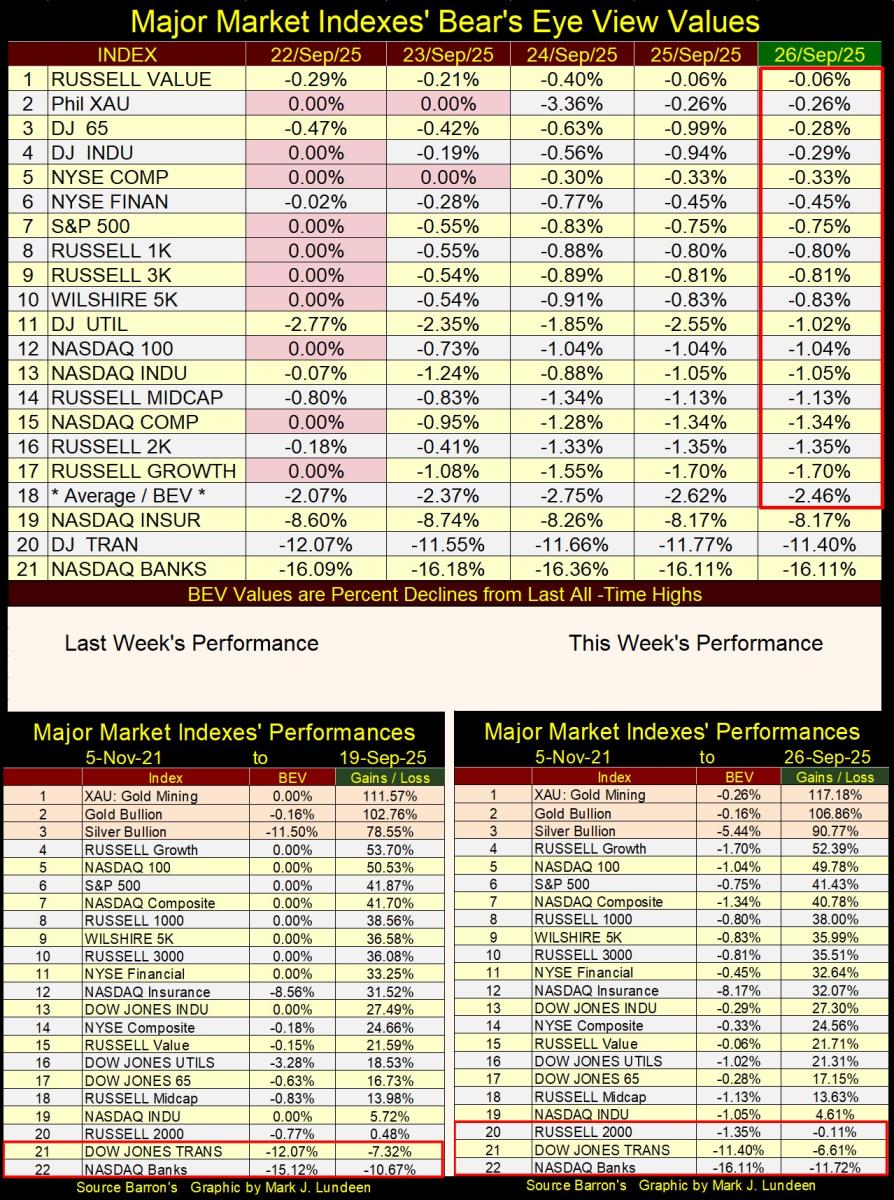
In my table below for my major market indexes’ BEV values, Monday saw plenty of new all-time highs, Tuesday saw only two BEV Zeros. For the rest of the week, we had to be happy with most of these indexes closing in scoring position, which isn’t a bad thing to see in the market. The lowest index in scoring position was the Russell Growth Index (#17), closing the week with a BEV of -1.70%, or only 1.70% below its last all-time high.
We are still in a bull market advance, something we should assume for as long as most of these indexes remain above their BEV -5% lines. How hard would it be for these indexes to advance by the pittance they currently find themselves below their 0.0% lines, seen at this week’s close, to new all-time highs? Not hard at all.
So, bear that I am, I’m still expecting to see additional all-time highs in the coming weeks, and maybe months to come in table below.
Unlike the Dow Jones since the end of June, precious metal assets in the performance tables (#1-3) above have been on fire! Every week, the gap between them and everything else only grows larger. I expect this will continue to be the story of these indexes for the foreseeable future;
- precious metal assets good,
- non-precious metal assets not as good.
What did the NASDAQ Banking Index do this week? Down by 1% from last week.
I remember 2006-07, when the sub-prime mortgage debacle was approaching its market top. Two decades ago, every night I’d get phone calls, almost every hour from complete strangers, asking me if I wanted a second mortgage. This over the phone from total strangers!
They didn’t have a clue who they were calling; I was someone who purchased his home outright. It wasn’t much of a house, but it was fully paid for, and I appreciated that. I never had a mortgage, and now someone wanted to know if I wanted a second mortgage? Just thinking about a mortgage on my home made me spit-up blood, and now total strangers were offering me a second mortgage at very attractive yields?
It wasn’t just me receiving these phone calls. In response to the public outcry of these invasive phone calls for second mortgages, the Federal Government began a Do Not Call List, that you can still get on. Call 1-888-382-1222 to place your phone number on this list for a year.
Well, strange things like that happen at market tops. In the late 1990s, my mail box was stuffed with junk mail from only God knows who, telling me all about the next Microsoft, or Intel wannabe stocks to invest in. I was getting pounds of junk mail weekly; I kept a waste paper basket by the front door to throw that junk in.
What makes me bring this up? Well, my phone number may be on the Do Not Call List, but once again, for months now, I’m getting unsolicited phone calls from complete strangers, asking me if I want to sell my home. This has a bad smell to it, one that to my nose, reeks of a credit excess somewhere in the banking system.
When was the NASDAQ Banking Index’s last all-time high? November 2021. Looking at the table above, this week these banks closed 16.11% below that. Maybe it’s just me that finds this so annoying. Still, this refusal for these banks to take part in the huge market advance of the past four years really bugs me!
What did gold do in this week’s BEV chart? Like the Dow Jones, gold’s BEV chart is solidly bullish. Not since May has it seen a BEV below its BEV -5% line, and this week gold closed with a BEV of -0.16%, or only 0.16% below its last all-time high. So, like the Dow Jones, we should be expecting additional new all-time highs for gold in the coming weeks and months.
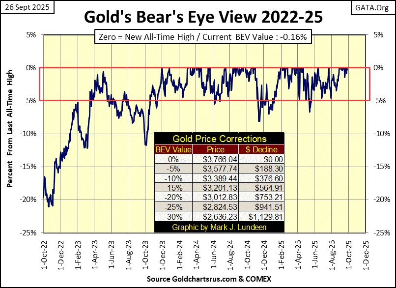
Like the Dow Jones with its BEV chart, the BEV chart for gold isn’t telling the entire story. For that let’s look at its indexed value chart below. Gold is on fire. The advance seen below is unlike anything seen since 1969, except for the 1979 surge in valuation.
But the surge in gold in 1979 was at a market top. A time when everyone in the media, and the broad public loved gold. In 2025, the media has yet to discover this amazing advance in gold. Instead, they remain focused on the bull market in AI stocks, while the public at large is unaware, or at best indifferent towards gold’s amazing performance.
There are huge differences in market psychology between 1979 and now. In 1979, investors wanted to own gold bullion (silver too), and I mean everyone. In 1979, Scott’s Liquid Gold, a wood polish for beautiful table tops was a very hot stock, just because it was called “liquid gold;” true story!
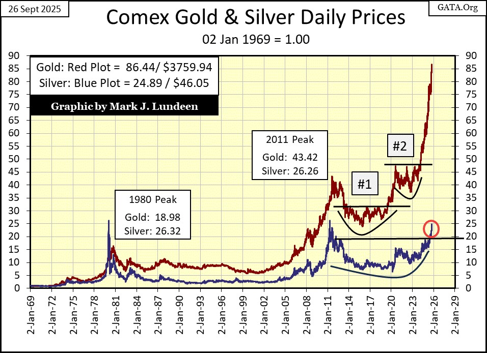
In 2025, a very tiny portion of gold’s potential market demand has yet to buy any gold, unless they are central bankers. So, why is the price of gold spiking, as seen below? I had to increase this chart’s scaling to 90 this week, to fit gold’s plot inside the chart. Something I’m expecting I’ll have to do once or twice in October as this amazing advance continues.
Looking at gold’s advance below, one word comes to my mind; correction. No market just spikes upward like this, and not be vulnerable to a big pull back in valuation. Are we going to see a proper correction anytime soon? Maybe, and then maybe not. I’m not going to make a prediction, as every time I do, the market makes a monkey out of me for being foolish, for pretending I know something about the future.
I’m currently conflicted with this advance in gold. Reason and prudence tell me a correction in price is very much due at this level. But then, my greed glans begin secreting gluttonous goo into my blood stream, and I’m willing to believe gold has much, much more to advance before it will correct.
I’m just going to sit back and watch what is going on in the weeks and months to come, and make the necessary scale adjustments as required. How long before I have to rescale this chart to 100 (gold at $4,350)? I haven’t a clue, but that will be a happy day!
Silver in its indexed value plot above has finally cleared its 20-index line, and closed the week just a hair below its 25-index line. Let’s look at silver’s BEV chart below.
This week, silver closed with a BEV of -5.44%, or 5.44% below its last all-time high seen in January 1980, forty-five years ago. In my file, I have silver’s last all-time high at $48.70, and this week silver closed at $46.05. This is an amazing chart; there is nothing else like it!
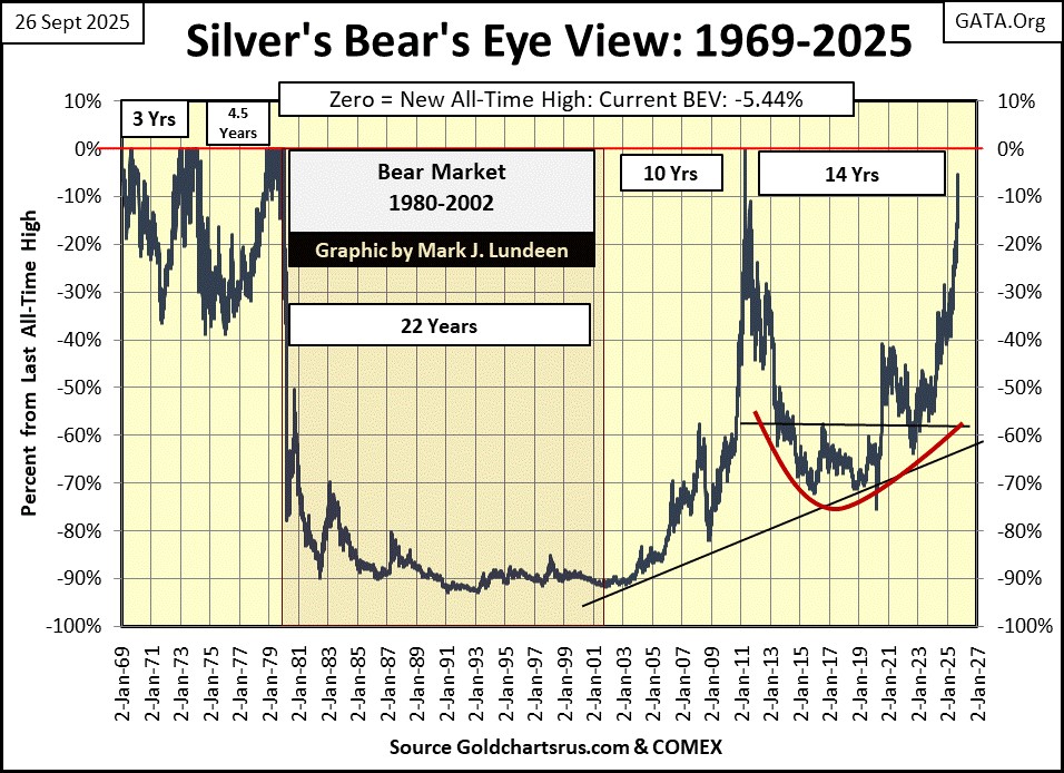
Since January 1980, silver has been a horrible market for investors, a market void of any hope of making a profit, if you were a bull. For about a decade, during the 1990s one could buy silver for less than $5 an ounce, for years for less than $4 an ounce. Silver was for chumps, and today, in the mind of most investors, silver still is for chumps. But look at silver’s BEV chart above! When silver finally makes its first new all-time high since January 1980 (call it $50 silver), what happens then?
I don’t know, but I expect it will be something profound!
Just for fun, I generated the frequency distribution table below for silver; it is so pathetic. Since January 1969, silver has seen only 144 daily new all-time highs, and every one of them before February 1980. And daily closes in scoring position? Only 318 in the past fifty-six years, and most of those before February 1980! So, adding the percent of total days for the 0%, and -0.001% rows, we see silver has been in bull market for only 3.85% of its total days since January 1969.
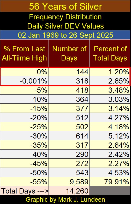
Where silver has spent its time since 1969, has been in the -55% row in the frequency table above; 55%, and very much more from its last all-time high. In the past six decades, silver has seen 9,589 daily closes 55%, or more from its last all-time high, or 79.91% of all of its total daily closings since January 1969.
But we’re not talking about the buggy whip and horse shoe market here. Silver is the indispensable metal for electronics, and the chemical industry. That, plus silver, like gold, is one of the monetary metals, that for thousands of years was the blood that flowed in the economies of the world. Is silver money? In 2025, economists and “market experts” would claim it is not. But I have a few Morgan, and Peace Dollars, minted over a century ago by the US Treasury, that state that it is.
Silver was removed from US coinage in 1965 not because it wasn’t good money anymore, but because using silver for coins was a check on inflation. To have continued using silver in US coinage would have made the US government’s “monetary policy” of monetary inflation impossible.
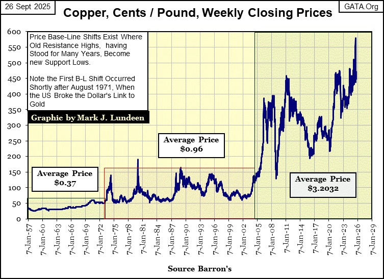
So today, instead of US coinage being minted in a precious metal, the US Mint prefers copper and zinc. But US inflation since 1965 has now made even base metals like copper and zinc, prohibitively expensive for US coinage.
In the chart below plotting the price of copper (in cents per pound) since 1956, we find that copper was trading at $0.38 a pound in July 1965, when President Johnson demonetized silver from US coinage. This week copper closed at $4.71 a pound, down from $5.80 at the end of July.
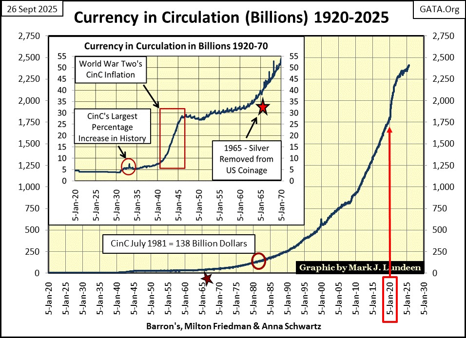
In 1965 when they removed silver from US coinage, US CinC (paper dollars in circulation) was only $40 billion dollars. This week the Federal Reserve reported CinC at $2.4 TRILLION dollars (see chart below).
I highlighted January 2020, to note how the idiots responded to the March 2020 Flash Crash – massive monetary inflation to paper over the dollar losses seen in the financial markets.
Here is President Johnson’s announcement of the termination of silver for US coinage. Johnson, like most politicians, did more harm to the world, than good. Note: he said nothing about the pending massive inflation in paper dollars, seen above, that followed shortly after the termination of silver for US coins.
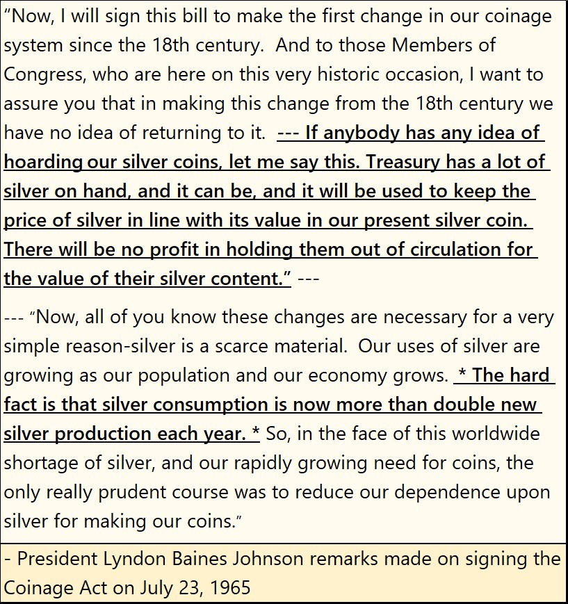
Demand for silver was growing in the 1960s, and nothing has changed since then. Except the silver horde Johnson brags about in 1965, billions and billions of ounces of silver once held in the US Treasury’s vaults, are now gone, and have been since 2002.
So, what happens when silver for the first time since January 1980 makes a new all-time high, or better yet, breaks above $50 an ounce? I don’t know, but I’ll be watching! One thing I can say with certainty; the price of silver, as well as for gold has yet to be adjusted for the massive inflation seen above.
Whatever the fully adjusted price will prove to be for gold and silver, the gold and silver miners’ valuation will outperform the metals themselves. But the problem with that is, like all other stocks, the gold and silver miners will be priced in dollars. The time is coming when everyone will prefer owning gold and silver to dollars issued by a bunch of idiots at the FOMC. So, it’s best to own some bullion too.
Moving on to gold’s step sum table below, gold made two new all-time highs this week; Monday and Tuesday. At the close of this week, gold’s 15-count closed at a +5. So gold isn’t yet an overbought market, as it was when its 15-count was a +7 or a +9 earlier this month.
It would be good to see a few daily declines in the coming week, to keep its 15-count below a +7. Other than that, it looks like all systems are a go for gold!
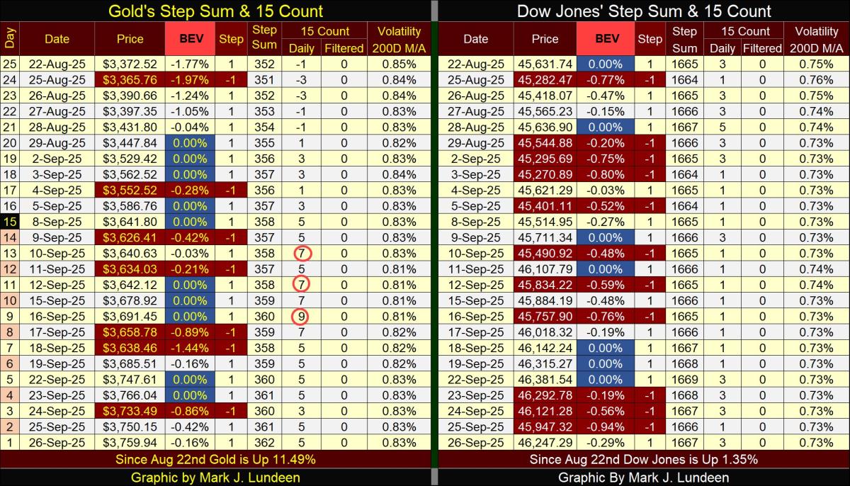
The Dow Jones step sum table looks good too. The Dow Jones is seeing more down days than is gold, but that can be a positive. A true bull market advance is more a marathon, than a sprint.
The biggest positive for the Dow Jones, is its daily volatility’s 200D M/A remains below 1.0%, and as long as it does, its path of least resistance may be upwards.
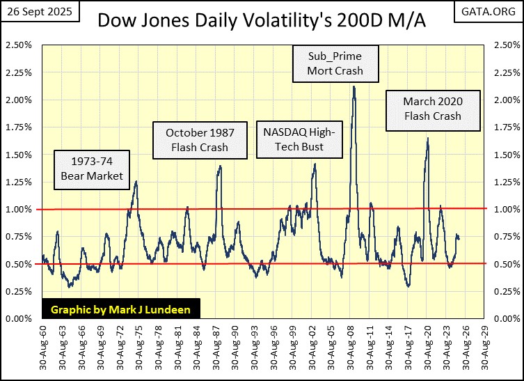
Historically, what kills every Dow Jones bull market is rising daily volatility. With the arrival of Mr Bear to Wall Street, comes his dreaded Dow Jones Days of Extreme Volatility, or Dow Jones 2% days, where the Dow Jones moves (+/-) 2% or more, from a previous day’s closing price.
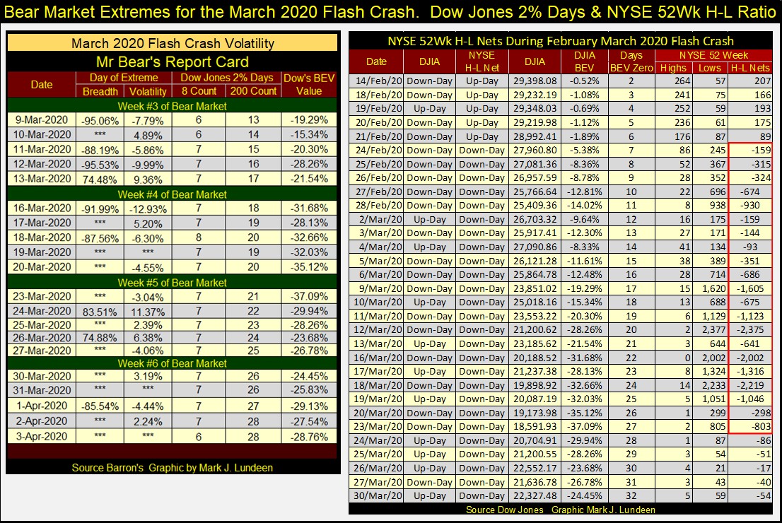
What that looks like can be seen during the March 2020 Flash Crash, left table below, volatility column. Look at the daily moves for the Dow Jones in March 2020. During the flash crash, there were days the Dow Jones advanced or declined by over 10%, from one day to the next.
This is what a BIG BEAR MARKET looks like. And that is something I fear we’ll see once again, sometime in our uncertain future.
Mark J. Lundeen
********
More from Silver Phoenix 500


