All Market Roundup - Bonds, Stocks, Dollar, Gold, Silver, Oil, PM Stocks


Never before have we seen major indicators in such a conflicting state. Taken in isolation many important indicators are giving clear signals, but they are in conflict with one another to the extent that the outlook is a clouded mess. When such situations arise it usually leads to choppy, treacherous market conditions until such time as the indicators align in a more unified manner.
There are lies, damned lies and statistics, which is why we generally use charts in preference to the latter, but as you will see as you read through this report, using charts is not always a piece of cake either, especially at a time like this. While you will soon understand what I mean when I say that the indicators are conflicting, that certainly does not mean that we can’t come to some useful conclusions about probabilities and how to handle these markets going forward.
Let’s start by looking at the 5-year chart for gold. By itself the gold chart looks bullish. Gold has been in a trading range for 18 months now, and for most of this period it has been fluctuating between very clearly defined support at $1500 and very clearly defined resistance at $1800. What this means is that these support and resistance levels are VERY IMPORTANT, and a breakout above the resistance at $1800 or below the resistance at $1500 will signal the next major move. What about the danger of a false breakout? – well, there hasn’t been one so far as this range has formed. The quite strong advance of last August – September looks like an impulse wave, a move in the direction of the primary trend, particularly as the subsequent reaction has the attributes of a Flag, a type of correction.
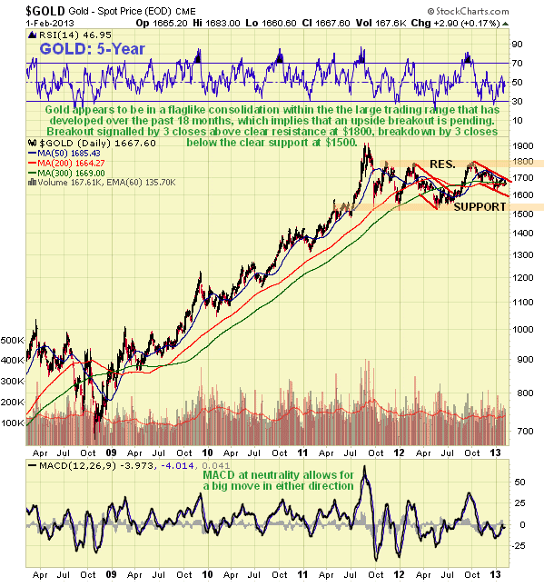
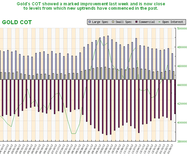
It is thus interesting to observe that gold’s COT chart is at its most positive since last August right before the sizeable rally started, with the picture improving just last week as Commercials slashed their short positions.
So far, so good, right? Now we look at silver. Its 5-year chart is rather similar to that for gold, with the practical exception that the resistance at the top of the recent trading range is not so clearly defined. This chart too looks like it portends an upside breakout and higher prices.
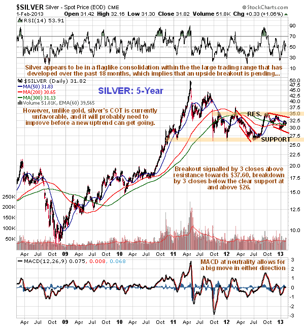
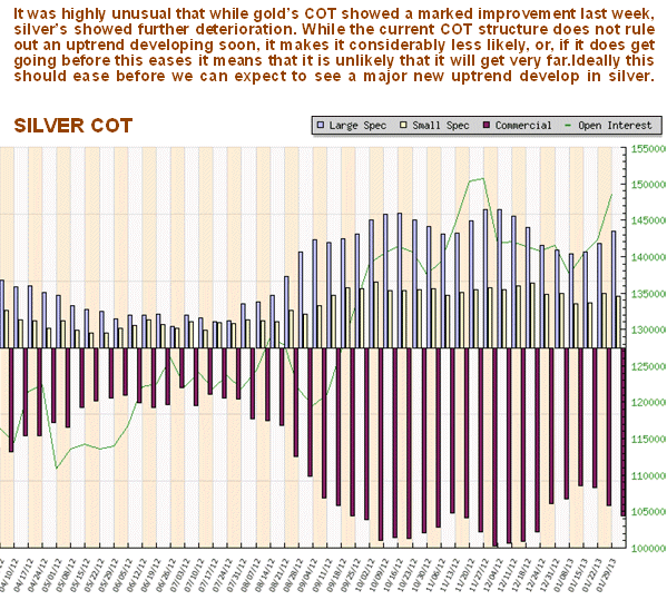
But if silver looks set to break out upside and rally soon with gold, then why were the Commercials piling on the shorts last week so that they are now getting to a high level again? I have no explanation for this as the COTs suggest that gold is going to take off higher and silver break down, a situation which is clearly highly unlikely. Thus, what we can probably expect to see is more choppy action near-term until gold and silver COTs are better aligned.
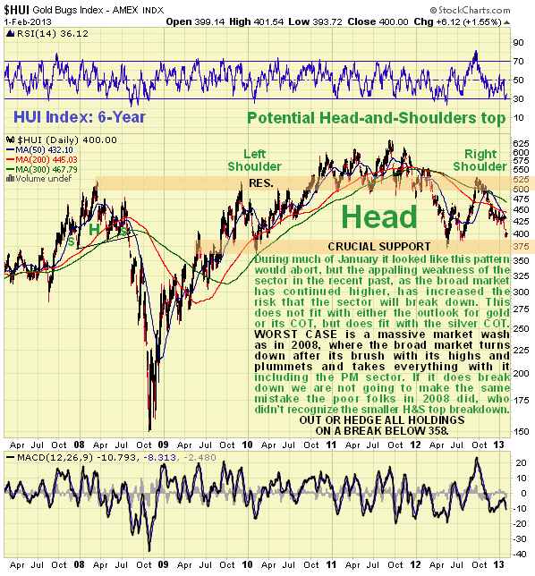
If the outlook for gold and silver is taken to be positive, then why are Precious Metals stocks performing so terribly? – they should now be firming up if a breakout by gold and silver is looming but instead they have been plumbing new lows. The 5-year chart for the HUI index looks awful – we had earlier thought that the large Head-and-Shoulders top in this index was going to abort, but the latest weakness is increasing the risk that it is valid. If it is valid it has grave implications for the market as a whole as it targets the 100 – 150 area, and quite obviously this could only happen in circumstances of another 2008 style deflationary wash, in which case the now lofty broad market would turn tail and drop like a rock. In any event PM stocks have heavy overhanging supply to contend with in the 500 – 550 area on the HUI. PM sector holdings should be protected by either a general stop below 358 on the HUI index, or by hedging should this level be breached.
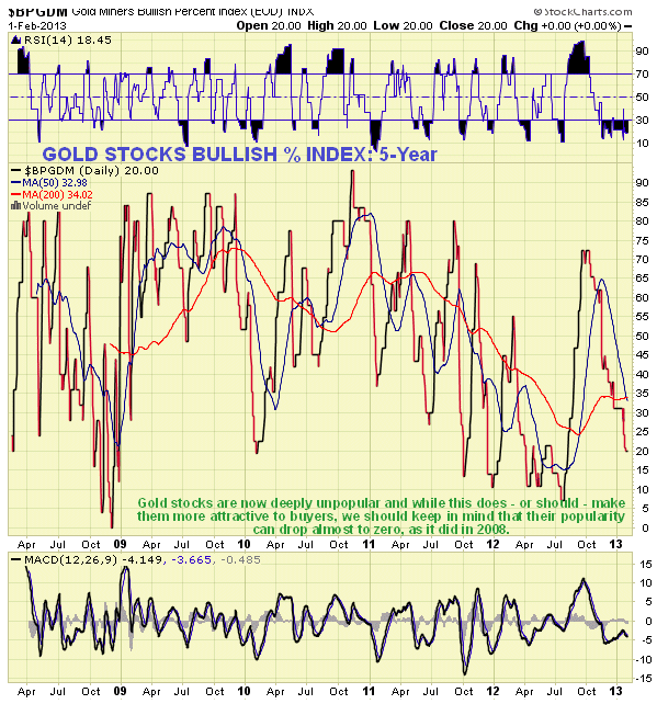
The gold shares bullish % index charts indicates that we are getting into normal buying territory for gold stocks, but we should remember that this indicator can actually drop to zero, and it did in 2008, and if that happened we could see terrible losses even from the current depressed levels.
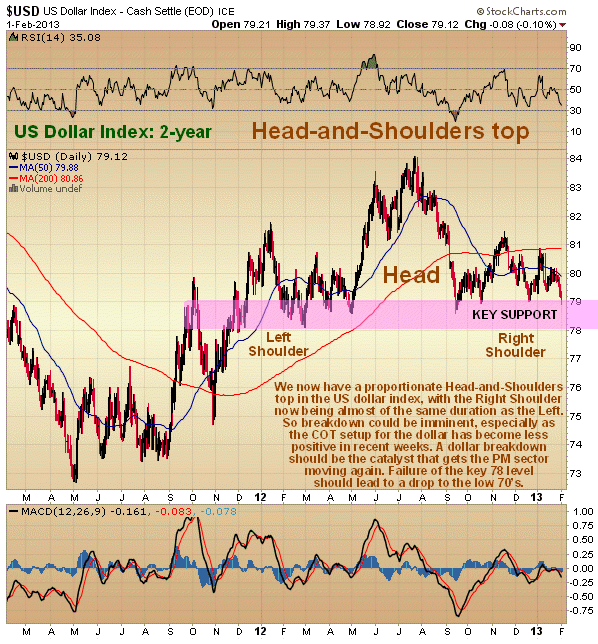
This is the point to look at how the dollar is shaping up and see how it fits into the mix. The 2-year dollar index chart continues to look bearish with a sizeable Head-and-Shoulders top looking like it completing. We now have a Right Shoulder to the pattern that is almost of equal duration to the Left Shoulder, so breakdown soon look likely. 78 is the key level to watch – if it breaks below this, the pattern targets the low 70’s. COTs in recent weeks were strongly bullish for the dollar and in effect precluded a breakdown. They are still quite bullish, which means either that this pattern many abort, or that some more time is needed for the COT structure to change sufficiently to permit a downtrend to develop. Here’s a contradiction we have to contend with – if the dollar looks like it is going to break down from its Head-and-Shoulders top, as it does, then this is clearly positive for gold and silver – so why do PM stocks look so sick? Also, if the dollar breaks down we would expect to see the broad market advance to accelerate noticeably, breaking it out to clear new all-time highs, probably leading to a parabolic ramp into the traditional “sell in May and go away” time. However, if the H&S top in the dollar aborts, which COTs suggest is very possible, then we may be the top in the broad market right now and various sentiment indicators indicate that a top is close at hand.
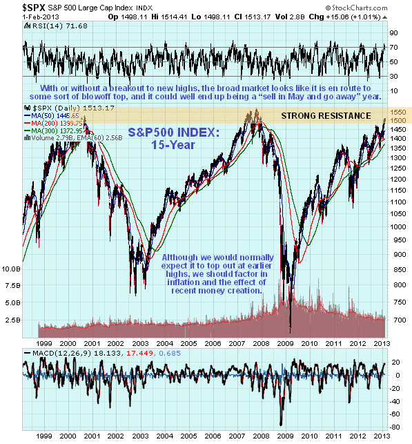
So how does the broad market S&P500 index chart look right now? On its 15-year chart we can see that after climbing a wall of worry for several years it is now arriving at very strong resistance approaching and at its 2000 and 2007 highs, and psychology is shifting with market participants heading in the direction of euphoria. A Triple Top reversal here would be a highly satisfactory technical development, although we must bear in mind that in real terms, stock values are way below what they were in 2000, once we factor in inflation during the intervening years. Also, regardless of the state of the economy, money spirited into existence by the Fed could drive markets considerably higher.
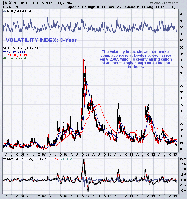
The VIX volatility index shows that complacency in the markets is at levels not seen since early 2007, ahead of the major crisis, and since nothing has been learned from that crisis, which has been simply papered over with bailouts, created money, credit and derivative expansion etc, the situation is potentially much more dangerous than that which existed in 2007 – 2008 with a housing market bubble having been trumped by a bond market bubble of immensely greater magnitude.
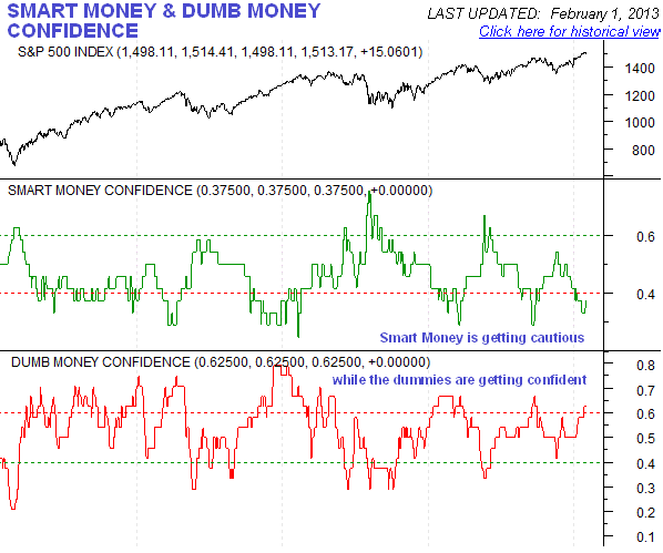
As the market has continued to rally Dumb Money has been getting itself worked up into a lather again, while Smart Money retreats to the shadows, as the following chart, courtesy of www.sentimentrder.com shows…
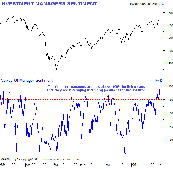
A study undertaken by www.sentimentrader.com shows that Investment Managers are at their most bullish since 2006, and for the 1st time ever are actually leveraging their long positions, and while these are generally intelligent people as a group they can fall victim to groupthink like anyone else, so this is viewed as a serious warning that a top is not far away.
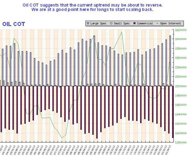
Finally, oil has a good run in recent weeks, but the current intermediate uptrend is getting long in the tooth, and the chances of a reversal soon are growing, especially as it is now overbought as it approaches a resistance level.
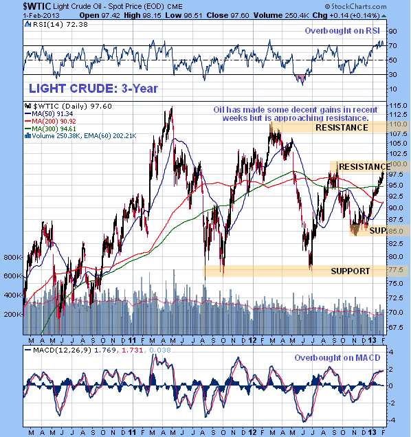
The oil COT chart certainly suggests that we are at a good point for longs to start taking money off the table, which is alright for us as we got in at the start of this rally .
If, after reading this, you feel more confused than before you started, you have every right to be, but at least you have a clearer idea why you are confused. The current contradictions are expected to resolve themselves into a clearer technical picture with passing time.
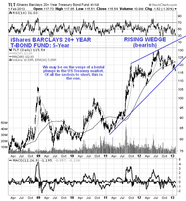
Finally we are starting to see evidence that a breakdown and potentially violent plunge may be imminent in the US Treasury markets. With the shameless and relentless abuse heaped upon this market by the Fed and the US government, it is only surprising that it has held up as long as it has. Anyone holding these instruments at this time, which have very little potential for capital appreciation after their prolonged gains, yield next to nothing and carry huge risk of heavy capital loss, is intellectually bankrupt and a moron, although we must recognize that a lot of the buying of Treasuries is undertaken by those who will not pick up the tab for the loss personally if they lose value. Of all the sectors to short, this must be the one.
Please note that this article may appear on some public websites.
Clive Maund, Diploma Technical Analysis
support@clivemaund.com
www.clivemaund.com
Copiapo, Chile, 5 February 2013
No responsibility can be accepted for losses that may result as a consequence of trading on the basis of this analysis.
More from Silver Phoenix 500