Cracks Forming In Fixed Income


It’s hard writing about the old monetary metals. Mind you I’m still quite bullish on gold and silver, but I understand the frustration gold and silver investors feel over the past three years. Looking at the price of silver (Blue Plot below) with its step sum (Red Plot) from January to Late April 2011, we see it moved up $22 to within pennies of taking out its January 1980 all-time high. The silver bulls were roaring during those four months, as seen in the step sum (Red Plot); during the twenty trading days of April 2011 silver closed lower than the previous day only three times, a rare occurrence.
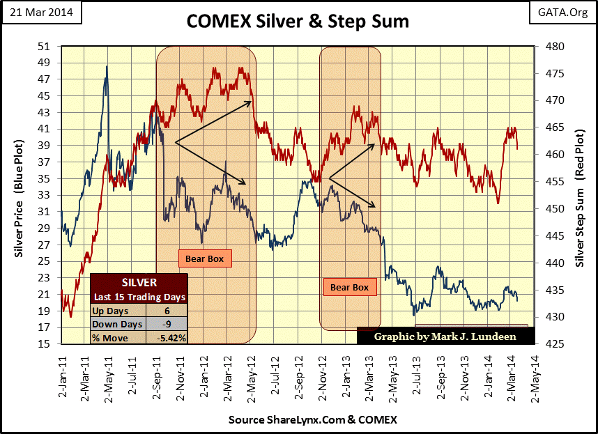
Then came early May 2011; the COMEX increased margin requirements three times in the highly leveraged silver futures market in a matter of days. The resulting effects were obvious; the price of silver crumbled by over $13. Then, in September 2011 there followed another $12 free-fall over just a few days. But the silver bulls weren’t having any of it if you can believe silver’s step sum. From September 2011 to May 2012 silver’s step sum (a single item advance –decline line) continued trending upward as the price of silver reversed and trended down, creating the first of two bear boxes in silver’s current correction; the second formed from November 2012 to March 2013.
Seeing the step sum plot refuse to follow a declining price trend (a bear box) can happen at any time, but usually occur late in a bear market (or price correction), indicating the bulls had returned to the market before the price decline was completed. Seeing their mistake, the bulls retreat and come back later. But looking at silver and its step sum below going back to 1998, we see how the silver market has formed a thirty-five month bear box since April 2011. During the past three years, with the price of silver collapsing over 60%, the silver bulls were never afraid to come back the day after a big decline and buy. The Silver Price and Step Sum table in the chart below tells the story; since the 29 April 2011 top in the price of silver, the silver market has closed up one day more than down during a huge three year price decline.
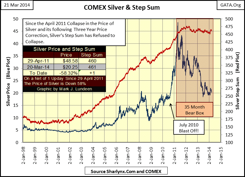
One of two things can happen from here; one is that silver’s step sum finally collapses. With down days finally outnumbering up days, the price of silver should finally see its ultimate low of the correction, which would then allow silver’s price and step sum trends to turn briskly upward as the bull market resumes. The second thing that could happen is what we saw happen in 2002, when more up days than down (rising step sum trend) ultimately took the price of silver along with it. Either way, the current skullduggery now dominating the silver market should end with a remarkable rebound in the price of silver, but exactly when the battle over $20 silver comes to an end is a question I can’t answer.
The true reason that silver and gold prices are * GUARANTEED * to rise in the future is the manipulation of bond yields lower than free market rates, through continual bond purchases by the Federal Reserve. Rising yields are proof of selling pressure and capital flight from fixed income markets. During the 1970s’ precious metals bull market, dollar denominated bond yields were increasing to historic levels, causing wealth to seek safety in gold and silver.
This has yet to happen in our current bull market. Since the old monetary metals’ price began rising in 2001, the yield for this 30 year bond issued in August 1997 (Red Plot below) seems only to have gone down. However, with the national debt now 224% greater than it was when this bond was issued, it’s easy to understand why gold and silver are in a bull market. The real question is how could the US Treasury market be enjoying a bull market along with gold and silver ever since 2001? That one’s easy to answer: Alan Greenspan and Doctor Bernanke have interfered in the Treasury market any time that Treasury yields increased above their “policy parameters” and purchased Washington’s IOUs at prices no informed investor using their own money ever would.
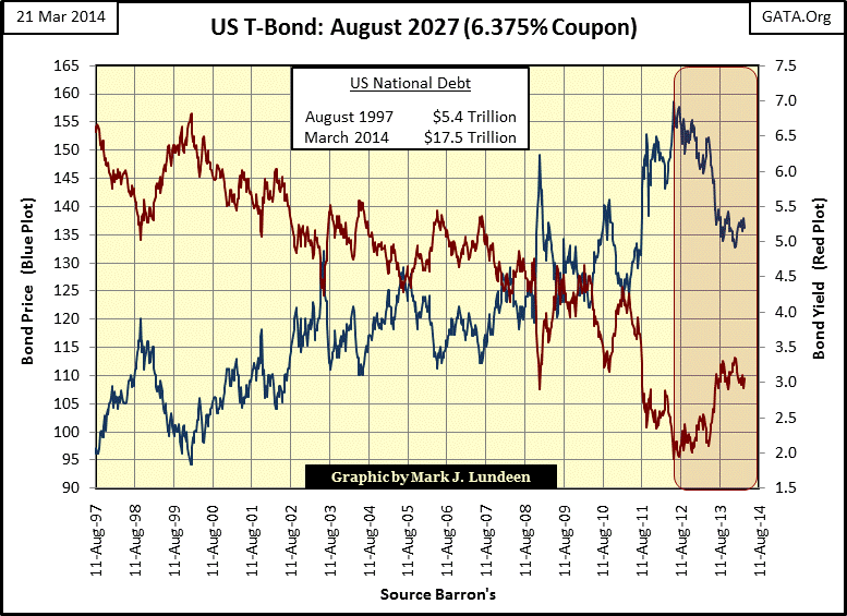
Be that as it may, we should note that this bond’s yield bottomed in June 2012. For the better part of the past two years Treasury bond prices have been declining and yields rising, even as the Federal Reserve continues mindlessly purchases Treasury bonds by the tens of billions of dollars each month (quantitative easing). How could this be possible? Simple, the true market demand for Treasury bonds is falling in excess of what the Fed is willing to support with QE. Though you’ll never hear this in the media, I believe that July 2012 marked the beginning of the coming horrendous bear market in fixed income.
There are other obvious cracks growing in fixed income as well, as seen below with TAX FREE muni bonds currently yielding more than TAXABLE Barron’s Best Grade Bonds. This has only happened twice before; once during the depressing 1930s and once in the early 1980s when Fed Chairman Paul Volcker allowed bond yields and interest rates be set by market forces.
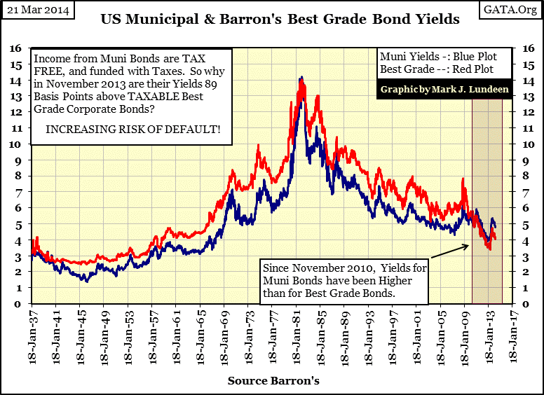
But today’s yield inversion is a different beast than seen in the Great Depression, and Paul Volcker’s inversion in the early 1980’s, as the chart below makes clear the current yield inversion has become a chronic market condition. Previously, seeing muni bonds yield more than best grade corporate bonds was a short lived phenomenon, lasting only weeks or months but never for an entire year. The current yield inversion has lasted for three and a half years with no end in sight; in fact since January 2013 the inversion has widened. This is unprecedented.
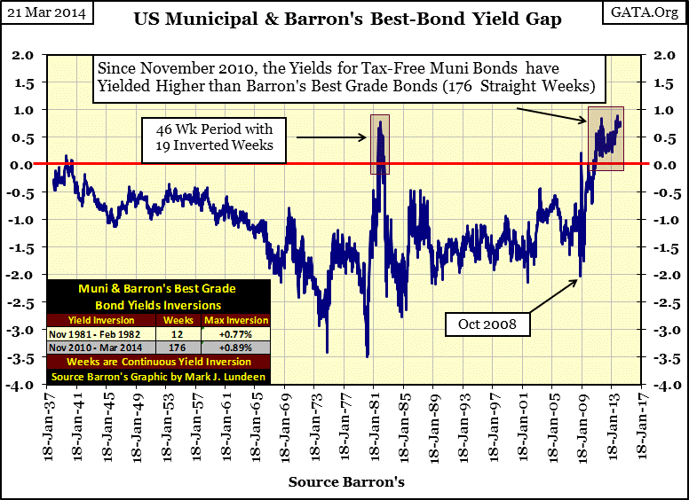
What’s causing tax free muni bonds to yield more than taxable corporate bonds is a general fear that local government bonds will default in all fifty states. We can lay the blame for this on Alan Greenspan and Doctor Bernanke’s subsidized interest rate policy and Wall Street’s derivative salesmen in the muni-bond market. Natural market forces would have set interest rates higher than those set by these central planners. Without the Fed’s interference, the muni-bond market’s unsubsidized yields would have prevented most cities and counties from taking on excess debt to expand employee benefits and build bridges to nowhere.
Muni bonds are a multi-trillion dollar market where the obligations of deeply indebted local governments trade. This unprecedented prolonged inversion is the market’s way of recognizing that local government’s employee benefits and pension plans will at some point overwhelm city hall’s ability to service their bonds with declining tax revenues; think Detroit on a national scale. The smart money has been exiting muni-bonds since November 2010 when this yield inversion began. There is no panic (yet) in the multi-trillion dollar muni bond market, but as I read this chart, one is coming and that can only be positive for assets with no counterparty risk such as precious metals.
Here are the yields Barron’s uses for its proprietary Confidence Index (CI). Their intermediate grade bonds are considered investment grade, issued by solid companies with less than sterling balance sheets. During good times these companies can easily service their debts, but maybe not should the economy turn against them. That’s what happened in the late 1930s. By 1940, with the United States turning its economy into a war machine, the depression was over for companies with less than rock solid balance sheets, but the bond market didn’t get the news until after 1945. Until then one could have been earning twice as much income from intermediate grade than from best grade bonds with little risk of default.
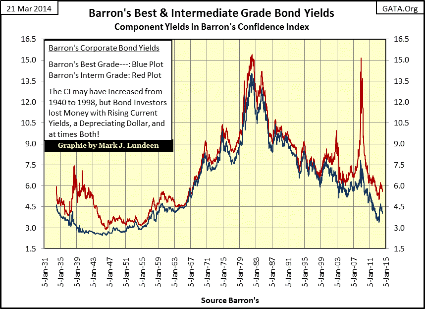
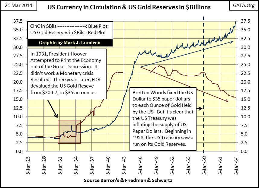
This chart above also shows the rise in bond yields (decline in bond prices) during the post WW2 Bretton Woods Monetary Accords era (1945-1971). In this international monetary agreement Washington agreed not to print more than $35 paper dollars for each ounce of gold held by the US Treasury, a gold standard similar to what we see in the chart below from 1925 to 1931; no more paper dollars than the US Treasury had gold to redeem. By 1958, paper money inflation began a run on the US Treasury’s gold reserves and eventually caused the US Treasury to stop minting silver coins in 1964. By 1964, there were about twice as many paper dollars in circulation than the US Treasury had gold to back; today, there are 115 paper dollars for each dollar in US Treasury gold (Washington values its reserve gold at $42.22 an ounce). This expansion in paper currency was made possible as money creation is no longer limited by reserves of silver or gold, but by the debt purchased by the Federal Reserve with fiat dollars created out of thin air.
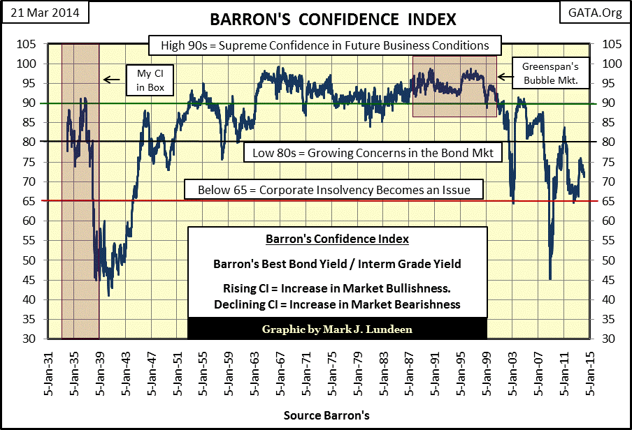
With this illegal increase in paper money has been a corresponding increase in debt for consumers, corporations, local government and the Federal Government; since 1971, more money = more debt by design. After bond yields peaked in 1981 the world began enjoying the ever expanding money supply, as financial asset values seemed only to increase. But after 1999, something changed in the bond market as we can see in Barron’s Confidence Index (CI) below.
The CI is not a timing tool for entering and exiting the bond market. Using it as such has only lost money for bond investors for decades. What the CI provides is an appraisal by the bond market of the future prospects of companies with less than rock solid balance sheets ability to pay back bond holders their principle with interest to term. Whether or not the bond holders received an inflation adjusted return on their bonds is something the CI doesn’t know.
Below we see how the CI responded to the return of hard economic times in the late 1930s; it dropped like a rock for fear of defaults in intermediate - grade bonds. We also see how the CI responded to the horrific bond-bear market of 1947-81; it rose above 85 and stayed there as bond yields soared into double digits. During the 1970s’ gold bull market, bond investors lost 50% their principal to Mr Bear, but the issuers of intermediate grade bonds found it very easy to pay back dollars borrowed in 1970 with depreciated dollars earned in 1980.
I placed a red box on the chart to note when Alan Greenspan was Fed Chairman (1987 to 2006); for a decade the CI never came close to descending to 90, making this an amazing period of market history, a testament of human gullibility in the financial markets. But then in January 1999, for the first time in over decade the CI declined to 90 and it began to change its tune. It’s important to note that since 1999, the declining series of down spikes in the CI have all occurred as the bond market was experiencing a significant bull market. But then Barron’s Confidence Index isn’t a bond market timing tool, but an assessment by the bond market of the future prospects of indebted corporations and their ability to service their debts to term should economic hard times arise. There’s a lot of history in this chart, and since 1999 the CI has increasingly been warning investors that risks in the financial markets are rising. If you take a moment to consider what has happened since the January 2000 top in the high-tech market, the CI hasn’t lied to us.
Currently, the potential for wealth destruction in the financial markets is huge. Let’s take a quick look at the discontinued Dow Jones 10 Utility Bond Average (1938-2002). I priced these bonds with their “as published” values (Blue Plot) as well as my “deflated by CinC” values (Green Plot).
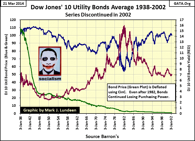
The DJ 10Util Bond Average was valued at 103.30 in January 1938, and in nominal dollars had lost only $2 by 2002 (see table below). But what a dollar could purchase in 1938 was far more than it could in 2002. Next we examine what happened to principal during the 1947 – 1981 bear market in bonds (Blue Plot above); bond owners lost 50% of their nominal investment during a period of double digit price inflation- OUCH!
Now, let’s compare how a million dollars in the DJ 10 Util Bond Average performed to a million dollars with the Dow Jones Industrial Average.
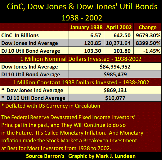
In the table’s upper data section I listed the “as published” values for the Dow Jones stock and bond averages with CinC, also as published in Barron’s. The increase in CinC was greater than the appreciation of the Dow Jones, but the DJ 10 Util Bond Average actually lost 1.45% over this 64 year period in nominal dollar terms. The next section shows what a million dollars invested in 1938 would have returned in 2002. The Dow Jones increased by a factor of 85 while bonds failed to break even. The final section shows the inflation adjusted returns of these Dow Jones Averages in constant 1938 dollars. Both lost money after inflation, but the Dow Jones 10 Utility Bond Average turned a million 1938 dollars into only $10,000 2002 dollars when corrected for inflation. Even though the nominal value was virtually the same, it had lost 99% of its purchasing power. I believe it. In 1938, with a million dollars, one could afford to live in any exclusive neighborhood in the United States with lots of money left over for fancy cars, first class travel and all sorts of luxuries. By 2002 it took a million dollars just to purchase a McMansion, with not much left for furniture because of what politicians, bankers and academics had done to the once “almighty dollar.”
For the past decade the bond market has been sending signals to investors that a day of reckoning is at hand. In our debt saturated world, counterparty risks grow daily and will one day overwhelm the makers of “monetary policy” and their dollar. Aside from the old monetary metals current difficulties, when the stuff eventually hits the fan you’ll be glad you purchased them.
More from Silver Phoenix 500


