Dow, ASX, BSE, DAX And FTSE…World Markets Are Topping


In this analysis, we will examine both the small picture and big picture using the daily and monthly charts.
Dow
What a difference a week makes! In my last report I thought that the Dow would correct before embarking on one final surge higher. Instead, price made a marginal new high before heading down and threatening to break down but managing to climb back into the end of the week. When things don’t play out as expected, I always head back to the charts to reanalyse. Let’s see what this new analysis suggests beginning with the daily chart.
DOW DAILY CHART
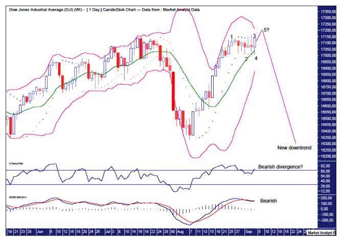
We can see there has been no real correction. I have added a Parabolic Stop and Reverse (PSAR) indicator which shows the dots being busted in quick succession. This is common at turning points as price makes up its mind which direction it will take.
In this case, it looks like a 5 point broadening top may be playing out. Price went into its first top (1) at 17153 before dropping to a low (2) and then heading back up to a new high (3) at 17161. Price has then dropped again before heading back up for potentially another marginal new high denoted by 5?.
The Bollinger Bands show price moving away from the upper band and bouncing off the middle band. Perhaps this next high will hit the upper band one last time before plunging.
The Relative Strength Indicator (RSI) shows that this next high may be accompanied by a bearish divergence. That would be nice.
The Moving Average Convergence Divergence (MACD) indicator is currently in bearish mode with the red line now above the blue line.
I’d like to see this next marginal top get up close to 17200 as that would be sufficient to bust all the stops that have been sitting above the July high level of 17151. Let’s see.
DOW MONTHLY CHART
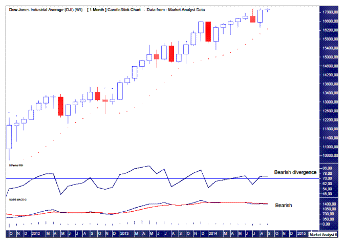
The RSI is now showing four bearish divergences. On the monthly chart. Puhhlleeease!!!
The MACD is also bearish with the red line above the blue line. The big move up in August was not enough to alter this.
I believe a big move will be seen this month of September. Last week I thought it would be up but with the action of this past week I am switching back to the bearish scenario. I intend to enter into short positions on a marginal new high.
Also, a big move down would most likely be a big bearish outside reversal that busts the dots of the PSAR to the downside. That would then most likely lead to an even bigger bearish candle for the month of October. We’ll know soon enough.
ASX200
The Australian stock market has actually been tracking exactly as laid out in my previous report. We had a drop down and then move up for a second marginal high. Since then price has moved down.
ASX200 DAILY CHART
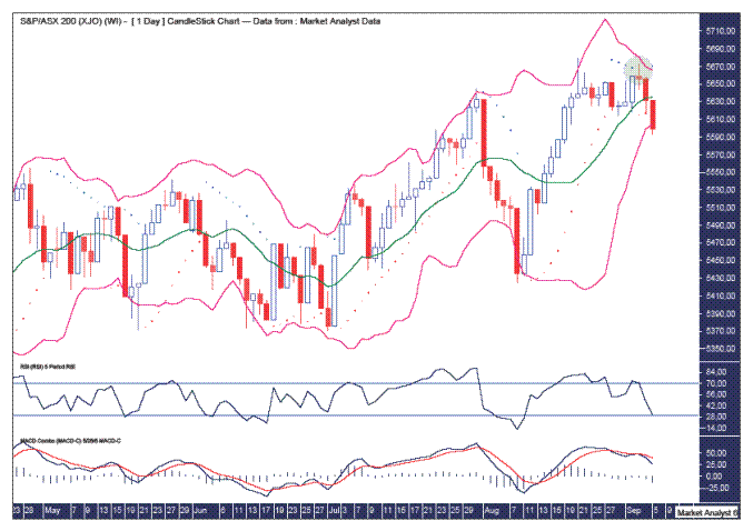
The Bollinger Bands show price moving away from the upper band and bouncing off the middle band for one last kiss goodbye to the upper band. It was actually an air kiss as price just missed the upper band. Price is now down to the lower band and while a little rally back to the middle band may take place early next week, price should then head back down and hug the lower band.
The PSAR support looks to have been broken firmly with the dots to the downside being taken out. The green highlighted circle shows what a fake out looks like. The dots to the upside were broken before it immediately reversed and subsequently took out the dots to the downside.
The RSI shows this second marginal high being accompanied by a lower RSI reading. A bearish divergence. It is now in weak territory and not looking healthy.
The MACD is also trending down. The fake out brought the averages back together but not enough to change the bearish outlook.
ASX200 MONTHLY CHART
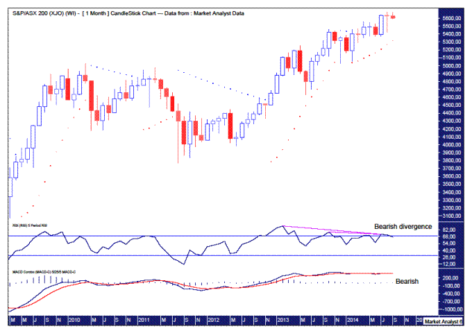
The RSI shows a triple bearish divergence. A move up to new highs would nullify that while a move to new monthly lows would confirm it. I favour the latter.
The MACD shows the averages toing and froing at a high level for over a year now. Last month saw the averages cross over marginally again. The red line is just above the blue line so bias has to be given to lower prices. A big move down in September would show this bearish outlook confirmed in vivid detail.
The month of August was actually a marginally negative month. A red doji. Might be sayonara to these high prices now!
A big month down this month may also see PSAR support busted. Those dots currently stand at 5321.
BSE SENSEX
The BSE has also been tracking pretty much as expected. It wouldn’t have surprised to see it top out a touch earlier but the pattern of trading is still consistent with topping formations.
BSE DAILY CHART
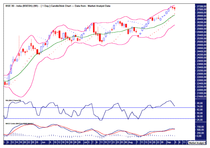
The RSI topped recently at an extremely overbought reading of 94. It’s rare to get readings that high. Not out of the ordinary though when price is tracing out a big final thrust higher to fully exhaust the buyers.
The MACD is still bullish but the averages appear to be coming together and a bearish crossover is certainly threatening.
The Bollinger Bands show price recently moving away from the upper band. There may be one last hurrah early next week that has a crack at touching the upper band one final time. Let’s see.
The dots of the PSAR indicator look to be getting steeper and catching up to price. How long can price keep from being caught by the dots? Not long in my opinion.
BSE MONTHLY CHART
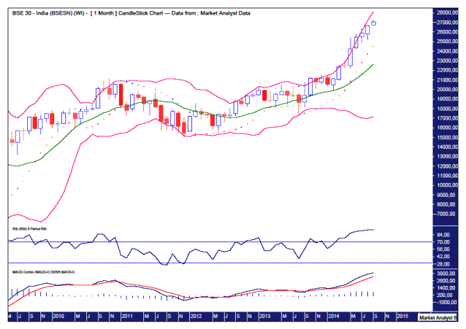
The extremes at which the BSE30 is currently trading demonstrates just how stretched things have become. The RSI is showing a reading of 93.75. And this is the monthly chart, no less! I have data going back to 1994 and this is only the second time since then that the RSI has risen so high!! Umm, yes I think the BSE is going much higher now. NOT!!!
The MACD is yet more proof of how extreme things have become. The averages have diverged wildly. Time for some regression to the mean I reckon.
The Bollinger Bands show price has just started to move away from the upper band this month. It’s a big drop back to the middle band. That’s where it’s headed in my opinion. And then eventually on to the lower band. Time will tell.
The PSAR dots are getting very steep. The end is nigh when that happens.
DAX
The DAX looks to have already topped out back in June. In my last report, I outlined my view that this was a bear market rally. I still think it is but it has rallied more strongly than I expected. Let’s take a look.
DAX DAILY CHART
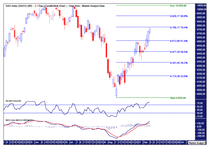
I have added Fibonacci retracement levels which show the rally has now rallied back to the 76.4% level. I should have picked this as I often favour the first bear rally in a bear market making a deep retracement. Price may well turn down here. I have added the 88.6% level as another possibility.
Both the RSI and MACD are trending up and nearing extreme territory. There may be a touch more upside going by these indicators but things are already starting to look stretched.
DAX MONTHLY CHART
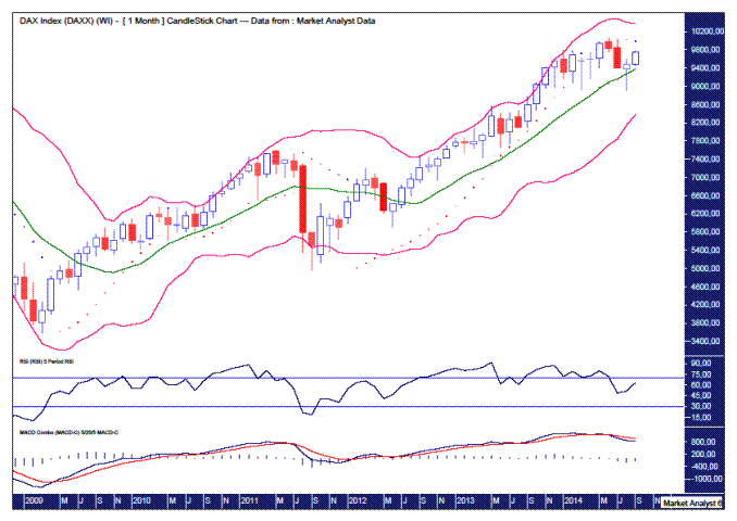
The RSI showed a triple bearish divergence at the June 2014 top. Nice.
The MACD confirmed the bearish crossover in July and nothing has happened since to alter that.
The Bollinger Bands show price moving away from the upper band at the start of 2014. It is now hanging around the middle band. It would not surprise one iota to see it start to head directly to the lower band. But that’s just me speculating!
Interestingly, the PSAR shows the dots to the upside which should be resistance. Those dots currently stand at 9994. That is only 2.5% away but I doubt price will get that high. Looks just about time for the DAX to drop.
FTSE
Finally! In my first report on the FTSE back in June, I stated I thought price would make a marginal new high between 6895 and the 1999 high of 6950. It just hit 6904. But since then this market bamboozled me so I can’t really claim it. Can I? I won’t!
FTSE DAILY CHART
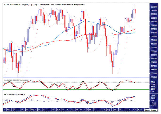
We can see the move down failed to take out the previous major swing low denoted by the horizontal line. This was a big clue that price was headed to a new high. Easy in hindsight, isn’t it?!!
Price looks to have topped out a couple of days ago. The move down was enough to take out the PSAR support. The dots are now on the upside and represent resistance.
I have added the 50 period (blue line) and 100 period (red line) moving averages. The 100ma is now above the 50ma which is bearish. A big move south will be no surprise here.
The RSI is now trending down after a bearish crossover in the last week of August. This thrust higher has not altered that. The final thrust?
The MACD looks to be threatening a bearish crossover. Perhaps that will be confirmed next week. Let’s see.
FTSE MONTHLY CHART
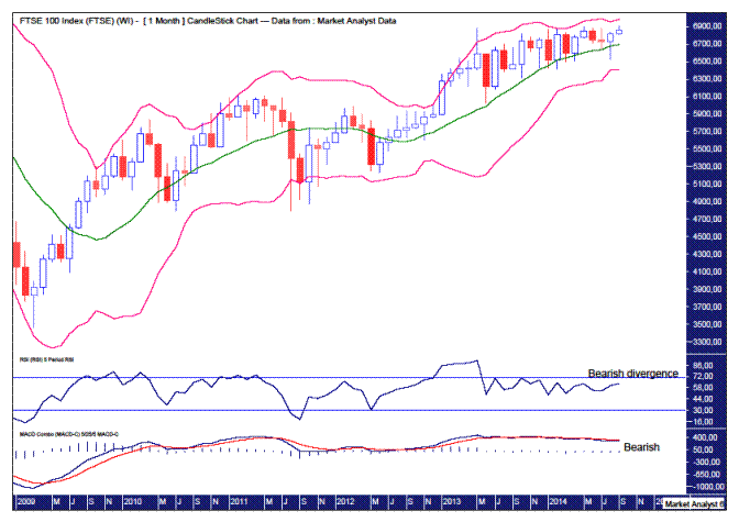
The RSI has been tracking sideways for over a year now with the last couple of highs showing marginal bearish divergences. This looks set to show a hefty drop.
The MACD shows the red line above the blue line suggesting lower prices are likely going forward.
And the Bollinger Bands show price has moved away from the upper band, not by much though. It seems more attracted to the middle band. Perhaps it’s time to give the lower band a shot!
That wraps it up. The direction price goes at the start of the month can often be a fake out. A dummy in rugby parlance. World markets seem to be showing strength at the start of September. Perhaps it’s just a bluff. Let’s see what cards are being held come the end of the month.
********
Please register your interest in my website coming soon. Any questions or suggestions, please contact austingalt@hotmail.com
© 2014 Copyright Austin Galt - All Rights Reserved
Disclaimer: The above is a matter of opinion provided for general information purposes only and is not intended as investment advice. Information and analysis above are derived from sources and utilising methods believed to be reliable, but we cannot accept responsibility for any losses you may incur as a result of this analysis. Individuals should consult with their personal financial advisors.
More from Silver Phoenix 500