Gold, Silver And The Dow Jones Industrials Their Progress From The Lows Of The Credit Crisis


Let's take a look at gold, silver and the Dow Jones from their lows of the Credit Crisis, starting with the Bear's Eye View and price charts for silver.
Silver
Of the three, silver is the star performer, gaining 244% from its October low of 2008. Not shown in the silver chart below is the 57% crash from its high of $20.69 on 05 March 2008, to its bottom of $8.69 on 28 Oct 2008. What happened there? Well, I don't believe I'm compromising national security by revealing that our financial markets are a sea of stagnant "liquidity." This being the case, the steady rise of gold and silver prices from 2001 to March 2008 might have confused some people to the point where they might no longer see the US dollar as the "World's Safest Asset" in the months leading up to the October 2008 credit crisis.
So, the "policy makers" crashed the precious metal bulls' party to prevent rising gold and silver prices from becoming a vote of no-confidence on the world's reserve currency, just before Doctor Bernanke more than doubled the size of the Fed's balance sheet by purchasing $1.37 trillion dollars worth of Wall Street's toxic mortgage sludge during a 14 week period (Sept - Dec 2008).
Then there was that situation where some of the Fed's "un-named, favored financial institutions", found themselves on the wrong side of the trade in the precious metals market, getting squeezed by rising gold and silver prices, just as they are now. In any case, starting in March 2008, as the credit markets began their relentless slide toward a crisis on a scale not seen since the Great Depression, Wall Street still had enough ammunition left to torpedo silver three years ago.
If you want to know why silver, even at $30 an ounce is still a once in a lifetime opportunity, the lowest risk, highest profit potential investment you will ever make, do yourself a favor and take 30 minutes of your time to listen to the interviews above.
But let's move on to my silver price chart.
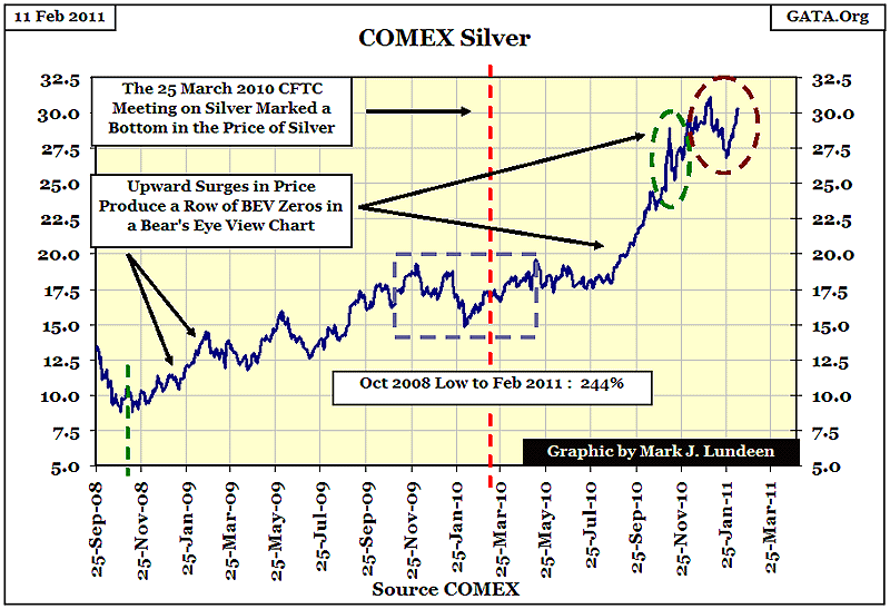
You'll notice I placed a dashed square and two dashed ovals in the chart, as well as some arrows marking places where silver had made new post 1981 highs. These objects were inserted in the chart to help locate the corresponding areas in the Bear's Eye View chart below. Note the different start dates in the two charts. In the silver * price * chart above I wanted to include the decline to the 2008 low in the price of silver so I pushed the series start date back 20 trading days. The green dashed vertical line in the chart above shows the point where I began my BEV series, using the absolute daily low of 2008 as the starting point in the BEV chart below.

When comparing these two charts of silver (both charts are based on the same data), it's obvious that a BEV chart treats all increases in the price of silver, * Above a Previous All-Time High * the same: they are all equal to ZERO. But it's obvious from silver's price chart how these new highs in the box and ovals are very different. However, the Bear's Eye View of the silver market shows the world as Mr Bear sees it, and Mr Bear doesn't care how high the bulls take silver up, only how far he can take silver down. It is from this perspective we should understand a BEV chart.
It's interesting that * before * the 25 March 2010 CFTC hearing on manipulation in the silver market, Mr Bear forced silver into a series of increasingly steep +15% corrections. But note that after the CFTC hearings these deep declines ceased, and the price of silver began an impressive advance (see silver's price chart). The two ovals mark the two most recent attempts by Mr Bear to take the silver market down. The green oval marks a sharp six trading day, 13% decline in November. It took just 12 trading days for silver to recoup this loss and move on to ever higher prices (see price chart). The second Bear raid (red oval), started in early January, and took 15 trading days to shave 14% off the price of silver. Silver has rebounded strongly after its January 28th low and only ten trading sessions later is close to reaching a new post 1981 high (BEV Zero).
It's significant that twice in the past few months, Mr Bear could not take the price of silver below the BEV -15% line. Something has changed in the silver market since March 2010. All things considered, we should assume the bulls are still in control of the price of silver. I expect we'll soon be seeing new BEV Zeros appear in silver's BEV plot, as silver surges to impressive new highs.
Gold
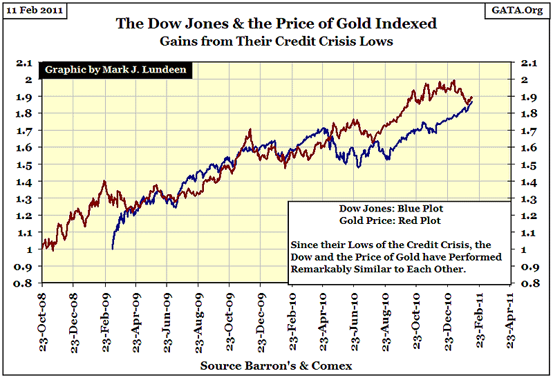
All my charts for silver, gold and the DJIA were prepared Wednesday, Feb 9th, so things may change a bit by my publishing date of Feb 11th. But as of Wednesday night, gold and the Dow are about even in their post credit-crash advances. The Dow has advanced 87%, to gold's 89%. But the Dow gained its 87% in 23 months, while gold took 29 months to advance its 89%.
But despite the similarity in the Dow's and Gold's progress, there is a HUGE DIFFERENCE in the coverage given by the financial media to these two markets. For the last 2 years, the financial media has offered the public "expert commentary" spouting the party line that the Dow is in a bull market, while gold is overbought or in a bubble likely to pop at any moment. They can't pronounce an end to the 2001-11 precious-metals bull market as they never acknowledged it in the first place. But the plots for gold and the Dow speak for themselves and what the NUMBERS show is that since their credit crisis bottoms, there has been little difference in their performance from one to the other.
But this hasn't been a fair footrace, as the stock market is being supported by the "policy makers", while gold has had to frog-march backward uphill. Don't think so? Well, then what should we make of Doctor Bernanke's comment below?
"Policies have contributed to a stronger stock market just as they did in March 2009, when we did the last iteration of this. The S&P 500 is up 20% plus and the Russell 2000, which is about small cap stocks, is up 30% plus."
- Doctor Benjamin Bernanke, CNBC Interview with Steve Liesman 13 Jan 2011 (1:40 PM).
Call me a market "conspiracy theorist" for believing the stock market is actively managed upwards by the US Government, but what you would call Doctor Bernanke who freely admits he's manipulating the stock market? And what should we call those market "experts" who will continue to deny official sector involvement in the financial markets, even after Doctor Bernanke admitted on TV that his $600 billion, second sortie into "quantitative easing" was targeted at lowering long-term interest rates? Is there any doubt that he clearly takes personal satisfaction that his post March 2009 "policies" gave the stock market a double-digit goose, and expects his QE2 to do more of the same? It's obvious that market prices today are only "policy" statements, and price discovery is kaput.
Gold has been going up consistently since 2001, but not everyone takes satisfaction in its ten year 458% gain. In 1998 (13 years ago), Doctor Greenspan felt the need to warn everyone that gold would not go up unopposed by "central bankers."
"Central banks stand ready to lease gold in increasing quantities should the price rise."
- Alan Greenspan, Congressional Testimony 24 July 1998
Doctor Greenspan was issuing a warning to the gold bulls not to mess with the "policy makers" and their central bankers. And indeed the central banks did "lease" much of their gold reserves as the price of gold was increasing 458% over the past 10 years. How much gold the West's central banks actually have left is a question that currently the "policy makers" would rather not have asked them. But it can't be MUCH if they are now so desperate as to shake down pension funds for their gold bullion, as we are informed by this Associated Press news story.

Dutch Central Bank: pension fund must sell gold
Feb 10, 2011 3:36 PM CT
By The Associated Press
AMSTERDAM (AP) - A pension fund in the Netherlands says the country's central bank has ordered it to sell its gold holdings because it is overexposed to a fall in the value of the yellow metal.
- End AP Snippet -
The Dutch Central Bank's concern for the glassworkers' union is touching. No doubt the Dutch "policy makers" have also noticed that gold has climbed just as high as the Dow Jones has for the past two years, and don't like it one bit.
Let's take a look at the price chart of gold.
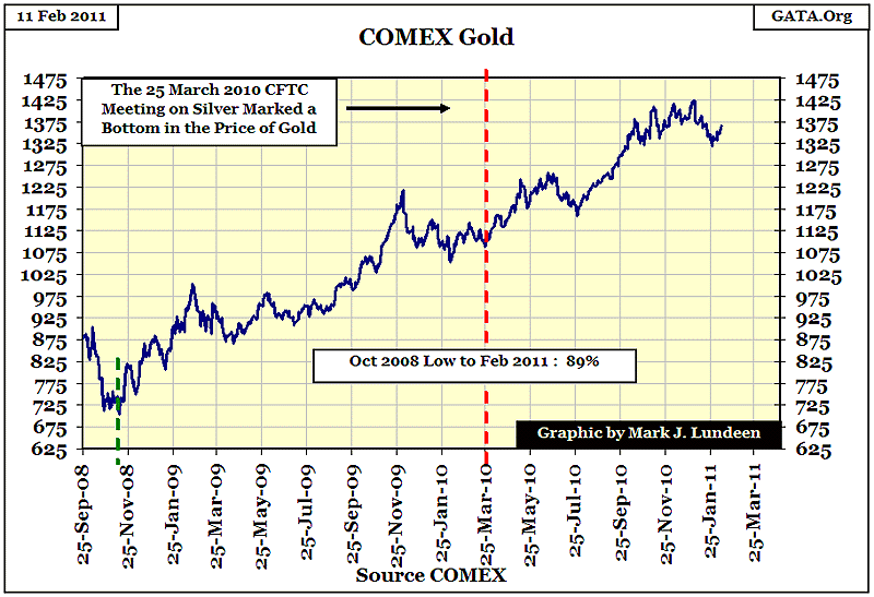
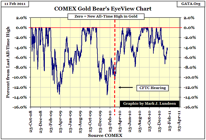
Gold's progress has stalled since last September. It's currently sitting under a little inverted bowl that spans from Sept to January. But all-and-all, this is not such a bad chart. So let's go on to gold's BEV Chart. Again, the Bear's Eye View displays something not so evident in the price chart. Before the CFTC's 25 March 2010 hearing, the corrections in the price of gold took the price of gold down just short of 14%. But I note that since March 2010, after two nice advances in the price of gold, the bulls gave less than 8% of their gains back to Mr Bear each time the market corrected.
Could this be a coincidence? Maybe. But me, and Holland's glassworkers have our own reasons to suspect that something changed in the metals market after the CFTC's March 2010 hearing. In any event, gold's BEV chart clearly shows that gold's latest correction was the smallest since its credit-crisis low two and a half years ago. Gold's BEV plot indicates that the gold bulls are still strong, while Mr Bear is weakening. So, unless the European central banks can find some new gold bullion hidden in some other union's pension fund, I expect to see new BEV Zeros sometime in the not-to-distant future.
The Dow Jones Industrials
Now for the price chart for the DJIA. If I liked the chart for gold, I can't say I hate the Dow's chart. But I do question the wisdom of the "policy makers" ratcheting the Dow up when it clearly should be going down. I think it's fair to assume that left to its own resources, the stock market would be at much lower levels than it is currently, *AND* this is also Doctor Bernanke's opinion as stated in his quote above. " --- in March 2009, when we did the last iteration of this." So, no "Policy", no Double Digit gains in the stock market according to a man who knows.
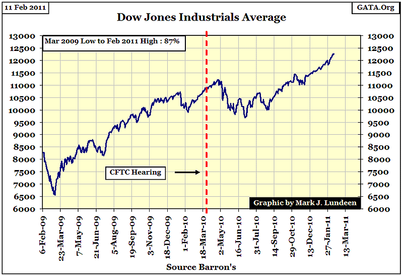
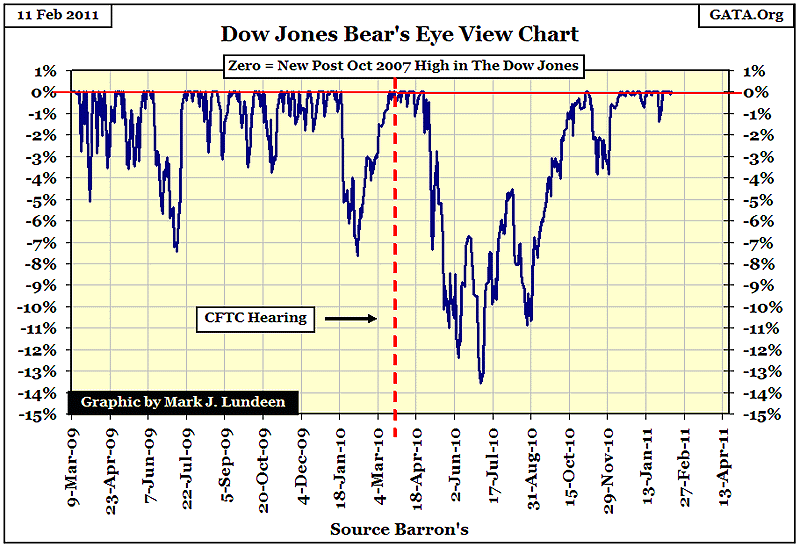
The DJIA's BEV chart is interesting. Gold saw 14% corrections before and 8% corrections after the CFTC's March 25th hearings, while the Dow Jones had 8% corrections before, and a 14% correction after 25 March. This reversal in the pattern of market corrections between gold and the Dow are not the bloody-fingerprints left at the scene of a crime, but are intriguing all the same.
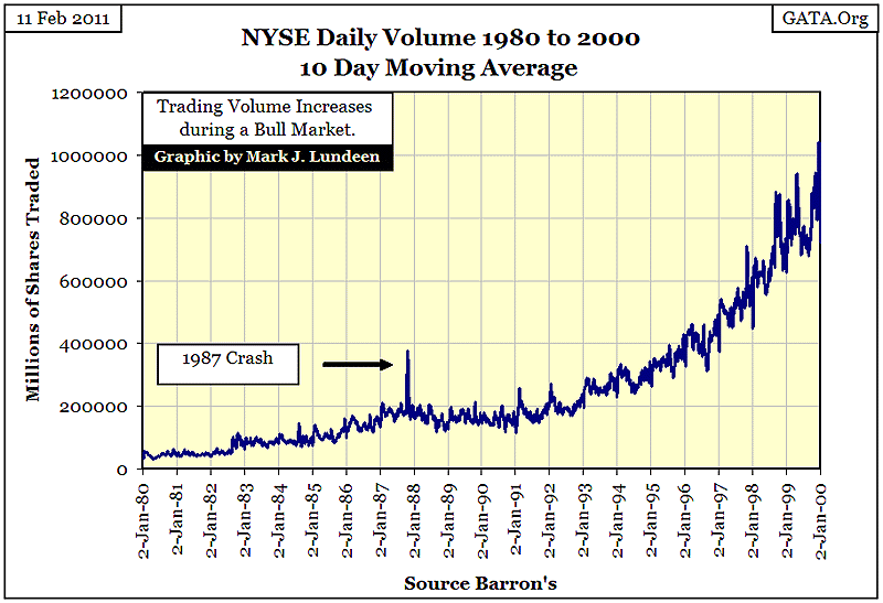
To see Doctor Bernanke's fingerprints on the stock market, let's have a look at the NYSE's trading volume. I didn't want to clutter this chart by including a plot for the Dow, but who today doesn't remember the greatest Dow Jones Bull Market in history ran from August 1982 to January 2000? And just as you'd expect, trading volume increased during this 18 year bull as more and more people entered the casino looking for action.
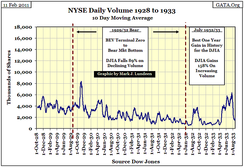
To get some perspective on trading volume, let's take a quick look at the 1929-32 crash, and the best year in Dow history, (July 1932-July 1933). The top in the Dow occurred in August of 1929, and like the Crash of 1987, we saw people fleeing for their lives as volume exploded during the crash months of October & November 1929. But from mid-month November 1929, to the market bottom in July 1932, trading volume just faded away as the public exited the stock market. Note how the Dow's best-year-ever had two surges in volume, corresponding to the two price surges that took the DJIA up 158% in just 12 months.
The charts above are a good example of the 100 year correlation the Dow Jones had with trading volume from 1900 to 2000. But this all changed after Doctor Greenspan's high-tech bubble popped in January 2000.
I inserted a BEV plot of the Dow (Red Plot) in the chart to display the radical difference in trading volume patterns since the year 2000.
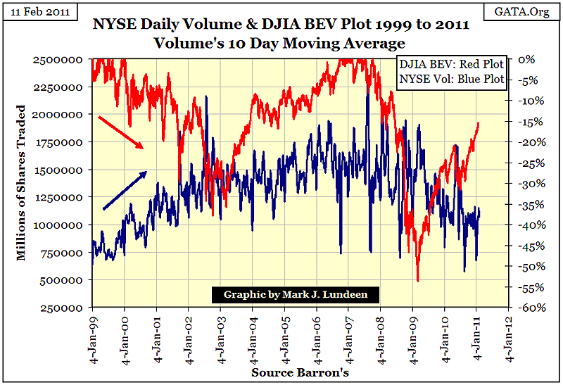
The Dow Jones saw a 38% decline in price from Jan 2000 to Oct 2002, as NYSE trading volume exploded. Who was the big buyer during those two and a half years? This isn't remotely similar to the Oct-Nov 1929 crash (two months), or even the few days of the October 1987 crash. From 2000 to 2002, trading volume INCREASED during the entire decline, AND VOLUME DIDN'T BEGIN TO DECLINE UNTIL AFTER THE DOW TOOK OFF AGAIN! During the entire period from 1900 to 2000, the stock market hadn't seen anything like this! But since 2000, the historically weird has become the everyday normal where trading volume is concerned. Just look at what happened to the Dow during the credit-crisis crash. This was the #2 Bear Market bottom since 1885, but once again volume didn't contract until * After * the March 2009 bottom. Seeing this violation of historical trading patterns happen ONCE might be considered a fluke, but not twice in one decade.
It's not like it wasn't obvious to everyone who the big mystery buyers were. Heck, during the October 2008 televised Congressional Investigation on the credit crisis, many members of Congress outright told Doctor Bernanke and Treasury Secretary Paulson to get out there and "STABILIZE" the damn stock market! How is that done? By overwhelming purchases of stocks by the PPT, at above market prices, financed with monetary inflation. We should all wonder how much of the stock market is currently held by agents of the US Government as a result of Doctor Bernanke's "policies?" It must be huge!
Two years ago I was predicting a decline in the Dow of something over 60% from its highs of October 2007. But a decline of that scope wasn't the "policy", so it didn't happen - yet! This is all going to end in tears for the stock market longs, because the current "bull market" in the stock market is as phony as the money used to support it. You had best move on to something real like gold and silver, before the bottom falls out of this insanely over-inflated stock market.
More from Silver Phoenix 500