The Most Important Chart Right Now


The big news in markets last week was the surge in Treasury yields with the US 10-year note yield spiking 17 basis points to its highest weekly closing level since April 2011. For the first time in more than 30 years the 10-year UST yield caught up with its 200-month moving average:
U.S. 10-Year Treasury Yield (Monthly)

This move up to reach its falling 200-month moving average is highly significant because bonds have been in a major bull market since the early 1980s. Moreover, there have been mounting signs that this bond bull market has come to an end and that we are now in the early stages of what could prove to be a substantial bond bear market. The double-bottom in 10-year yields circled above would gain extra confirmation in the event of a breakout above ~3.25% on the monthly time frame. The 3.25% yield level is significant not only because it represents the 200-month moving average (technically at 3.22%), but also because this level represents important support/resistance dating back to 2003.
Rising bond yields are also beginning to upset the equity bull market as evidenced by last week's 3.8% decline in the Russell 2000 and a ~2% drop from Wednesday's high in the S&P 500. It's still early days in any potential equity market correction, however, there are growing signs that U.S. equities could be in for a much larger decline if bond yields continue to rise.
The following ratio chart of the US 10-year note yield divided by the S&P 500 shows a potential head & shoulders bottom pattern on the weekly time frame:
U.S. 10-Year Note Yield/S&P 500 (Weekly - Log Scale)
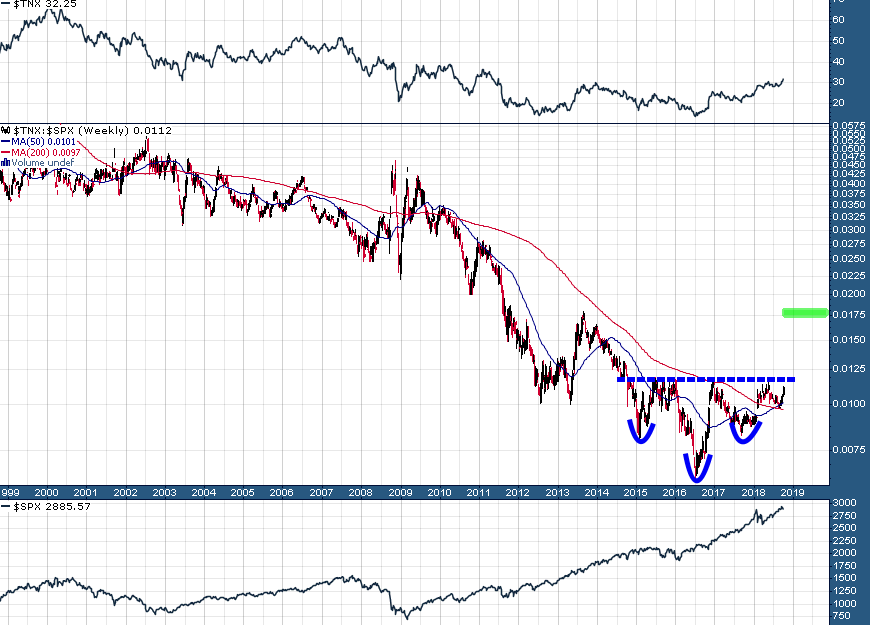
This is a very nicely constructed bottoming pattern which if triggered (breakout above neckline near .012) would target a 50% rise in this ratio; a .018 ratio in the 10-year UST yield/S&P 500 would roughly equate to a 4.25% yield in the 10-year and a 2400 level in the S&P 500 (~17% correction from current levels). It's also worth noting that this ratio recently experienced a "golden cross" and the last time this ratio experienced a 50/200 weekly moving average crossover was a "death cross" in 2010 which proved to be a powerful signal to buy bonds (betting on lower yields) and buy equities.
Will this turn out to be a great time to sell both bonds (betting on rising yields) and equities?
Given its far reaching implications it's safe to say that the chart of 10-year UST yields/S&P 500 is the most important chart right now.
DISCLAIMER: The work included in this article is based on current events, technical charts, and the author’s opinions. It may contain errors, and you shouldn’t make any investment decision based solely on what you read here. This publication contains forward-looking statements, including but not limited to comments regarding predictions and projections. Forward-looking statements address future events and conditions and therefore involve inherent risks and uncertainties. Actual results may differ materially from those currently anticipated in such statements. The views expressed in this publication and on the EnergyandGold website do not necessarily reflect the views of Energy and Gold Publishing LTD, publisher of EnergyandGold.com. This publication is provided for informational and entertainment purposes only and is not a recommendation to buy or sell any security. Always thoroughly do your own due diligence and talk to a licensed investment adviser prior to making any investment decisions. Junior resource companies can easily lose 100% of their value so read company profiles on www.SEDAR.com for important risk disclosures. It’s your money and your responsibility.
More from Silver Phoenix 500


