Shocking Increase In U.S. Money Supply In Past 2 Weeks


The increase in the U.S. money supply in the past two weeks is absolutely shocking. Something must be seriously wrong behind the scenes at the U.S. Treasury and Federal Reserve for the M1 Money Supply to increase more in the past two weeks than it did in six weeks during the beginning of the pandemic shutdowns in late March.
I wrote about this in my last subscriber video, INVESTOR WARNING: Markets Just Propped Up By Half-Trillion In Liquidity, Brace For Major Correction Ahead. In just one week, the M1 Money Supply surged by $498 billion. While that was stunning, I was quite shocked to see another huge increase in the past week.
The FRED – St. Louis Federal Reserve just updated their M1 Money Supply figures showing another increase of $312 billion, on top of the $498 billion added the week prior. So, the total increase in the U.S. M1 Money Supply for Nov 16th to Nov 30th is a shocking $809 billion. Compare that to the $388 billion increase from Mar 16th to Mar 30th when the pandemic shutdowns first began.
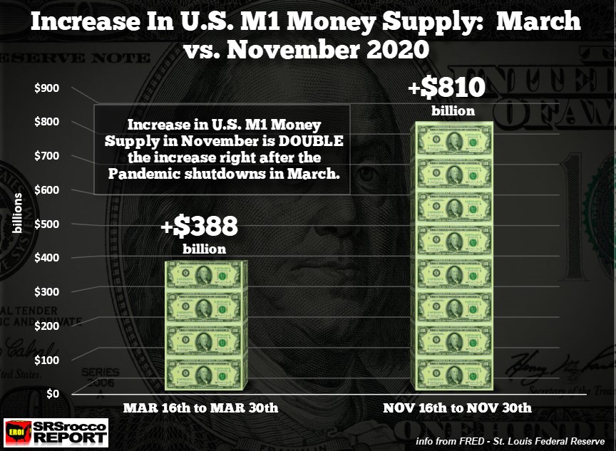
Do you know how much $810 billion equals? That turns out to be four years of global gold mine supply totaling 440 million or 40 years of global silver mine supply of 32 billion oz. This is beyond stunning to see this much of an increase without any news release by the U.S. Treasury or Federal Reserve.
Of course, it made sense to see the M1 Money Supply to increase after the pandemic shutdowns and stock market meltdown… BUT WHY NOW??? Take a look at the following chart from the St. Louis Fed (FRED).
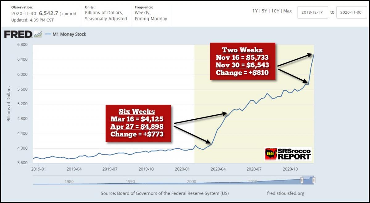
From March 16th to April 27th, the U.S. M1 Money Supply increased $773 billion… six weeks. Why on earth has the M1 Money Supply increased $810 billion… in TWO WEEKS!!!
Again, something very serious must be going on that we don’t know about because this is certainly unprecedented. I thought just maybe this was some sort of accounting mistake. But, when I went to the Board of Governors of the Federal Reserve Money Stock Release Dec 1oth, I found the following chart:
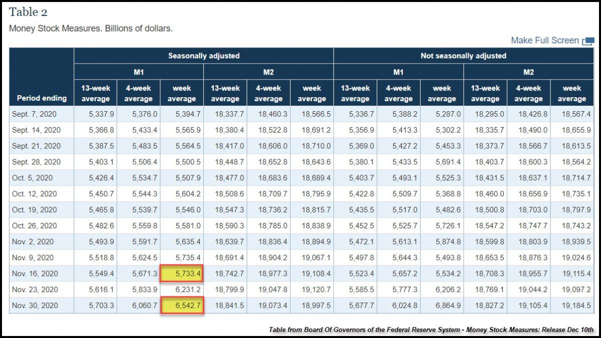
And there they are, highlighted in YELLOW. What’s interesting is that the M2 Money Supply figures actually declined a bit during the same period.
The next chart is the Long-Term M1 Money Supply chart since 1980. As you can see, in the past eight months, the M1 Money Supply has gone STRAIGHT UP.
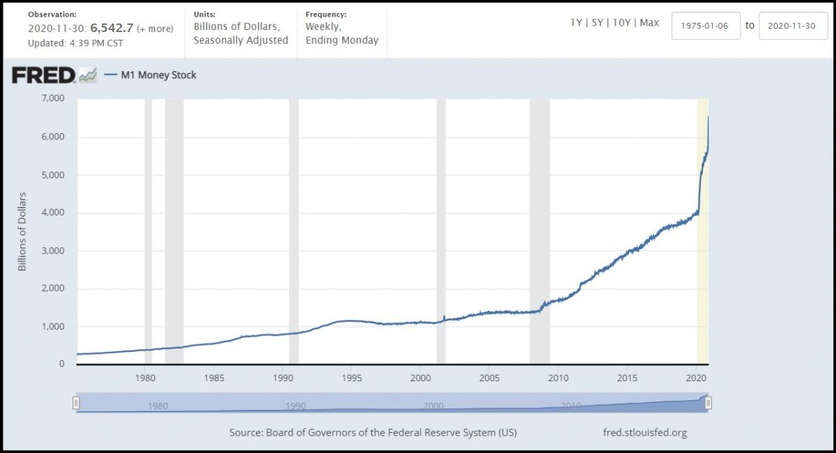
Actually, it has gone more STRAIGHT UP in the past two weeks than it did during March-April this year. To see the M1 Money Supply increase this quickly, again, something must be seriously wrong… which we will likely find out sooner or later.
*********
More from Silver Phoenix 500