Silver’s Price Roadmap


History tends to repeat itself - and the more similarities to a past pattern we have, the bigger likelihood that it will continue to repeat. The day-to-date price swings of silver may seem erratic. However, from a broader point of view, they are repeating – to a great extent – the same pattern that we saw in the past. The most interesting thing is what followed the previous pattern.
Let’s take a look at the charts (charts courtesy of http://stockcharts.com):
Before discussing the latest developments, let’s quote what we wrote about silver’s projected price path on October 7:
(…) We can now see that comparing the current downswing to the previous medium-term ones does not have bullish implications.
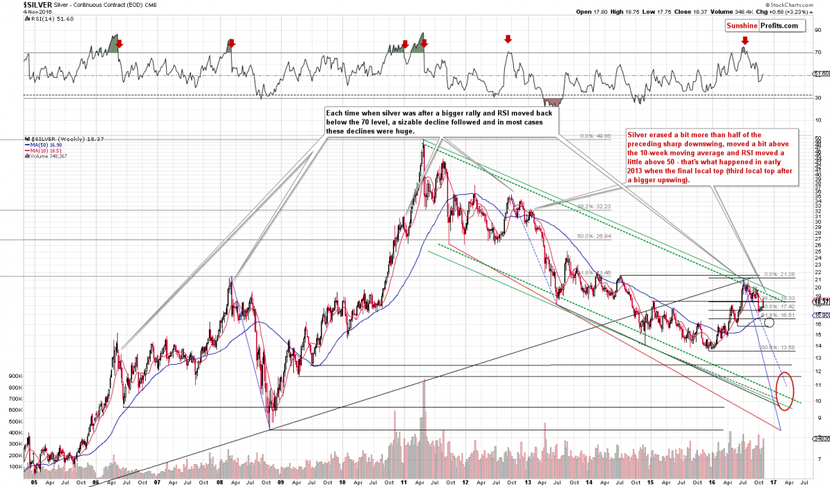
The important thing about this decline is where it started – it started when silver topped with the RSI above 70. That’s not something that happens often and consequently it’s critical to check what tends to happen next once such a situation materializes. Long story short – silver declined after such cases, but the most important thing is that after the $50 top we saw only one similar case – the 2012 top and the 2012 – 2013 decline. Actually, we wrote about the similarity of these declines a few times in the past months. So far the analogy holds.
The late 2012 top and the 2016 top were followed by some sideways trading, then an initial small decline, then a rally close to the previous high. The sharp decline followed in both cases. In the past, silver was only one small (smaller than the previous ones) correction away from the big slide.
When and where did silver bottom in late 2012 before the final small correction? After 14 – 16 weeks (depending on how we define to bottom – weekly closing price or the intra-day price), below the 50-week moving average and with the RSI at about 40 (…).
Right now silver is in the 13th week of the decline, still above the 50-week moving average and the RSI is at 44. Silver appears to be relatively close to the bottom (the majority of the decline seems to be behind us) but may not be at it just yet.
We wrote the above after silver ended the session at $17.34. That was indeed the final bottom in terms of the daily closing prices and the final bottom in the case of intra-day lows formed on the following day.
What happened next? The self-similar pattern was upheld. Silver rallied in both late 2012 (and early 2013) and in the past few weeks. Since the very similar pattern remains in place, what happened next in the past is a likely roadmap for what lies ahead.
Back in early 2013, silver topped after:
- Moving above its 10-week moving average.
- Correcting a bit more than half of the preceding short-term downswing (Back then it corrected 61.8% of the late-2012 decline, and now silver has corrected either 50% of the rally or 61.8%, depending on which moment we use as the starting point of the decline. Using silver’s early-September high as the starting point, we get the 50% retracement, and using silver’s September 30 intra-day high as the starting point, we get the 61.8% retracement).
- The RSI moved a bit above the 50 level.
This time, we have already seen these signals and consequently, silver appears to be ready for the next part of the pattern – a huge decline.
The very characteristic trait of the 2013 decline in silver is that it had very few upswings (and rather insignificant from the long-term point of view) before it was really over – several months later. This could be the case also this time, but doesn’t have to – the self-similar patterns are generally getting less reliable when one is trying to make a more long-term-oriented prediction (the closer the prediction date or the price path to the current moment, the greater the impact of the pattern is likely to be).
As far as gold is concerned, we received a question about the MACD and PMO indicators and their recent buy signals (whether they invalidate the bearish outlook).
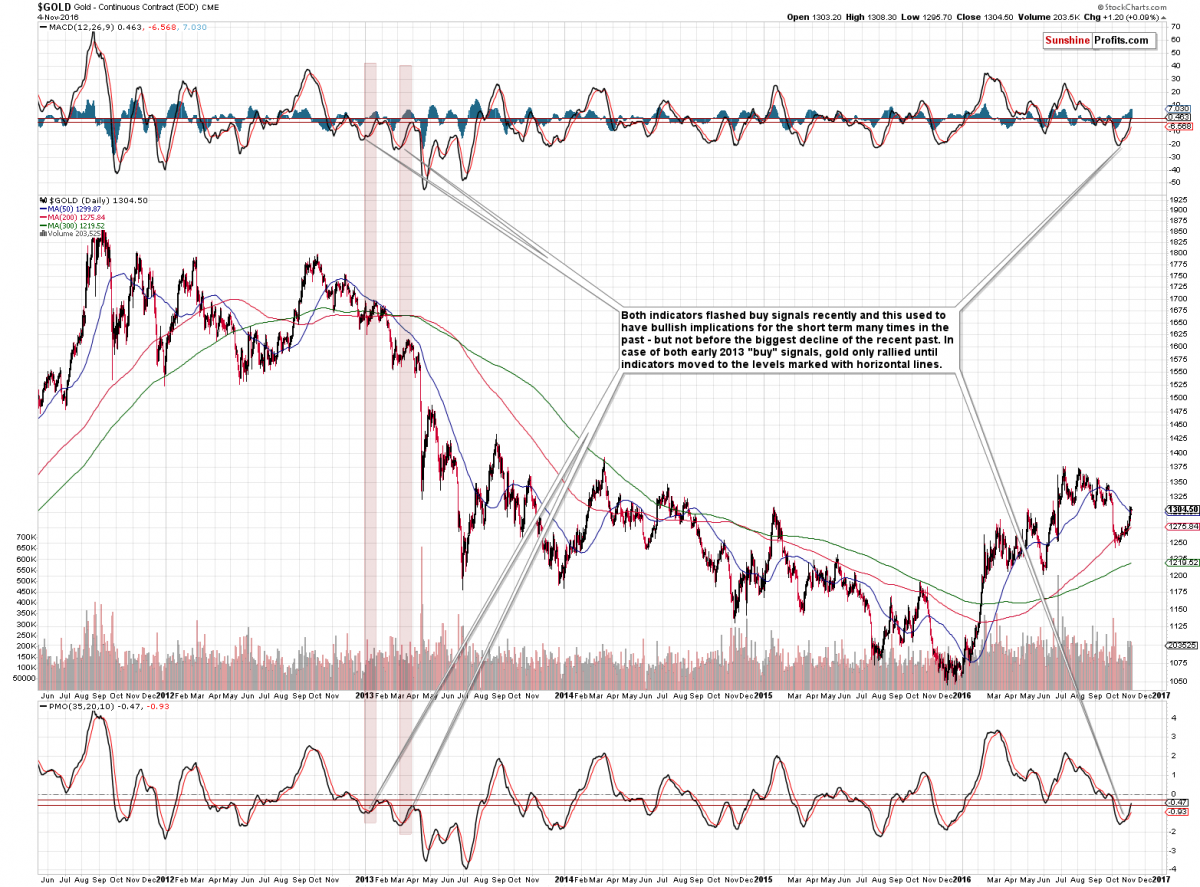
In short, they are both useful short-term indicators, but since the current situation is similar to what happened in early 2013, they may work... as in 2013. Back then the buy signals from the MACD and PMO were followed by short-term rallies in gold and themselves, but these rallies were followed by much bigger declines.
We marked the levels to which both indicators rallied in early 2013 with horizontal lines. The MACD indicator is already at the upper of the lines and the PMO is right in the middle thereof. Consequently, in light to the analogy to 2013, it seems that the top in gold is already in or at hand.
Overall, the implications are very bearish for the coming weeks and months.
Przemyslaw Radomski, CFA
Founder, Editor-in-chief, Gold & Silver Fund Manager
 Przemyslaw Radomski, CFA, is the founder, owner and the main editor of SunshineProfits.com.
More from Silver Phoenix 500