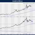
Silver’s Uprising

At the end of December the price of gold bottomed and has moved up smartly while leaving silver behind, to wallow in a sideways pattern before making it’s low at the end of January. This odd behavior caused many investment writers to hedge their recommendations while waiting for a confirmatory breakout, while InvestorKey had been invested in the precious metals since the earlier part of January and now have profits of 20+% waiting to be booked. This common idea of waiting for confirmation by breakout is something that has always bothered me over my 33 years of trading, when reading other analysts recommendations. To me, it appeared that this type of strategy not only increased your risk of protecting your capital and leaving money on the table, but also increased the possibility of the now common “head-fake”, where a price breaks out, then immediately reverses, leaving the investor like a deer caught in the headlights, dazed and unable to react. It also tells me that those making this type of confirmatory breakout recommendation really do not understand the underlying security, nor know its potential in terms of direction or strength, but rather, are simply betting the odds of a pattern breakout.
While silver’s recent behavior perplexed many, we were able to recognize that silver mining equities were going to participate in gold’s rally and also knew that silver would not be far behind. The reason for our confidence lies in a multitude of long-term charts we monitor that have identified one very bullish pattern for precious metals that indicated they finally bottomed last month. Our previous writings have also been consistent in this theme.
This pattern identifies certain dates in history as being key to projecting forward for the next 15 years. The pattern is a large 25+ year head and shoulder bottom, and is also the primary reason we disagreed with so many pundits saying that commodities and precious metals had entered a secular bear market. We have been emphatic in stating that they have been experiencing only a cyclical bear market that has now ended, and the secular bull market in those asset classes that began in 2001 has now resumed.
To demonstrate our thinking for this premise we exhibit three charts going back to 1980 to highlight the dominant long-term pattern at play. First is the Silver/US 30-yr T-Bond ratio chart with an underlying RSI momentum indicator. Focus first on the thick red dotted line, as this represents the neckline of a very large double-head and shoulders pattern (highlighted in green) in this ratio. It is easy to see that this ratio broke above the neckline in 2010 favoring strength in silver verses bonds, then from 2011 corrected back to the neckline in a classic Elliott Wave a-b-c corrective wave pattern. This 2013 bottom also found additional support in the form of a horizontal support level across peaks and troughs and a triangle. Additionally, the price has created a powerful wedge pattern and has a positive momentum RSI divergence as identified by the short blue uptrend line in the indicator panel below the chart.
Silver/US T-Bonds ratio - Monthly

Silver - Monthly

Silver/Gold ratio - Monthly

By laying these charts above each other, it becomes easier to see the multiple confirmations that supports the premise that a solid bottom is now in place and that the secular trend is resuming. The second chart of silver also has a matching head and shoulders bottom and indeed, the correction since 2011 also stopped on it’s neckline in what also looks to be an a-b-c wave pattern.
Finally, in the third chart, the Silver/Gold ratio demonstrates the normal over-valued and under-valued levels of silver verses gold, by the lightly shaded red and green upward sloping trend channel. However, note the solid red horizontal resistance line that also seems to align with the same line in the Silver/T-Bond ratio; this may leave room, once breached, for silver to achieve a very significant over-valued level to gold, as it did in 1980 as highlighted in the Silver/Gold ratio chart. Lastly, this ratio also achieved a positive momentum divergence against the ratio in the underlying rate of change indicator. This indicator also acts as a good confirmatory measure of overbought and oversold using the signal lines at the +-20 level.
While there may be still precious metal bull market doubters out there, readers should not judge investment analysts or writers solely by what they say, but by what they do. InvestorKey’s closed trades are available for all to see and verifiable by our Blog. Not only are they posted in real time, we also send our members timely emails so you can act on our recommendations.
********
InvestorKey


