Silver Price Charts And Other Factors Say Now Is Time To Buy (Part 3)


For Part One, please go HERE. For Part 2, please go HERE.
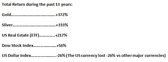
 To really appreciate how silver has demonstrated sterling performance since 2001, one must see the relative performance of other asset classes. Below is a Relative Performance chart (2001-2014) showing the Total Return of Silver vis-à-vis Gold, Dow Stock Index, US Real Estate (an ETF) and the US Dollar Index.
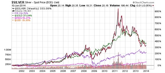
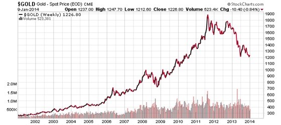
And here are the individual price charts of each of these asset classes:
Gold
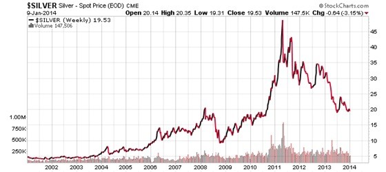
Silver
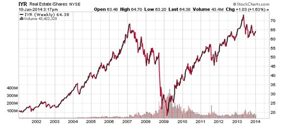
US Real Estate (ETF)
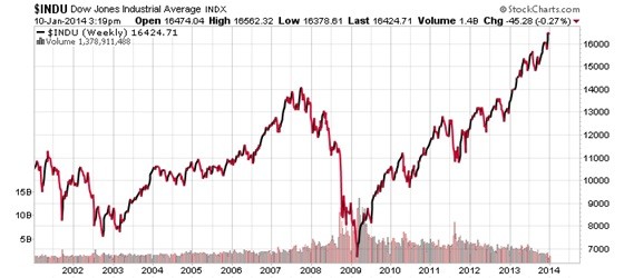
Dow Stock Index
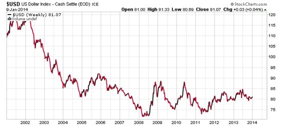
US Dollar Index
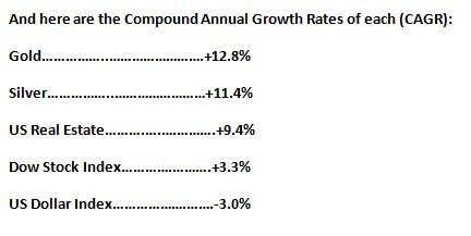
And rest assured the US Dollar will continue to lose -3.0% annually in purchasing power…if not more!!
Like the man on TV is always asking: AND WHERE IS YOUR MONEY?
Hi…Ho SILVER…AWAAAAAAAY!!! http://www.youtube.com/watch?v=YIbYCOiETx0
********
More from Silver Phoenix 500