Silver Price Charts Tell A Sterling Story
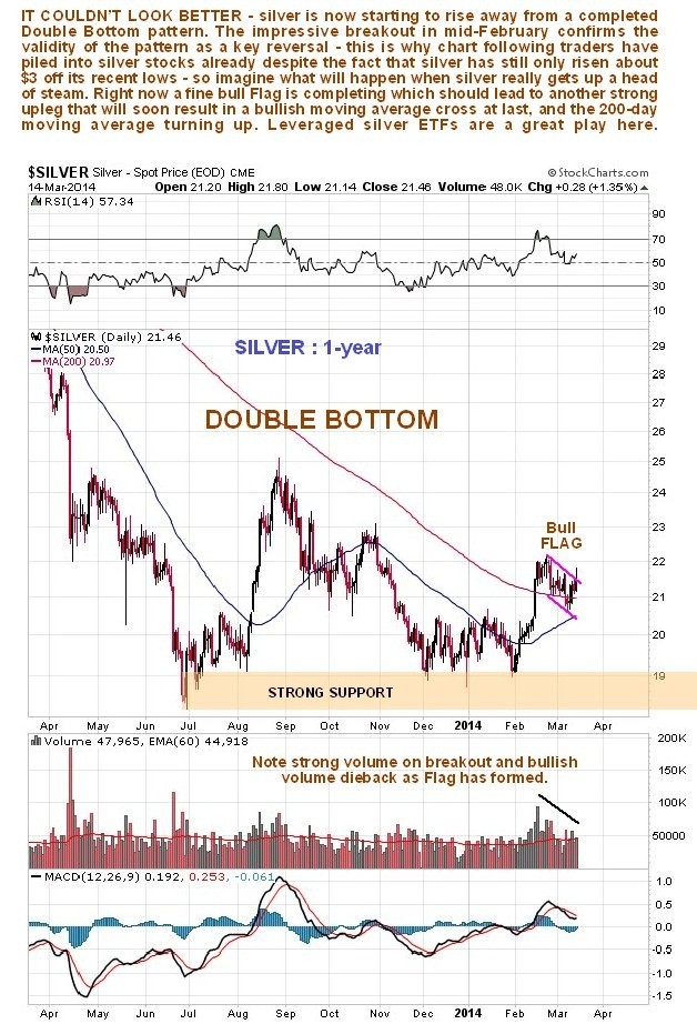
 On silver’s 1-year chart we can see that a fine large Double Bottom is completing. We already had the breakout on good volume from the 2nd trough of this Double Bottom in the middle of February, and it was this event that has (rightly) caused traders to pile into silver, although the price hasn’t moved much – yet. The better silver stocks, on the other hand, are already on fire, because the “writing is on the wall”. Right now the price is consolidating following the breakout in a fine tight Flag formation, from which upside breakout looks imminent.
Silver $21.46
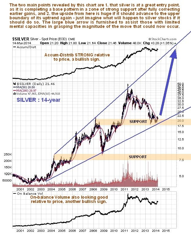
How far is next major uptrend in silver likely to carry? – to figure that out we turn now to the long-term 14-year chart, which shows silver’s entire bullmarket to date. On this chart we see that, despite the severity of the reaction of the past 3 years, silver never broke down from its long-term uptrend, which now looks set to reassert itself with a vengeance after a fine base pattern has formed at a classic juncture, in a zone of strong support just above the support line of the long-term uptrend. Volume indicators are positive, relative to price, and everything is in place for a monster uptrend to begin, with the giant blue arrow drawn on the chart designed to assist those of you with limited powers of imagination in grasping its potential magnitude – little wonder then that silver ETFs and stocks are such compelling investments here – their performance soon could put many tech stocks in the shade.
Speculating about the possible reasons for such a big uptrend is a complete waste of time – maybe John Kerry will succeed in starting WW3, who knows?
(Courtesy of www.clivemaund.com )


