Silver's Bullish Cup Formation
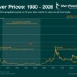
The most significant fact about silver, from a charting point of view, is the mega cup pattern formed over a period of more than 30 years.These cup (or cup and handle) patterns are very bullish formations. Below is a long-term silver chart showing the mega cup formation as well as two smaller cup formations:

When a cup is formed, it is often an indication that the price will eventually go higher than the peaks of the cup. This is why the mega cup formation is so significant, because it is telling us that the price of silver will eventually go higher than the $50.
For all the cups shown on the silver chart, gold had a similar cup. The main difference between the gold cups and silver cups is the timing. See a similar chart for gold:

In all three cases, the gold price went higher than the top of its cup before silver did. This means that gold was a leading indicator for the price of silver. In the case of the mega cup, silver has still not gone higher. Based on the fact that silver has always followed gold’s path by eventually going higher than the cup’s high, in the past, it is very likely that silver will do it again by going higher than the $50.
This is a very simple principle, but provides an enormous opportunity to those who are willing to buy physical silver and have the patience to hold on to it no matter how volatile the price swings.
The fact that we have such a big cup is what makes timing the breakout of the cup so difficult. I believe we have come close to the point where the silver price is about to challenge the cup’s high, and eventually breakthrough (more detail coming to premium subscribers only). First though, it has to make the low for the current decline.
On the charts above you can see that during the 70s, silver always went higher than its cup in the year following gold’s similar feat. It has already been more than three years since gold went higher than its cup high. Silver has still not gone higher; however this is reasonable considering the fact that the cup is so much bigger than the 70s cups.
Previously, I have written about how conditions are similar to that of 1973, when the Dow started a crash at the same time that gold started a spectacular rally. That was incidentally the year that silver also started a massive rally, and went higher than the cup formed before that.
Below is a silver chart showing price action around a cup of the early 70s:

I have indicated a cup that was formed during the late to early 70s. Note that the gold chart also made a similar cup during that time. Early 1973, about the time when the Dow started its crash, silver was still trapped lower than the cup’s high. However, by 1973, the gold price had already gone higher than the cup’s high. In the same year silver went higher than the indicated cup’s high, eventually peaking multiples higher than the cup.
This is similar to today’s situation, with gold having already gone higher than the $850 area, and silver still lagging lower than the $50 area. This would suggest that the peak in the stock market (which I believe is busy happening now) will be the significant signal for the coming silver rally towards and beyond the $50 level.
For more of this kind of analysis on silver and gold, you are welcome to subscribe to my premium service. I have also recently completed a Long-term Silver Fractal Analysis Report .


