Those Key Behind-The-Scenes Stories That Silver Tells
 share
share
 share
share
 share
share
 share
share
 share
share
Friday’s session didn’t bring much of easily noticeable action in the precious metals. While the day-to-day picture remains calm, the mining stocks’ move has brought us direct short-term implications. We’ll examine the lessons both the gold-to-silver ratio and silver are sending us. Let’s get into silver’s message.
There is much more to the performance of gold and silver than meets the eye. There are important medium-term implications of the performance of their ratio, and there are major short-term indications from their quick day-to-day moves.
Let’s start with the former.
The Many Views of the Gold to Silver Ratio
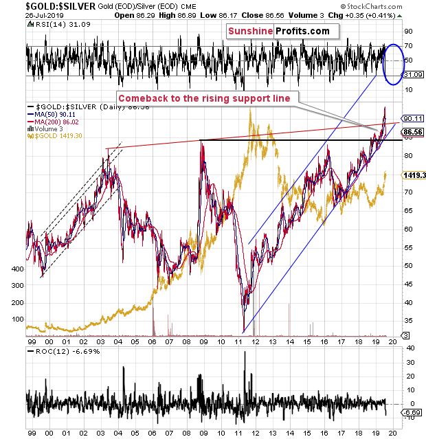
The gold to silver ratio had soared recently and it corrected its huge upswing in the last couple of weeks. How should one interpret this decline? The interpretation relates to the support and resistance levels that we have on the above chart. One thing is that the breakout above the rising red resistance line was invalidated, which is bearish for the ratio. However, the ratio didn’t move below its 2008 high nor the rising long-term support line that we marked with blue. This means that the breakout above the previous highs was not invalidated and that the uptrend remains intact. This – combined with the rising support line remaining unbroken – means that the trend remains up, despite the invalidation of the breakout above the rising red line. The latter is simply not as important as the combination of two other – just as strong – long-term levels. It’s a simple trading rule that the greater number of equally or more important signals or support/resistance lines, the more important the outlook confirmation.
Please note that it was the first time that the red resistance line was broken, so its strength is only theoretical. The rising blue support line is something that already worked multiple times, so its strength is already proven. All in all, the trend remains up and the implications for the precious metals market remain bearish, because the ratio tends to move in the opposite way to the individual PM prices.
Having said that, let’s take a look at the implications of the short-term price movement.
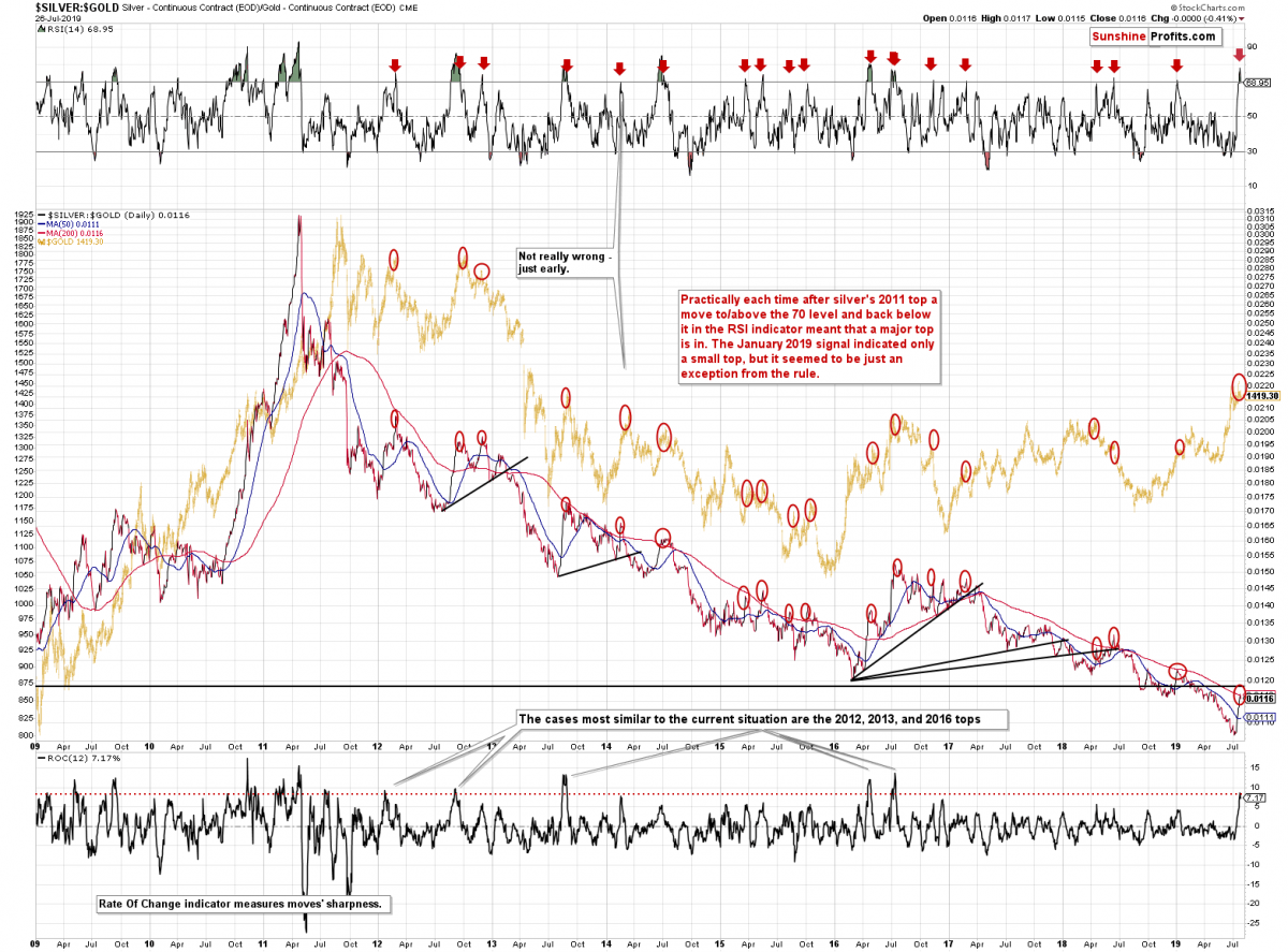
The above chart appears very different from the previous gold silver ratio so we’ll explain. The above chart simply provides a different (mirror) perspective on the ratio as it divides silver price by gold price. It’s just a cosmetic change that doesn’t really impact the data in a direct way. We like to look at the key ratios from all angles to make sure that we don’t miss anything important – even though the dataset is the same, sometimes it might be easier to spot something in an uptrend and sometimes in a downtrend. As far as the ratio itself is concerned, we see that it moved below the previous low and now it moved back up without invalidating the breakdown. This is in tune with the implications described below the previous chart. What is new on the above chart, are the positions of indicators (note: they are both based on the ratio, so they are silver to gold ratio indicators, not simply gold indicators).
The indicator in the upper part of the above chart is RSI and the important thing about it is that it was just above 70 and now it moved back below it. It doesn’t seem like a big deal at first sight, but it becomes a critical development once one examines what happened in practically all previous cases. These were almost all major tops and the very few exceptions were either close to major tops (early 2014) or a major top in silver but not that significant one in gold (early 2019). With this kind of performance (almost throughout!) seeing this signal right now is extremely bearish.
But wait, there’s more. Not all silver rallies are equal. In some of them, silver is moving higher relative to gold in a rather slow manner, and sometimes silver shoots up with a dramatic (and usually fake) scream. The latter kind of performance is more meaningful as it indicates more emotionality in the market. And whenever emotionality gets extreme, a price extreme also forms. The more emotionality we see, the more profound the price extreme usually is. That’s the theory. What about practical implications for predicting silver prices?
The Rate of Change indicator measures the sharpness of a given move and we applied it to the ratio to detect exceptionally sharp rallies. As it turns out, there were only several cases when the rally was as sharp as it was been recently. Since the 2011 top in gold (which was also accompanied by silver-to-gold ratio’s sharp rally) we saw five similar cases. They all confirmed tops in the ratio and painted a bearish outlook for gold. Four of them were the final tops and the one case that was exception from this rule was actually a relatively important top anyway (and it was not too far from the final top either).
These cases are: two 2012 tops, the 2013 top, and two 2016 tops (including the final top). These were indeed major tops and given their prominence, the odds are that a top of similar importance has just formed as well.
The analogy to the late-2012 top is particularly important because of what we wrote about it on Thursday:
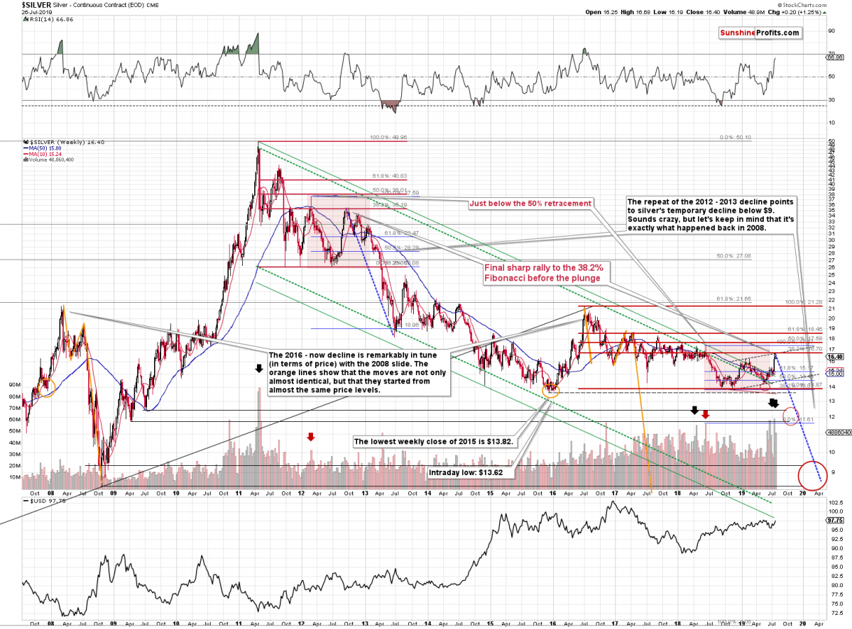
There is actually much more to the silver story than just a breakout above the recent highs. In fact, the breakout itself is not that important. What is important, is the resistance that was just reached and how it relates to what we saw in the past.
By "resistance" we actually mean two resistance levels. One is created based on the line that's parallel to the rising support line created by connecting the 2018 and 2019 bottoms. Copying this line and moving it higher so that it touches the early 2019 high creates the upper border of the rising trend channel. This is silver's second move higher and the "C" part of a rising ABC correction pattern (the late-2018 - early-2019 rally was the "A" part of the move and the subsequent decline was "B"). The ABC corrections (a.k.a. zigzags) are relatively common corrective patterns that don't change the preceding trend. In this case, the trend was down.
We can speak of the big downtrend that started in 2011, or we can speak of the more medium-term downtrend that started in 2016 - either way, the corrective ABC pattern seems to have already run its course as silver moved to the upper border of the trend channel.
There is also additional reason for silver to turn south from the current price levels that's even more important. Taking the 2016 top as the starting price for the decline and using the 2018 bottom as the final (so far) bottom, we get $16.70 as the 38.2% Fibonacci retracement. This is a good reason on its own for silver to turn around, especially if we also consider the fact that silver moved to the above-mentioned upper border of the trade channel.
The extremely bearish outlook comes from something else, though. There are many things that emphasize that the outlook is extremely bearish (such as the recent volume readings in silver and silver stocks), but with regard to the price level that was reached yesterday, there is one more very important detail that most investors will likely miss.
The entire 2016 - now situation and the 2011 - late-2012 price movement are very similar.
In both cases there were actually four bottoms at very similar price levels that preceded the final upswing and the first one of them was very sharp (late 2011 and mid-2017). The timing between the following bottoms was different, but there are two major similarities that just can't be ignored or left unmentioned.
The first thing is that all major tops were lower than the previous ones. The only outlier is the early-2019 top, which - as it turned out - wasn't the final top for the rally, so overall it seems that the analogy remains intact.
The second thing is that the top (the one in early 2012) that preceded the final top of the consolidation is extremely similar to the mid-2018 one and this an extremely useful roadmap sign that tells us where silver is in light of the entire analogy.
The key thing is that the final pre-slide (late-2012) top formed at the 38.2% Fibonacci retracement level based on the preceding decline. The early 2012 top formed slightly below the 50% retracement (intraday high) and the weekly close was a bit below the 38.2% retracement. The mid-2018 top (analogous to the late-2012 one) also formed a bit below the 50% retracement and the weekly close of that top was a bit below the 38.2% retracement.
This means that if the analogy remains intact, silver should top at the 38.2% retracement right now, which is at $16.70. And what was silver's high yesterday? $16.68 - almost exactly the level of the retracement. This price level is today's pre-market high based on finance.yahoo.com and stooq.com prices.
The top that was just reached is likely much more important than it seems based on just today's intraday chart.
Given what we’re seeing in the gold to silver ratio and the silver to gold ratio charts, the above-described analogy becomes even more important. This also means that the follow-up action is even more likely to be similar. This, in turn, makes the very bearish outlook for silver, extremely bearish.
Summing up, the breakdown in the gold stocks and the multiple signals coming from the silver market clearly confirm that the rally in the precious metals sector has most likely already run its course. Moreover, let’s keep in mind that gold has recently invalidated its breakout above the previous highs, the late-2013 highs, and the upper border of the pennant pattern, which is also a very strong bearish sign. The situation in the currency market confirms the bearish outlook for the PMs. In those circumstances, we simply cannot predict higher gold price in the medium term. There will most likely be times when gold is trading well above the 2011 highs, but they are unlikely to be seen without being preceded by a sharp drop first.
Today's article is a small sample of what our subscribers enjoy on a daily basis. For instance today, we have shared with them the short-term outlook in precious metals with the signal miners just issued, and the edge the very long-term silver cycles give. Check more of our free articles on our website, including this one – just drop by and have a look. We encourage you to sign up for our daily newsletter, too - it's free and if you don't like it, you can unsubscribe with just 2 clicks. You'll also get 7 days of free access to our premium daily Gold & Silver Trading Alerts to get a taste of all our care. On top, you’ll also get 7 days of instant email notifications the moment a new Signal is posted, bringing our Day Trading Signals at your fingertips. Sign up for the free newsletter today!
Przemyslaw Radomski, CFA
Editor-in-chief, Gold & Silver Fund Manager
Sunshine Profits - Effective Investments through Diligence and Care
* * * * *
All essays, research and information found above represent analyses and opinions of Przemyslaw Radomski, CFA and Sunshine Profits' associates only. As such, it may prove wrong and be a subject to change without notice. Opinions and analyses were based on data available to authors of respective essays at the time of writing. Although the information provided above is based on careful research and sources that are believed to be accurate, Przemyslaw Radomski, CFA and his associates do not guarantee the accuracy or thoroughness of the data or information reported. The opinions published above are neither an offer nor a recommendation to purchase or sell any securities. Mr. Radomski is not a Registered Securities Advisor. By reading Przemyslaw Radomski's, CFA reports you fully agree that he will not be held responsible or liable for any decisions you make regarding any information provided in these reports. Investing, trading and speculation in any financial markets may involve high risk of loss. Przemyslaw Radomski, CFA, Sunshine Profits' employees and affiliates as well as members of their families may have a short or long position in any securities, including those mentioned in any of the reports or essays, and may make additional purchases and/or sales of those securities without notice.
********
share
share
share
share
share
 Przemyslaw Radomski, CFA, is the founder, owner and the main editor of SunshineProfits.com.
More from Silver Phoenix 500