Will You Make Money In The New Silver Bull Market?


Today let’s take a look at the bad boy of the PM complex, silver. If you’ve been following silver for any length of time then you know it can be aggravating at times as we’ve seen fairly recently when gold and the PM stocks have been running pretty hot to the upside while silver just sat there doing its job of frustrating as many investors in the PM complex as it could. Finally, three weeks ago silver broke out above overhead resistance and decided to join the party.
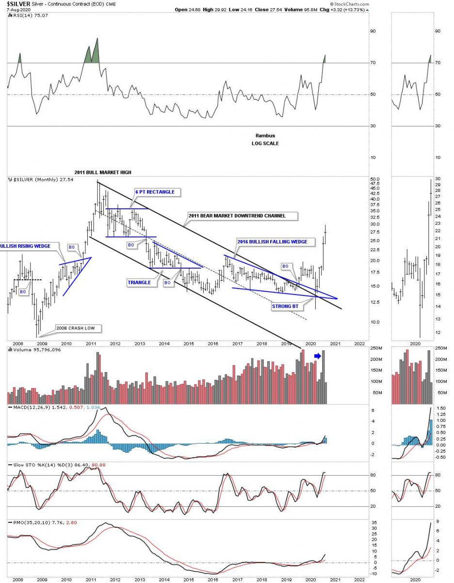
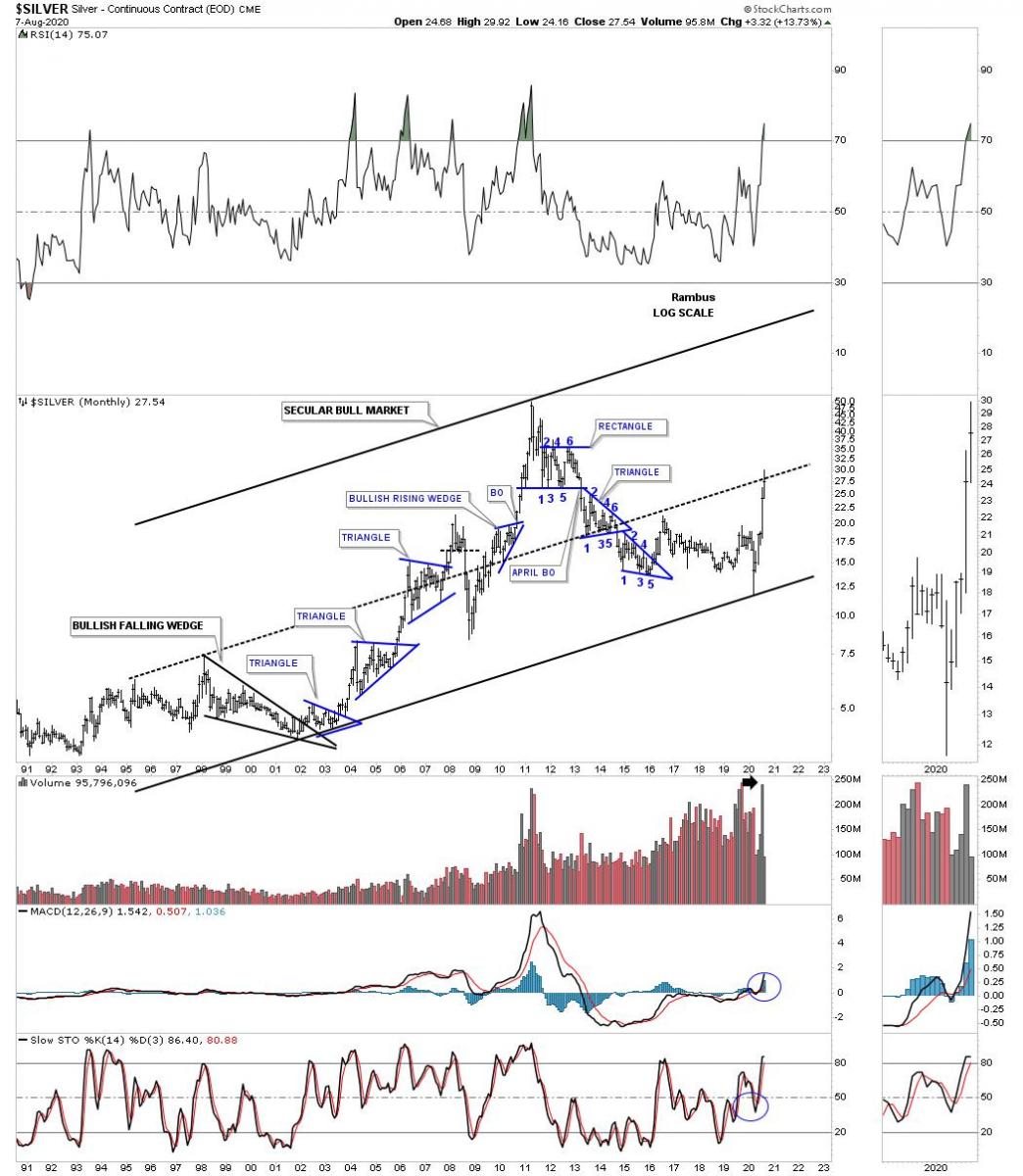
Tonight I’m going to start with a few long term charts for silver. It’s these long term charts we need to understand first so we know where silver has been trading and where it is likely to go based on the Chartology which has been guiding us pretty well so far since what will now be called the March 2020 low in the years ahead.
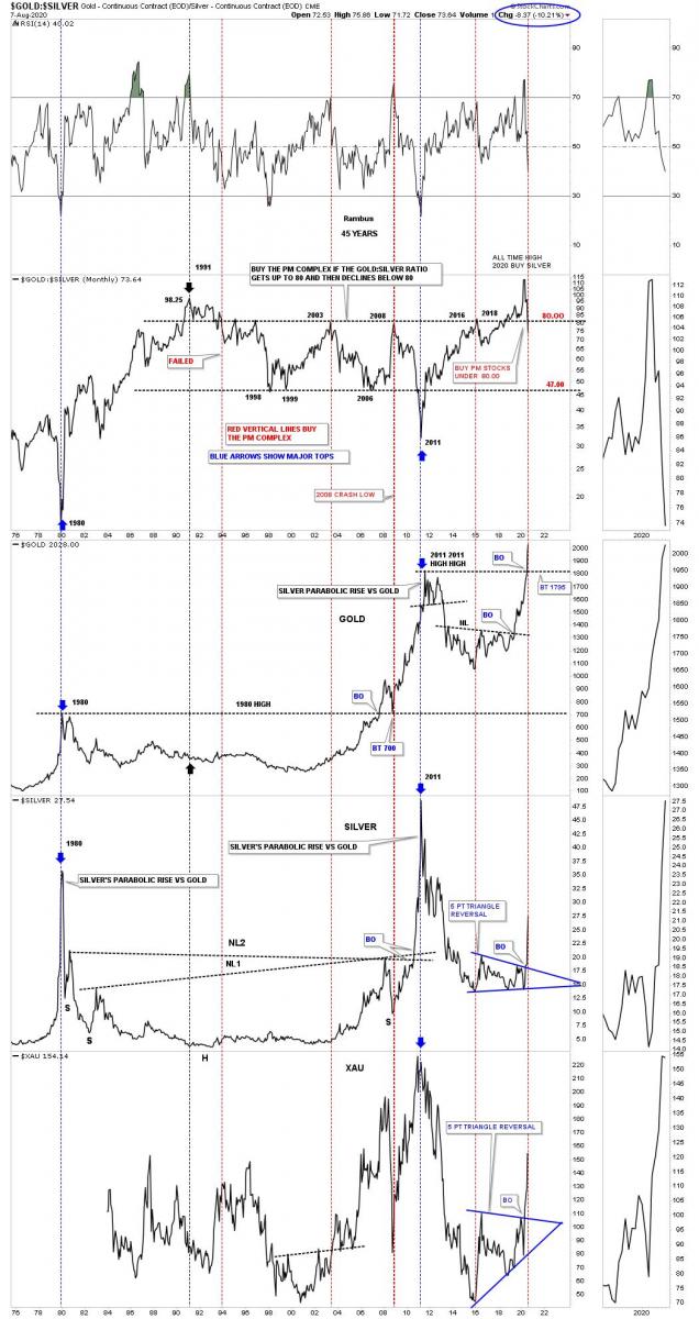
This first chart is a ratio combo chart which has the GOLD:SILVER ratio on top with gold just below followed by silver with the XAU on the bottom. Everyone has their own interpretation of how they like to analyze that ratio. I have my own thoughts on how I like to view the ratio chart and how to use it in deciding if the PM complex is in a bull or bear market. We’ve discussed many times is the past that knowing if you’re in a bull or bear market is the single most important aspect of trading the intermediate to long term trends.
There are times when a particular market, or in this case the GOLD:SILVER ratio can get out of whack and move to an extreme that you know is not normal as most extreme moves eventually revert back to the means. When I began accumulating our 4 long term silver positions it was based on this GOLD:SILVER ratio chart being so far out of whack I just couldn’t resistance it any longer. In April of this year the ratio rallied to the highest point in history. There was no way to know how much more extreme the ratio could get, but the odds started favoring it was time to start taking advantage of the divergence. We took our first position in the USLV 3 X long silver etf at 47.56 and accumulated 3 more positions that I labeled as, Long Term Holds.
There is quite a bit of information on this ratio combo chart so lets start with the recent all time high that was made in April of this year. The way the ratio is setup, when the price action rallies up to the 80 area or higher and then starts to decline below 80 that is usually a very bullish development that a new bull market is starting for the PM complex. The all time high in the ratio this past April now stands out like a sore thumb. What is particularly interesting is that this month the ratio has finally broken below the 80 level which in the past signaled a bull market except in 1991. If you look back to the 1991 timeframe you can see the ratio failed to deliver the bull market which produced more or less a sideways trading range until July of 2003.
Looking at gold, silver and the XAU below the 2003 high on the ratio you can see it was a great time to be invested in the PM complex. The next major buy signal came in November of 2008 which lasted until the bull market in the PM complex ended in 2011 which is the major low on the ratio chart. From that point the bear market began that slow grind lower for the PM complex and higher for the ratio until the bottom in 2016 which at the time the ratio traded slightly above 80 and declined below it. That 2016 low is considered the end of the 2011 bear market which it was, and the beginning of our current bull market. That 2016 rally was extremely strong but burned itself out in just 8 months. That rally ended up being the first reversal point in what turned out to be the first reversal point in most of our 2016 PM stock indexes and most of our individual PMs stocks that you can see in the PM Stocks Trade Portfolio.
During that 2016 blistering rally in the PM complex that looked and felt at the time that the bear market was over, which it was but why didn’t the bull market take off from that point like it has done this time after the March 2020 low. You’ve heard me mention this a million times in the past, big patterns lead to big moves. Looking back in hindsight we can see there was no big reversal pattern to launch a long term bull market at the 2016 low. It took four more years of base building for the PM complex to build up enough energy it is going to need to sustain a long term bull market. Think about that for a moment. We’ve just endured a 5 point trading range where prices basically went nowhere for 4 years. Now we are seeing the fruits of our labor with one of the strongest impulse moves we’ve see in the PM stocks since the 2000’s. I would venture to say most goldbugs have been chopped up into little pieces trying to trade the 2016 five point triangle reversal pattern. It’s how markets work. I can predict the future. Once our current impulse move is finished and we’ve made some nice profits most investors will give it all back during the formation of the next consolidation phase which is going to happen. Sound familiar? How many PM stock investors actually made a killing during one of the greatest bull markets in PM stock from 2000 to 2011?
At any rate you can see what is happening right now since the ratio broke below 80 on silver and the XAU. The last time we looked at this chart they were both still trading inside of their respective 5 point triangle reversal patterns.
How many silver investors made a killing during the 2011 bear market? How many are going to make a killing in the brand new bull market?
Silver’s secular bull market uptrend channel.
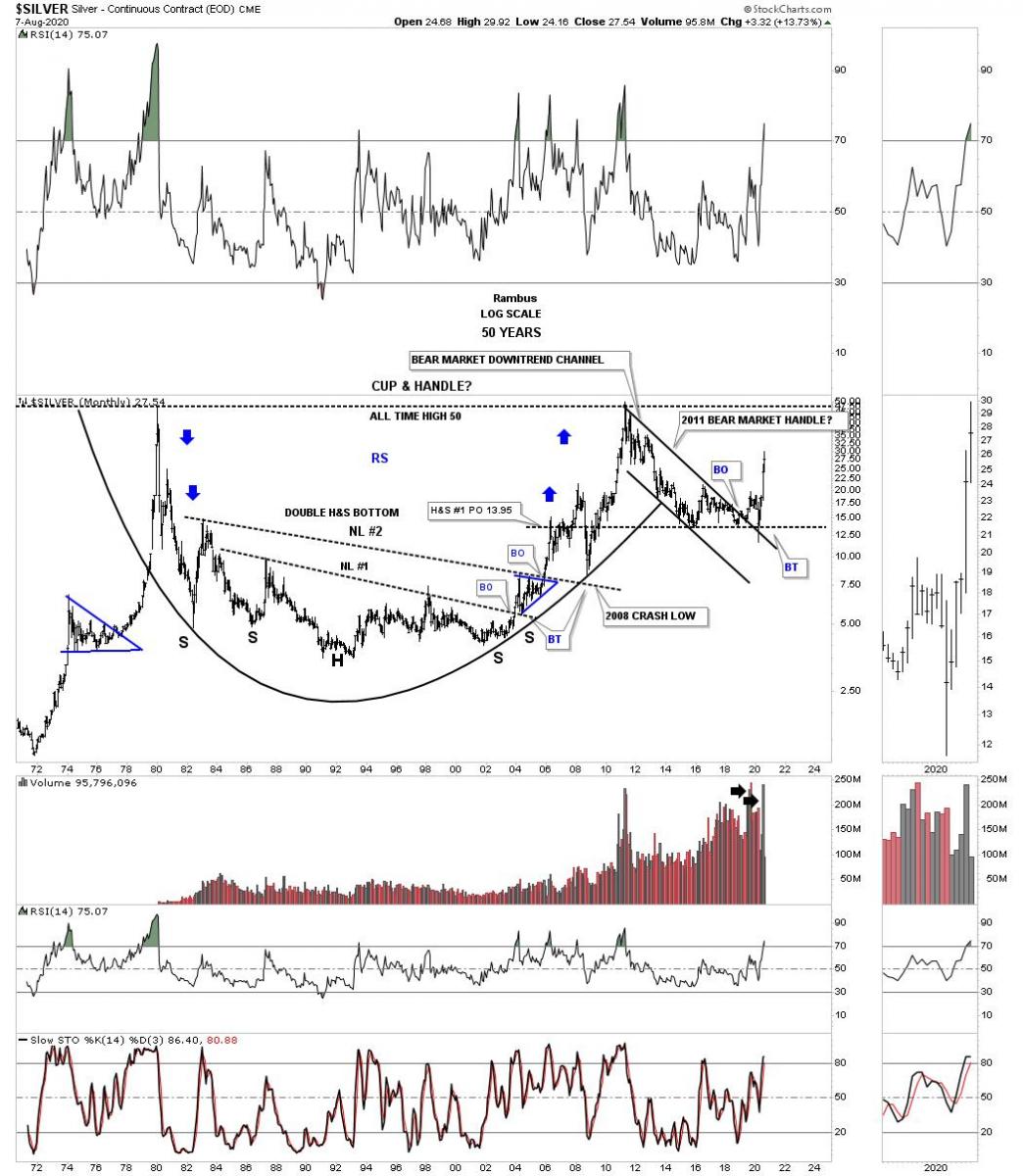
This last chart for tonight is one I’ve posted for many years which shows the massive double H&S bottom starting at the 1980 high which has evolved into the possible massive cup and handle with the 2011 bear market being the handle. Note how neckline #1 held support during the backtest in August of 2014 confirming the H&S bottom. Also note how neckline #2 held support during the 2008 crash low before it went nearly parabolic to its all-time highs at 50. You can also see the reverse symmetry as shown by the blue arrows, how silver went down is how it’s moving higher over the same area. I also have a very similar looking 50 year chart for gold which stands to reason.
It’s important to know where the PM complex has been trading so we can extrapolate that information and use the Chartology to help guide us into the future. Just because we have started a brand new bull market is no guarantee you are going to make any money. It all looks easy in hindsight but when you are living the bull market in real time it is a completely different story. Emotions and discipline are killers when it comes to trading the markets. If you can gain control of those two things you will be well on your way to being a winner in one of the toughest games on the planet to play. All the best…Rambus
*********
 Rambus Chartology is Primarily a Goldbug TA Site following the precious metals markets. Chartology is the Unique Blend of Technical Chart Pattern Identification and Market Psychology, Developed by Rambus During the Tech Mania of the late 1990s. His Early Training came the old fashioned way...Reading Edwards and McGee's Bible of Technical Analysis and spending years with a sharp pencil graph paper and ruler refining his skills and accuracy. Visit the Rambus Chartology website at http://rambus1.com/.
More from Silver Phoenix 500