Silver Price Chart Has Lots Of Tension Going Into September Of 2020
London (Aug 21) After our silver forecast for 2021 was met already in 2020 the question became how much higher the silver price could rise. There is one, and only one, place where we can find any clue about this answer: the charts. Supply/demand data are nice reads, but meaningless for price forecasts. Similarly, any precious metals storage data, transportation data, coins, etc have no value whatsoever to understand price action and underlying trends.
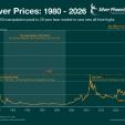
The silver price chart currently is one huge area of tension.
Too much tension, is what we would say.
Look at the congestion of so many different trends, all coming together in the area in which silver currently trades (yellow circle on below chart):
1.The short to medium term rising channel (dark green).
2.The long term rising channel (light green).
3.The 7 year year horizontal trendline (thick red line).
4.Another multi-year horizontal trendline (thin red line).
Any surprise we saw violent moves in the silver price once the price arrived in this yellow circle of tension?
What silver needs is a consolidation right above the thick red line. If silver succeeds in stabilizing around current levels, between 26 and 28 USD, it would set the stage for a continuation of its rise.
This can only happen if interest rates stay low (TNX should not rise significantly, TLT should not decline significantly) and the Euro should remain strong.
That’s a lot of conditions.
Instead of betting on it, we decided to give the silver market the time it needs to exit the area of tension. Within our Momentum Investing portfolio we exited our silver mining position with 21% profit in less than one month. However, we are following the precious metals very closely, and are ready to re-enter if conditions are supportive of a solid entry point.
Investing.com


