That Inflation Feeling!
 share
share
 share
share
 share
share
 share
share
 share
share
Looking at a picture of the S&P500 on an inflation adjusted basis you get a different picture then what is being painted by the market and especially the mainstream media. Most people only look at where the market is today vis-à-vis an earlier period. And what they see is a market making all-time highs. That is nominal all-time highs. The result is that market participants and especially the financial media get excited and tout how great the market is.

Charts created using Omega TradeStation 2000i. Chart data supplied by Dial Data
But should they? On an inflation adjusted basis the S&P500 is still below the highs it made back in July 2000. It is barely back to the levels it was at in July 2007 although the gains since the end of September might push it over. But what this chart highlights is that it has been 13 years of going nowhere. Officially it has been a 13 year secular bear market.
Ok not quite. The period has been highlighted by the high-tech/internet crash of 2000-2002 and the housing bubble/sub-prime loan/financial crash of 2007-2009. In between was the 2002-2007 rally and the so far 2009-2013 rally. Could this one follow the same pattern of 2 years down followed by 5 years up? The collapse in 2000-2002 saw the market fall 48% and in 2007-2009, the decline was 53%.
The chart of the S&P500 above uses the actual CPI with a base of 1982-1984 = 100. The scale is correct although the prices reflect prices during the base period. There are some interesting observations. The nominal high in 2000 was seen in March but the inflation adjusted high was made in July. The nominal low was made in October 2002 but the inflation adjusted low was seen in February 2003. The 2007 nominal high was made in October but the inflation adjusted was seen in July. Finally, the nominal low for the S&P500 in 2009 was made in March but the inflation adjusted low was seen the month before in February.
The rally that got underway in March 2009 nominally is up 165% . On an inflation adjusted basis the S&P 500 is up only 110% (to the end of September 2013 only. The October CPI is not due out until later in November). Inflation has taken away quite a bit of the rally. The 2002-2007 rally nominally gained 105% but the inflation-adjusted gain was only 63%. Once again inflation took a big bite out the gains. What about the downside? The nominal collapse in the 2000-2002 bear market was 51% but the inflation adjusted drop was only 48%. The nominal 2007-2009 collapse saw the market fall almost 58% but the inflation adjusted decline was only 53%. Inflation eased the pain of the collapses slightly but took a significant bite out of the rallies.
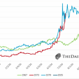
The second CPI adjusted chart below is the Dow Jones Industrials (DJI) dating all the way back to 1800. This is another in the excellent charts (and data) maintained by Nick Laird of www.sharelynx.com. The DJI is shown with a trendline and a 75% confidence band. Through 200 plus years of the DJI it has maintained a remarkable steady climb. There are a number of observations that jump out from this chart.
- The 1966 high on an inflation-adjusted basis was not that much higher than what was seen in 1929.
- The 1982 low was barely above the lows seen in the 1940’s (1942 and 1949).
- The 1982 low was actually below some of the highs seen from 1900 to 1920.
- The 2009 low was close to the high of 1966.
- On the other hand, the long-term chart of the DJI does show a long-term uptrend with a series of higher highs and higher lows.
The DJI has been trading generally between the rising trendline and the upper end of the 75% confidence band. Note the similarity between the action since 2000 with the action of the DJI roughly between 1900 and 1920. For quite a number of years the DJI managed to hold the center trendline while trading to or just above the upper end of the 75% confidence band. The period saw two panic in 1903 and 1907. One hundred years later the collapse this time took place in 2002 and 2008. The major inflation adjusted high during that period was made in 1909 although the nominal high was not seen until 1919. There was a significant low made in 1921. The nominal low at that time was actually higher than lows seen in 1903, 1907 and 1914 but the inflation adjusted low took all of those lows out. The suspicion here is that there should be at least one more collapse coming that would take the DJI to the bottom of the 75% confidence band in order to complete the pattern. This still could take a number of years to complete.
The DJI may make a higher high or it may still be a lower high going forward. But the proximity to the top of the 75% confidence band suggests that the caution should be exercised in the market going forward. This should not be the place to be buying. The major buying opportunity should come when the DJI falls to below the 75% confidence band. This has given rise to significant buying opportunities in the past.
Source: www.sharelynx.com
Copyright 2013 All rights reserved David Chapman
share
share
share
share
share
More from Silver Phoenix 500