Long Bond Breakdown
 share
share
 share
share
 share
share
 share
share
 share
share
Well, here we go again. I do not know how many times over the past year or so I have noted what looked like a chart breakdown in the US long bond. By that I specifically mean a close BELOW the 50-day moving average. Generally, that will get technicians to sit up and take notice and begin to approach a market from the short side. Each time I have noted this however, the bonds have done a flip-a-roo and back up they have gone continuing the bull streak.

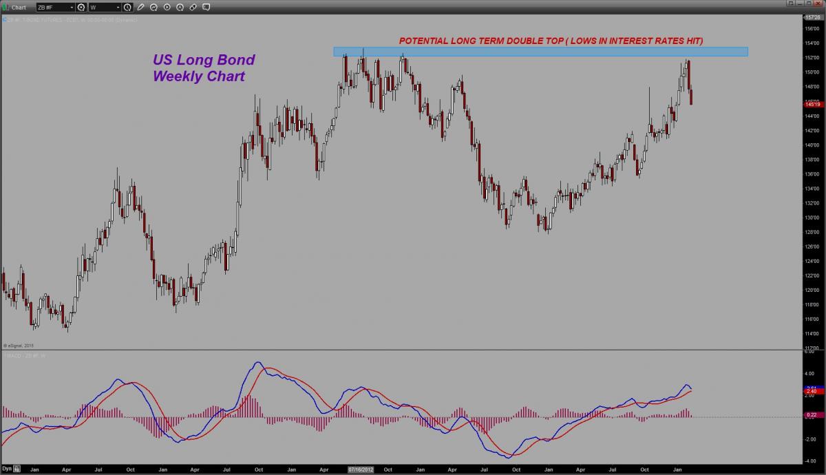
This time, maybe, just maybe, we are seeing an end to the ultra-low long term interest rate environment. As badly at this market has tripped me up over the last year and a half, when it comes to turning negative on it, I am somewhat reluctant to get too worked up about a close below the 50 day moving average once more. This time however, while it cannot be seen on this daily chart view ( look at the weekly chart below), we were up near ALL-TIME HIGHS in the bonds. That translates to ALL-TIME LOWS in long term interest rates.
The question I ask is how much lower can long term rates go from these levels? I suppose they could indeed head lower but I shudder to think what economic conditions would be like were that to occur as it would signify a near collapse in US economic growth and a huge failure on the employment front.
Note on this intermediate term chart (weekly) the MACD has not yet given a Sell signal. It has hooked down however.
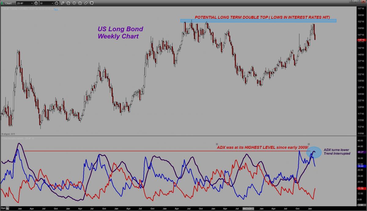
Let’s switch the indicator to look at the ADX/DMI however because there is something quite notable that we need to discuss. The ADX, that line which when rising indicates the presence of a strong trending move, has finally hooked lower and turned down. It has done that before but this is what has my attention – it is doing so from ITS HIGHEST LEVEL ever since 2009! Look at the horizontal red line I have drawn across that indicator. You might recall that was when the very first QE program was initiated by the Federal Reserve and traders reacted by pushing bond prices sharply higher. However, it was not until the full impact of all those longer term bond purchases was being felt in the interest rate markets that the long bond went on to make its all-time high in the summer of 2012. Look and see – even at that point, the ADX was not nearly as high as it currently is.
The same can be said of the Positive Directional Movement Indicator (+DMI BLUE LINE). It too is at its highest level since that same time frame in early 2009!
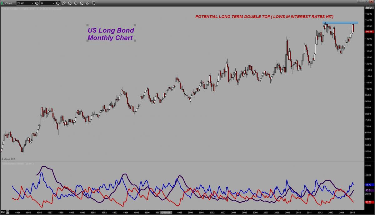
In other words, we have experienced one of the most powerful uptrends in market history in the bonds – a trend that goes back over 30 YEARS and this trend, may just possibly be finally coming to an end. I do not want to read too much into one week’s price action in a trend of this duration, nor even one month’s price action, but given the level at which the bonds are trading, and given the comparable incredibly low corresponding interest rates, I personally believe that we have seen long term interest rates go as low as I will ever see again in my lifetime.
The only thing that I believe will disabuse me of this notion, is as I stated earlier, a complete economic collapse. Barring that, one has to wonder if 30 years of falling long-term rates has now become one for the history books.
********
Courtesy of Trader Dan http://traderdan.com/
share
share
share
share
share

