Weekend Report…A Comprehensive Look at the Chartology of Silver…
 share
share
 share
share
 share
share
 share
share
 share
share
In the Wednesday stock report we took an indepth look at gold to see what the chart patterns were telling us. Tonight I want to look at silver as there is a chart pattern similar to the gold rectangle that no one is seeing at the moment. This pattern is very large and will have a major impact for the silver price going forward. Before we look at the bigger picture I want to bring everyone up to speed on the daily look that shows the chart patterns that have formed since the first of the year.
The daily chart shows silver finally breaking down from the blue bear flag that has been forming since the middle of May. If you recall this pattern started out as a 5 point triangle reversal pattern that looked like it would workout to the upside when it had a big breakout gap on nice volume. The next day it gave back all its gains and looked like it was doing a backtest to the top rail of the triangle. I remember at the time, dragging the bottom rail up to the high made the day before. This showed you that silver could have a false breakout and to watch the potential for this pattern to morph into the blue bear flag that we now see as the correct chart pattern. Sometimes when you get a false move to the upside like silver had, and you can detect it early enough, you will get a good move in the opposite direction, in this case back down. The high point on the blue silver bear flag is what I’m talking about.
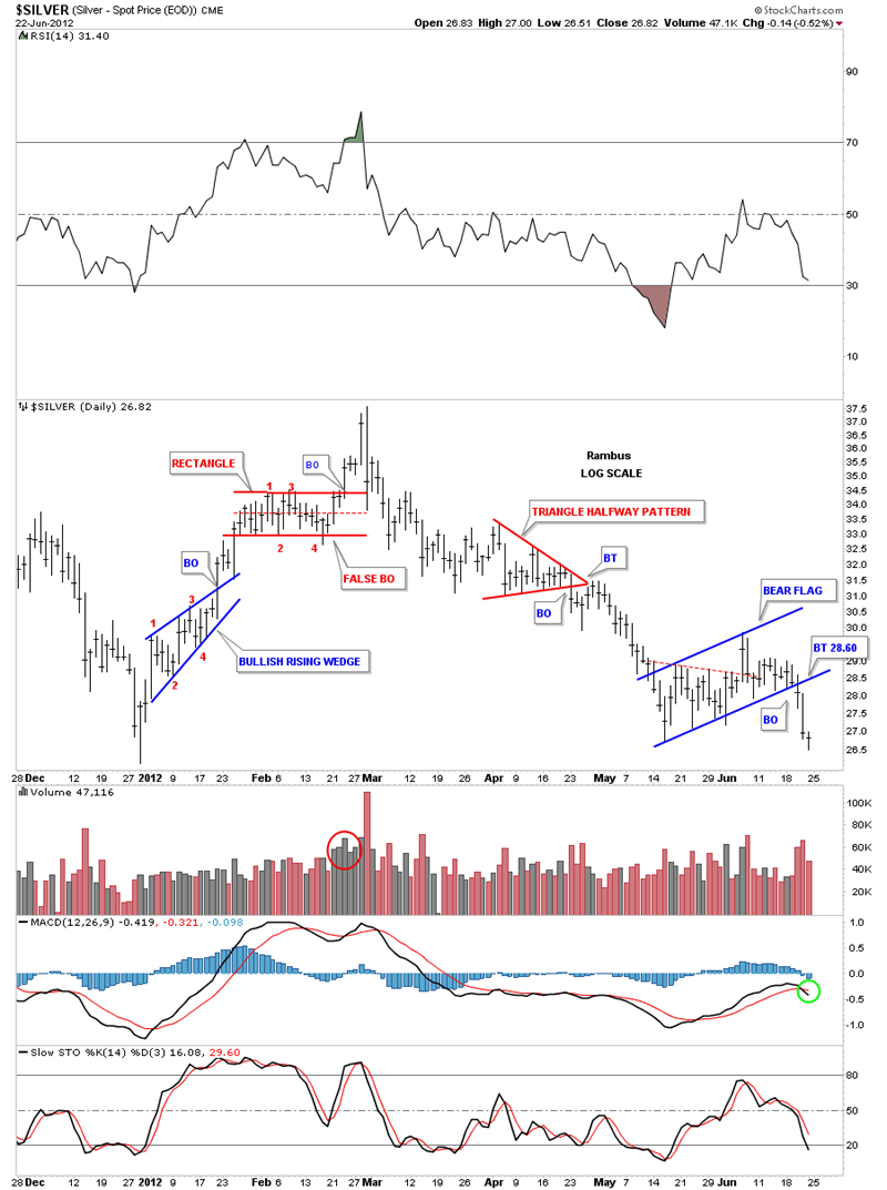
The thin red dashed line, on the chart above, shows the top rail of the triangle, with the big breakout that failed to materialize, and caught many traders by surprise when prices fell back below the red dashed rail.
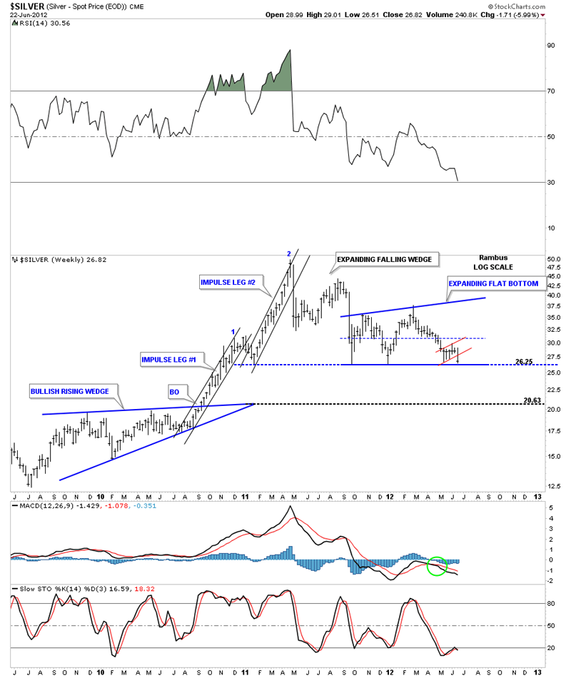
This next chart is a weekly look that shows the blue expanding flat bottom triangle that no one is recognizing yet. You can see the bottom rail of this pattern is part of the big horizontal support zone, at 26, that has been in place since the end of 2010. I can’t stress enough how important the horizontal support rail at 26 is for silver. If silver breaks below, it will reverse it’s role and act as resistance on any rally attempt. You can see our little red bear flag that I showed you on the daily chart above that may be giving us a big clue that the bottom rail at 26 is going to fail. Another clue that the bottom support rail may break to the downside is that flat bottom triangles usually break through the horizontal rail, not always but most of the time.
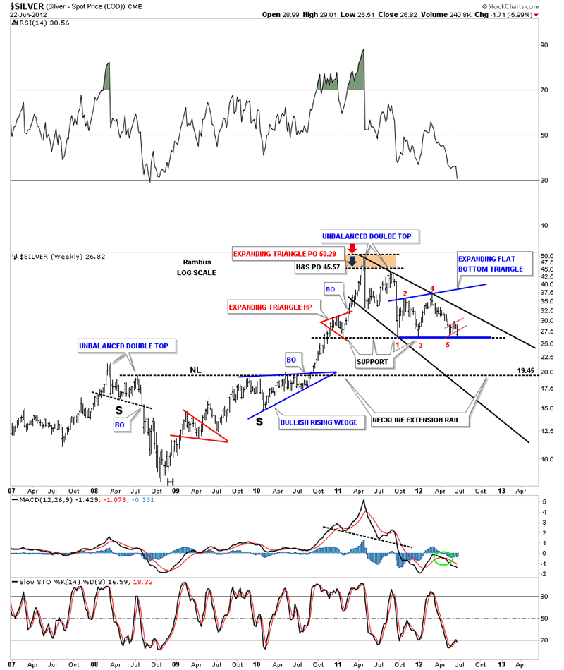
Lets look at another weekly chart that goes back over five years to put everything into perspective. I’ve also added a downtrend channel that is expanding in nature. I’ve also labeled the reversal point for the expanding flat bottom triangle so you can see it is a completed pattern. You can also see the little red bear flag that has been forming on the bottom blue rail. If the bottom support rail breaks down I’ve extended a neckline extension rail that was made back in 2009 during the formation of that big H&S base that helped launch the huge rally to 50. The neckline extension rail would be the first logical place for silver to find some decent support.
The next chart I would like to show you is the long term look that goes back to the beginning of the bull market for silver. Its been in a very nice uptrend channel. The top rail off the major uptrend channel had to be moved one magnitude higher when silver went on its near parabolic run to 50. This is the same technique I showed you on the gold chart on the Wednesday Stock Report. You can see there is only one touch of the top rail that was put in place by the height of the measuring stick made off the upper black dashed rail. Silver could conceivably trade down to the bottom rail of the major uptrend channel and still be in it’s bull market.
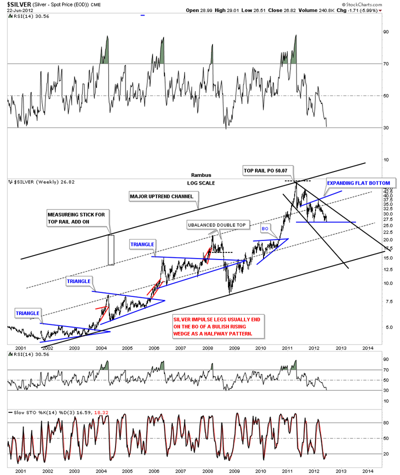
The last chart I would like to show you leans toward the bullish side for silver. This chart goes back 30 years and takes in the top that was made back in 1980 at 50. There are two huge H&S bottoms that were made when silver was in it’s major bear market after the 1980 high. I’ve labeled each neckline on the H&S bases #1 and #2. First lets focus in on H&S #1 and how it fared. It broke the neckline in November of 2005 and reached it’s price objective at 19.92 in March of 2008. That high was made just before the 2008 crash began. As you can see the 2008 crash took the price of silver all the way down to just above 8 which was also the backtest to the neckline.
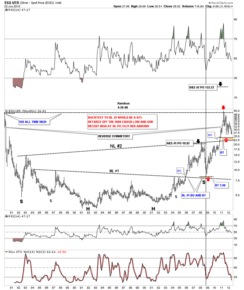
From that backtest low in 2008 silver started the rally that would take the price all the way back up to the 50 area. Now we need to focus in on neckline #2 that was broken to the upside in November of 2010. On the chart above I’ve labeled where we might see the backtest to neckline #2, brown area around the 22.50. The red arrows shows a 62% retrace of the entire bull market comes in around the 24 area.
Its going to be interesting to watch how things unfold and see if neckline #2 holds support like neckline #1 did. For me, this chart represents the most bullish aspect for silver because if neckline #2 holds, on a backtest, the second H&S base calls for a price objective to 130 or so. Stay tuned as things are really starting to get interesting for both the short term and the long term. All the best…Rambus
share
share
share
share
share
 Rambus Chartology is Primarily a Goldbug TA Site following the precious metals markets. Chartology is the Unique Blend of Technical Chart Pattern Identification and Market Psychology, Developed by Rambus During the Tech Mania of the late 1990s. His Early Training came the old fashioned way...Reading Edwards and McGee's Bible of Technical Analysis and spending years with a sharp pencil graph paper and ruler refining his skills and accuracy. Visit the Rambus Chartology website at http://rambus1.com/.
More from Silver Phoenix 500

