Are The Financials About To Fold?


Expectations appear to favor a good third quarter out of the big banks on “accelerating loan growth and strength in investment banking [to] help…shake off a malaise in earnings.” This analysis was offered by the WSJ on September 8 with another article on October 1 offering solid support for this view too.
But the various charts of the Financials Select Spider ETF (XLF or “the XLF”) suggest that this summer may not have been so kind to the country’s largest financial institutions – and/or - challenging conditions may be ahead.
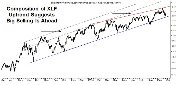
Starting out with a roughly 19-month daily chart of XLF, it appears to show a nice uptrend, but appearances can be deceiving and the XLF’s chart is no exception considering that its “taper tantrum” uptrend is narrowing in not one but two areas over the last year and a half as pointed out by the two arrows.
But funny enough, the clear Rising Wedge shown above is only the finale to the XLF’s Rising Wedge up and out of the 2011 correction. This “middle” pattern truly demonstrates what a narrowing uptrend looks like and particularly one that is clearly reversing on the ascending but sideways trading action of the more recent Rising Wedge that is not marked in the weekly chart on the following page.
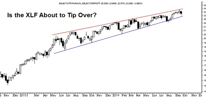
Put otherwise, the Rising Wedge shown in the chart on the previous page is the pattern to reverse the uptrend of the Rising Wedge in the chart below.
This speaks to a loss of certainty and enthusiasm on the part of the buyers behind this uptrend and tells us that these investors are buying the XLF but without really knowing why or feeling particularly good about what they are doing.
It is precisely this sort of unknowledgeable buying action that is a classic topping symptom of a mania prior to its reversal back down. This shows technically in the fact that XLF has not been trading in a bullish Ascending Trend Channel over the last18 months but rather in a bearish Rising Wedge that often results in a significant reaction to the downside.
Evidence of this formation is exhibited not just by the narrowing uptrend but by XLF’s failure to trade up into an Ascending Trend Channel last fall and again this spring. Rather than buying the XLF up to the point that would match the parallel resistance of an Ascending Trend Channel, investors have taken profits a bit earlier as short sellers have tried to take advantage of that modest weakness. This dynamic has resulted in XLF falling short of levels shown by the two top trendlines, and thus the appearance of a bearish Rising Wedge.
But just what does the XLF’s Rising Wedge mean from a practical standpoint today? Well - before talking levels and targets, itis important to pinpoint exactly which Rising Wedge in the XLF you want to know about.
That’s right. Shares of XLF have traded in such an artificial and unnatural manner over the last five and half years that there’s not just one of these bearish patterns lurking out there but three.
Now with QE3 about to end in 2014, history and the charts suggest that the bank stocks are about to falter if not fold.
Let’s start out with the most recent pattern and the one shown on the previous page. Its narrowing uptrend presents more clearly in the weekly chart below and provides a sense for just how fragile the financials are. It would not take a lot for the sellers to “tip” it over.
Needless to say, this chart shows a boom, bust and boom cycle in the financial sector with the latter dynamic reflected by their inflation of the financial sector from the crash that started in earnest in 2008. It makes one wonder whether another “bust” is next?
Currently, the XLF is clinging to that aforementioned reinflation uptrend but the various regions of narrowing suggest this is tenuous at best with the entirety of this structure suggesting some sort of a reversal back down toward the 2009 lows is not out of the question. Clearly that sort of a decline would be devastating from current levels but, interestingly not nearly as devastating as the crash that happened into that nadir bottom.
Ahead of a potential crash scenario playing out in the financial sector, however, it is important to consider the medium-term and this takes us back to the most recent Rising Wedge and a pattern that carries a full target of about 17.75 or a decline of about 25%. This possibility is consistent with my expectations for the broader equity markets.
One potential impetus for this sort of a correction could be a disappointing Q3 earnings season from the banks or even headwinds of some sort ahead. But probably the real reason for this sort of a potential correction in the financial sector is the most obvious reason and this is the end of QE3.
It goes without saying that the big banks have been a big beneficiary of the roughly $4.5 trillion pumped into the system over the last five and half years and it is about to come to an end - again.
When QE1 came to an end in 2010, the banks stocks declined by more than 20% and when QE2 came to an end in 2011, the bank stocks corrected by 36% and far more than the S&P’s roughly 20% correction that year.
Now with QE3 about to end in 2014, history and the charts suggest that the bank stocks are about to falter if not fold.
As always, thank you for taking the time to read this month’s piece.
********
Courtesy of http://www.peaktheories.com
More from Silver Phoenix 500