The Big Wave Prospect Of Silver In 2016


"Instead of bronze I will bring gold, And instead of iron I will bring silver.” Isaiah 60:17
The price movement of silver goes with that of gold. Gold price has a high volatility compared to the equity markets like DOW, but the silver price has an even higher volatility. While the Dow index prefers low volatility, i.e. DOW in counter correlation with the VIX index, the gold and silver prices thrive with high volatility. This phenomenon is in rhyme with the current global financial turbulence and competition in currency devaluation. We expect the silver market will be a bigger wave than the ones we discussed earlier on this website.
In this article we continue to use our special Fourier analysis to determine the timing and the price level of silver by the end of 2016. First we use the traditional trend line analysis to gauge the relative strength in gold and silver prices. Second, we use Fourier cycle analysis independently the rise prospect in silver.
Traditional Trend Line Analysis
There are already a number of fine and compelling articles published here on the fundamental reasons why gold and silver will rise in value. Here we take a pure technical approach. Below are 2 charts comparing gold and silver price. They showed that the silver price will outperform the gold price by this year and beyond.
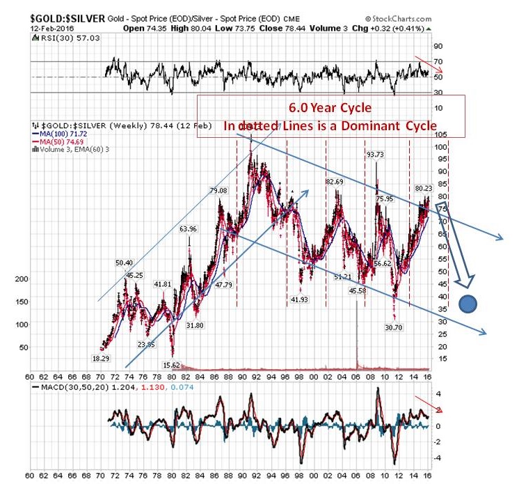
Gold to Silver Ratio
Currently, the gold/silver ratio has reached the top trend line marked in blue. The ratio will start to decline soon. The decline will continue into 2020. The dotted red lines present the 6 year cycle with more discussion in the next section on Fourier cycle analysis.
Ratio of CEF Fund to Gold
The Central Fund (CEF) is a fund investing in gold and silver in equal value amount. The ratio of CEF to gold is revealing for its oscillation between the 2 blue lines. This makes it quite predictable.
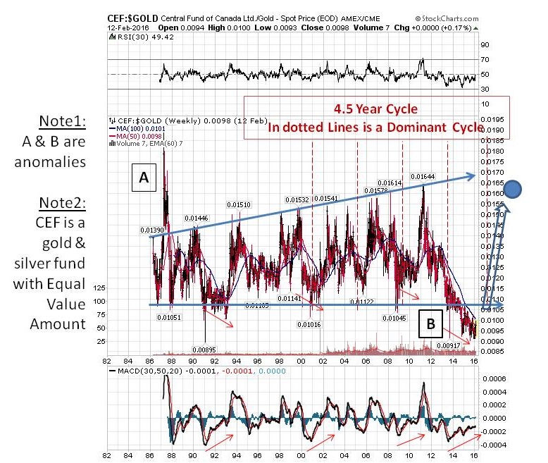
- Since CEF fund contains gold and silver in equal value, the ratio CEF/gold also reflects the rise and fall of silver price with respect to gold. With 2 exceptions shown in the chart, the regular oscillatory (up and down) movements of the ratio are confined to the extremes of the two blue lines.
- One exception is in year 2015 when the ratio hits below the lower blue line. While we do not wish to speculate the fundamental reason e.g. manipulation for this rare case, this decrease in 2015 gives more impetus for silver to rise very soon in 2016.
- Note that there is a dominant cycle of 4.5 years for the ratio series. This implies that the ratio will rise dramatically by the middle or 3rd quarter of 2016.
- This and the above ratio charts are consistent. Both point to a bigger wave for silver price this year.
Fourier Cycle Analysis on Silver
Second, we clarify our approach to technical analysis based on special Fourier transformation:
- We do not use cycles as inputs. The cycles are outputs. The dominant cycles are internal to the time series. Technically speaking, the time series and the cycle (frequency) domain are dual in nature.
- We found in our market analysis, there are usually a set of dominant cycles for each market. Given our current limitation in computing, we impose and select a maximum of 6 dominant internal cycles for our analysis.
- In practice, for many markets there are usually 2 to 3 dominance cycles.
- The fractal nature of the markets lends itself to computation and validity checks.
In this section, we present the results of our analysis on silver and silver mining.
Summary of Silver Wave Analysis
Highlights of Analysis
Gold/Silver Ratio
Our cycle analysis of the ratio showed that silver will start to outperform gold soon.
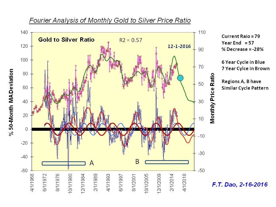
- The 2 dominant cycles, namely 6-year and 7-year cycles are shown. They are close together both in time span and in amplitude strength. So it is not correct to assume one cycle in the ratio.
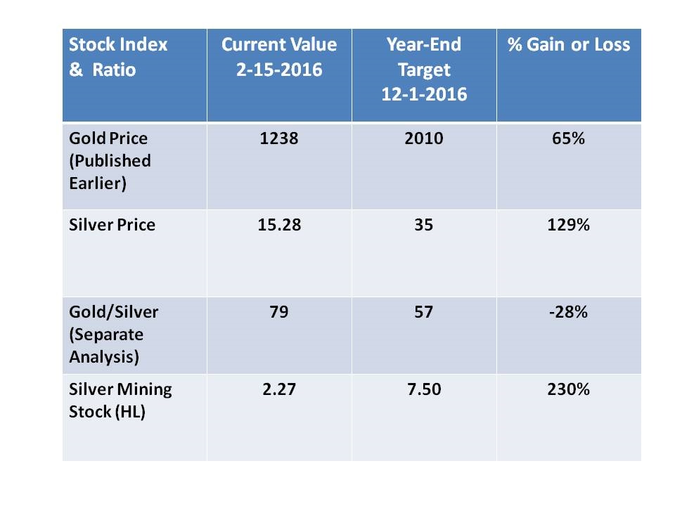
- The ratio will decline from a value of 79 to 57, representing a relatively large decline of 28%.
- There are 2 regions, marked with A and B, showing similar patten. Earlier we noted that the potentially explosive rise of gold price look similar to the rise in 1980’s. We do not wish to participate in the inflation versus deflation debate, as there are analysts with more expertise in the area.
Silver & Silver Mining Analysis
The following two charts are results of our analysis on silver and HL mining stock:
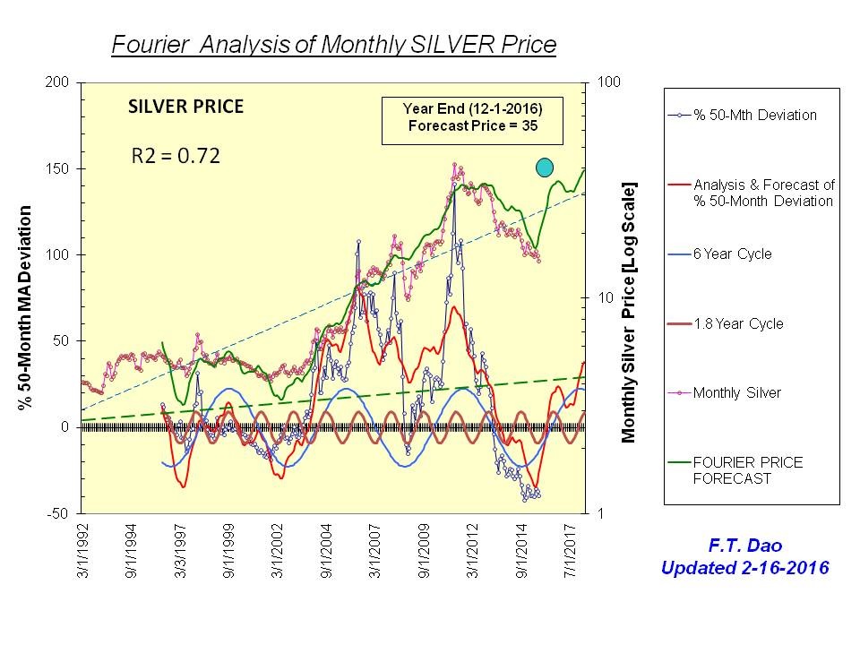
- The silver will rise from the current 15.28 to a year-end value of 35, representing an increase of 129%. This increase compares to 65% for gold. This increase also comes with high volatility and a measure of risk. The issue of rewards versus risk will be treated later and not in this article.
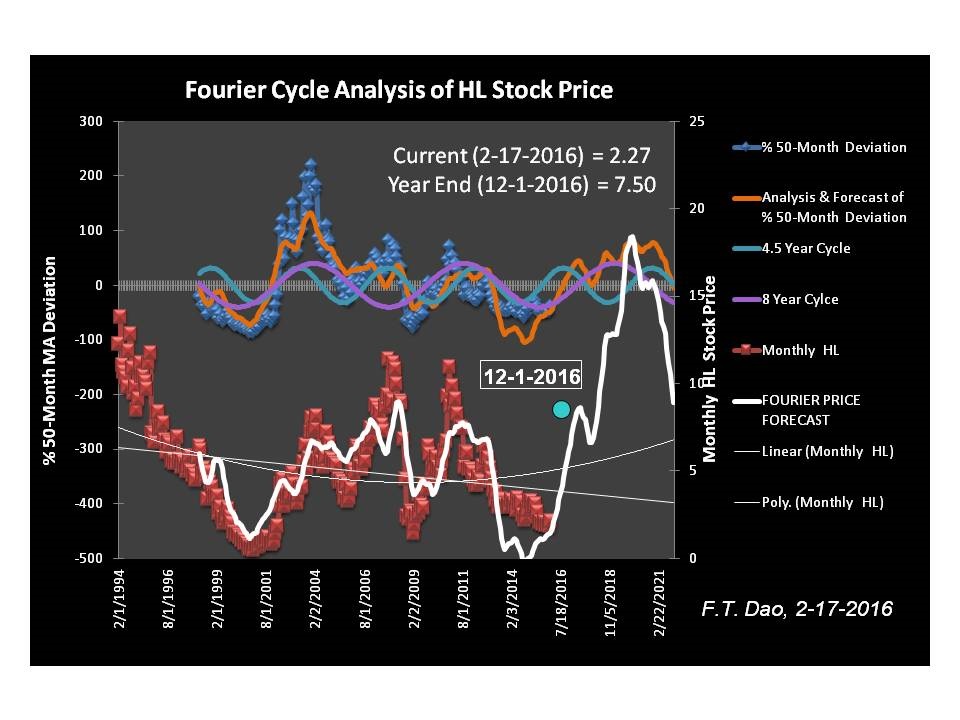
- As an example of the rise in silver stock price, we used HL for its long historical data. The rise of this mining stock is more dramatic and represents a gain of 230% from the current level to year end. Again, the HL has higher volatility in its rise.
The Next Step
We plan to improve our methodology with improved computation capability. The issue of rewards versus risk, ala the special volatility metrics, along with incorporation of cycle forecasting capability is critical in this global financially volatile environment. We believe the traditional methods in portfolio management will not work efficiently in the new environment. Our task is to come up with an improved methodology in the return-to-risk optimization. We welcome comments and potential collaboration.
More from Silver Phoenix 500