The Chartology Of A Deflationary Event


The great debate on whether we’re going to see inflation or deflation has been answered in spades. For years some of the greatest minds of our time have discussed this issue in great detail with each side giving probable reasons as to why we’ll see either inflation or deflation. Both sides can make great points to their arguments but in the end only one side will win the battle that has been raging on for years. While the fundamentalist argue their points I’m going to show you from a Chartology perspective the true story of what is taking place in this great debate.
In this Weekend Report we’ll look at some short, intermediate and long term charts for the US dollar and some commodities indexes to paint a picture of what millions of investors, from around the world are actually doing with their money. These investors leave their mark on a chart that show up as short term battles to longer term wars that can last for years. These battles and wars create chart patterns that define the winner and looser of each encounter.
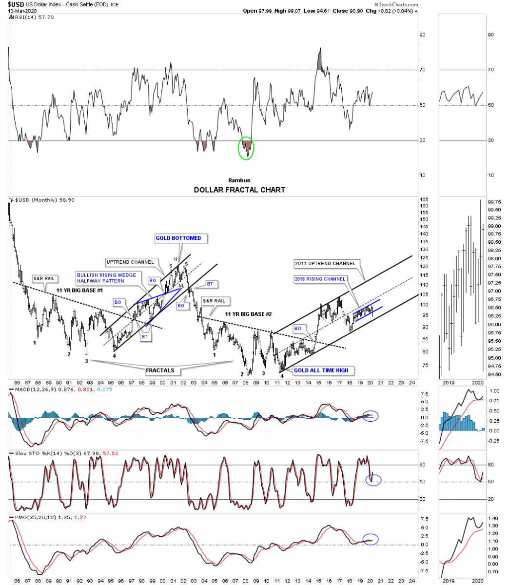
To understand the deflation scenario we are in let’s start with a few charts for the US dollar. This first chart is the 25 year monthly fractal chart we’ve been following since 2014 which shows the 2 fractals, big base #1 and big base #2. Our last deflationary event took place when the US dollar broke out from big base #2 in September of 2014. That impulse move began the 2011 uptrend channel that has been in place ever since. The blue rising channel is the same rising channel we were following on the daily combo chart that had the UUP on top with the HUI on the bottom. As you can see there was a small false breakout below the bottom rail of the blue rising channel that was negated when the US dollar traded back inside of the rising channel. Note where the US dollar was when gold bottomed in 2000 then note where the US dollar was when gold topped out in 2011. This shows us that over short periods of time these two can run together but over the longer term there is a distinct inverse correlation. Until the US dollar breaks below the bottom rail of its 2011 uptrend channel we have to assume the US dollar’s bull market remains intact.
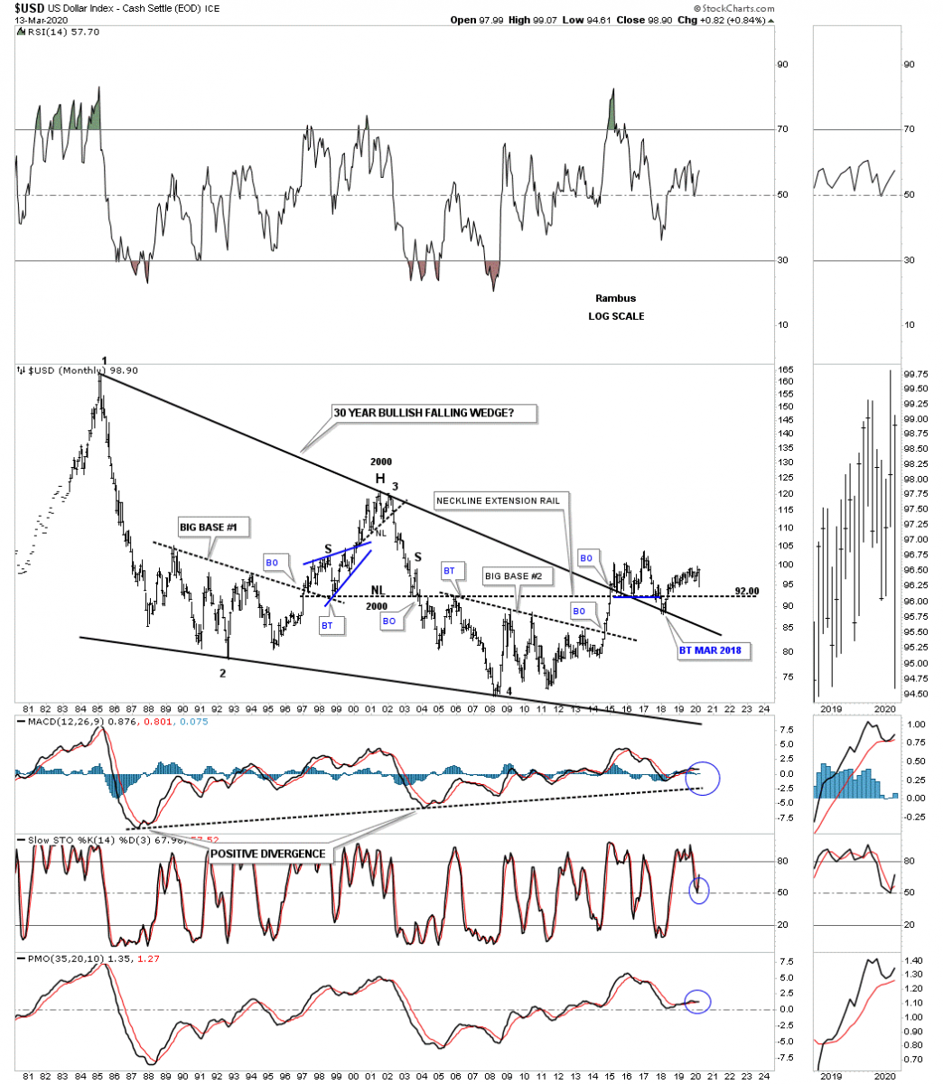
There was another long term chart I built for the US dollar back in 2014 which was the 30 year bullish falling wedge which got a lot of snickers when I first posted it. Keep in mind I posted this chart before the breakout of the top rail. After the breakout above the top rail the question then became will it hold support on a backtest from above? As you can see it has held on 3 separate occasions so far with the last backtest in February of 2018.There was another layer of support at the Mar 2018 backtest area which was the 2000 H&S top neckline as shown by the neckline extension line.
There is another US dollar index I follow which is a little more equally weighted that is the USDU. Last week it broke out from a bullish rising wedge that began to form in late 2018.
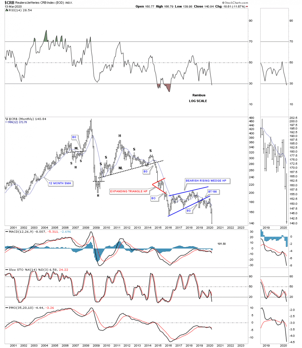
With the US dollar showing strength since 2011 let’s look at some commodity indexes to see what shape they are in starting with this monthly chart for the CRB index. First note the right shoulder high in 2014. That is the point where the last deflationary event started which ended in early 2016. For the last 4 years the price action has chopped out a large H&S consolidation pattern with the breakout below the neckline last month.
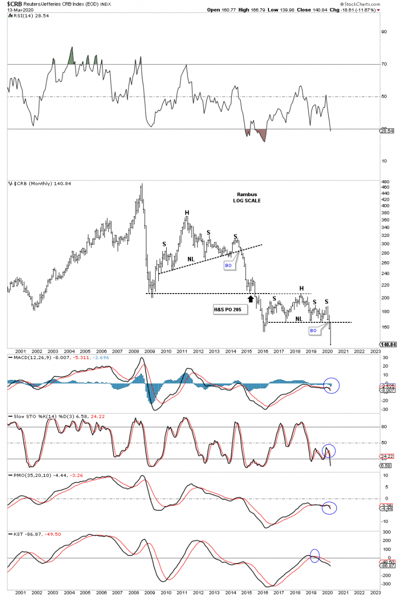
There is also another important chart pattern that has formed since the 2016 low which is a bearish rising wedge.
The most important commodity on the planet is oil which can tell us a lot about the economy. In a strong growing world economy there is a big demand for oil which causes the price to go up. On the other hand when the world economy is weak that strongly suggests a weak oil pice. Below is one of the charts for the WTIC we used back in the last deflationary event that began at the red circle at the top of the 5 point triangle reversal pattern. The red circle just shows weakness as the price action failed to reach the top rail which can be a precursor to the completion of a pattern. The thin blue dashed upslopping trendline was the first area we were waiting to give way. Then came the bottom rail of the 5 point triangle which had a perfect breakout and backtest as shown by the blue circle. The triangle price objective was achieved in January of 2015 at 44. It took almost another year before the final low was reached in February of 2016.
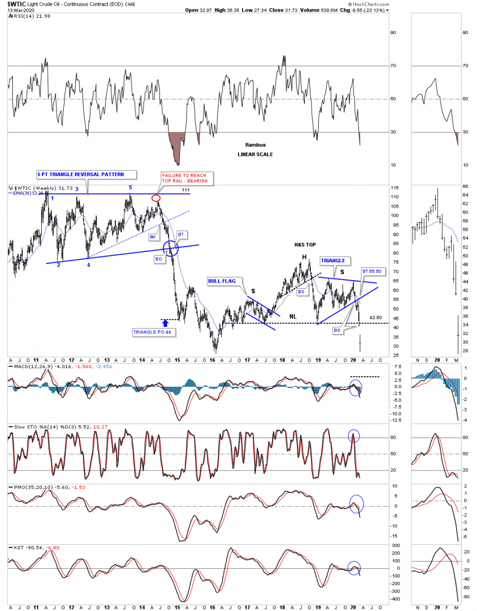
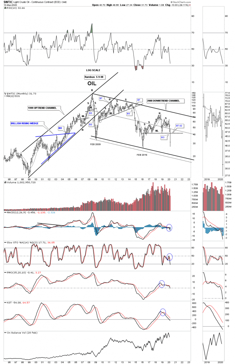
Many times when a stock is building out a multi year chart pattern it can be made up of several smaller individual patterns. You can see this on the H&S pattern on the weekly chart above which has a bull flag left shoulder and the blue triangle right shoulder. Below is a 25 year monthly chart for WTIC which shows the 1999 uptrend channel that ended with the small H&S top in 2008. That small H&S top in 2008 was made during the same time as the stock markets and PM stock indexes which led to the infamous 2008 crash which was, by looking at this chart, was the birth of the deflationary environment we currently find ourselves in.
After the 2008 crash ended in February of 2009 came the countertrend rally which ended up backtesting the bottom rail of the 1992 uptrend channel on multiple occasions, but could never break through above it. Then WiTC began to build out a very long drawn out trading range which eded up being a 5 year H&S top. That H&S top was one of those very large patterns that you spot early on and then have to wait for it to finally complete, testing your patience to the end, but the wait was finally worth it.
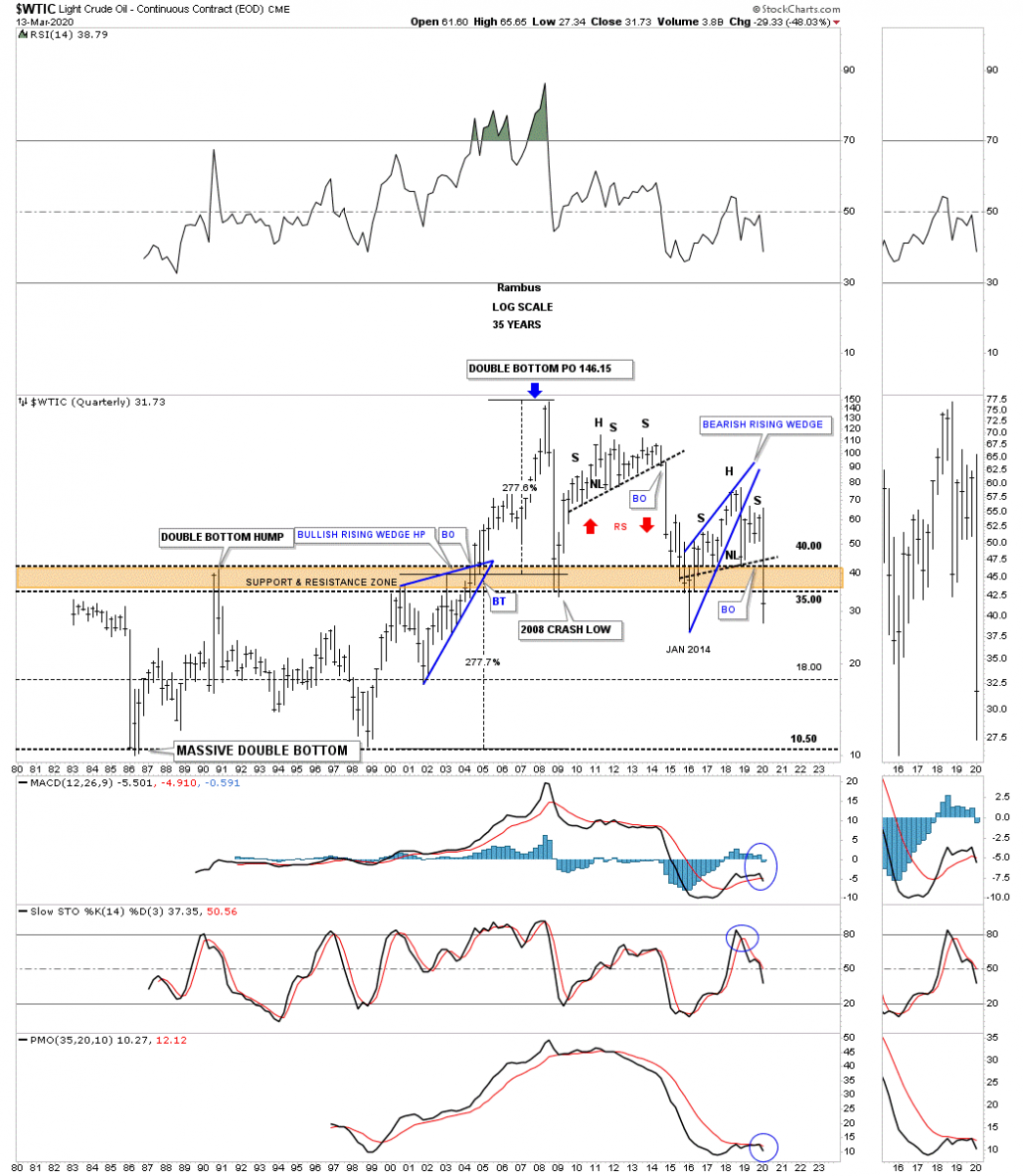
This last chart for WTIC is a 35 year quarterly chart which shows some classic Chartology. From the early 1980s WTIC formed a massive double bottom which finally completed in July of 2004 which launched oil on its parabolic run to its all-time high at 147 in July of 2008. Note the width of that massive double bottom which was 277%. When you add 277% to the double bottom breakout point above the double bottom hump trendline you get a price objective up to 246. As you can see the 2008 high came just in time for the 2008 crash during that deflationary decline. You can see how the 5 year H&S top we just looked at on the chart above fits into the big picture. The red arrows show you a good example of reverse symmetry, how oil went up is how it came back down over the same area.
Just like the CRB index we looked at earlier I was looking for support to come into play at the brown shaded S&R zone and just like the CRB index the price action punched through a bit before reversing back up. Like most commodities at that time oil bottomed in January of 2014 and began to build the blue bearish rising wedge which ended up being part of the classic H&S top. During the formation of a classic H&S top the left shoulder and head form inside of the rising wedge with the right shoulder high forming around the bottom rail on the backtest. Is it possible that WTIC is going to reach its all time lows going all the way back to the 1986 low before this deflationary cycle is finished?
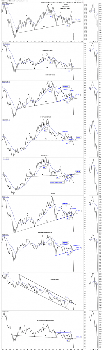
Below is the weekly combo chart for many different commodities indexes we’ve been following. I’ll let this chart speak for itself.
There is one last chart that I needed to get posted tonight which is a long term monthly chart for the HUI. All I can say is watch the bottom rail of the 2016 black triangle. Last week the HUI completed 4 reversal points which makes the black triangle a consolidation pattern to the downside. This is where the bulls have to step up to the plate in no uncertain terms and rally the HUI off that bottom rail to avoid a breakout. Please everyone stay safe and watch out for your family and friends. All the best…Rambus
*********
 Rambus Chartology is Primarily a Goldbug TA Site following the precious metals markets. Chartology is the Unique Blend of Technical Chart Pattern Identification and Market Psychology, Developed by Rambus During the Tech Mania of the late 1990s. His Early Training came the old fashioned way...Reading Edwards and McGee's Bible of Technical Analysis and spending years with a sharp pencil graph paper and ruler refining his skills and accuracy. Visit the Rambus Chartology website at http://rambus1.com/.
More from Silver Phoenix 500


