The Dow Jones 1885 To 2015


Ever since the March 2009 credit-crisis bottom the Dow Jones has seen solid gains. The table in the chart below displays the performance of the Dow Jones, gold, and silver along with the Federal Reserve’s massive acquisitions of US Treasury debt and the substantial increase in Currency in Circulation (CinC: the volume of paper dollars and base metal coins placed into circulation by the Federal Reserve). Without a doubt, the stock market has delivered gains far beyond those in the monetary metals, but both bullion and equities lag far behind the increases in credit created by the Fed’s quantitative easing.
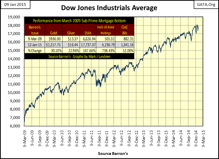
Even though the stock market may currently be rising, the dollars the Dow Jones is priced in are at risk of future devaluation well beyond its current gains. Ultimately, this reckless expansion of the Fed’s balance sheet will propel the dollar price of gold and silver to levels simply inconceivable today.
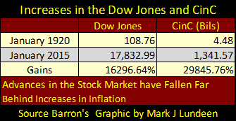
Returning to the Dow Jones; the inflationary expansion of the currency by the Federal Reserve has made the stock market a mug’s game since the 1920s as is obvious in the chart below. Increases in CinC and the Dow Jones over the past ninety-five years are an illustration of the impact of “monetary policy” on asset values. Blue-chip stocks may have seen tremendous gains since 1920, but they fall far behind the advances in currency and credit creation.
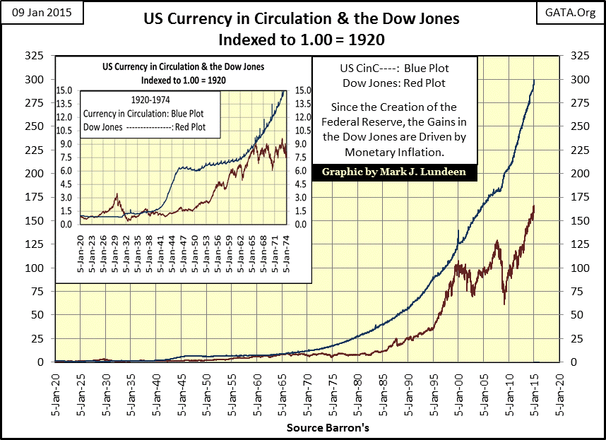
The table below lists the starting and end points in the plots above. Comparing the two answers the question: how did the Dow Jones increase by a factor of 163, to more than 18,000 in December 2014 from just over 100 just ninety-five years ago? Obviously, by increasing the supply of dollars in circulation by a factor of 298 over the same ninety-five years.
Over the long term, gains in the stock market have failed to compensate investors for inflationary losses in the dollar’s purchasing power, especially after factoring in capital gain taxes. To finance their retirement baby-boomers have been invested in the stock market since the 1980s. For most of them I suspect the promises made by Wall Street of a comfortable retirement will prove to be a disappointment.
Next we see the Dow Jones priced in constant 1920 dollars (the Dow Jones divided by the indexed value of CinC from the Blue Plot above). When adjusted for ten decades of monetary inflation, the Dow Jones’ current “lofty heights” are seen in a more realistic perspective.
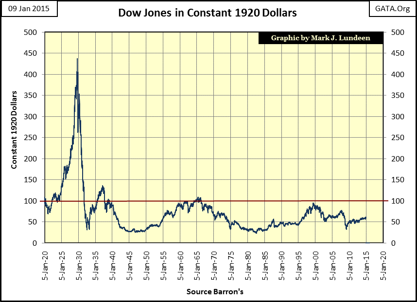
Keep in mind that $18,000 in 1920 (the current value of the Dow Jones) had a lot of purchasing power. The house I live in was built in 1910 for $500. By 2007 it had a market value of $136,000 yet was essentially the same house, only one whose valuation was greatly inflated. In 1920 someone with $18,000 could have purchased a new home plus a new automobile and still have over $16,000 remaining. The point that needs to be made is that though the Dow Jones has increased by a factor of 162 in the past ninety five years, “monetary policy” has at best made it a break even proposition considering all the risks investors assumed by investing in the stock market.
So why do people invest in the stock market? To capture inflationary capital gains and it’s been that way since the Roaring 20s. However before Congress created the Federal Reserve in 1913 the stock market was understood primarily to be an investment vehicle that provided a greater rate of return for income than the bond market. But dividend income has risks that bonds don’t.
Bonds are a contract for debt providing fixed income guaranteed by law, while stocks provide dividend income that are only a discretionary profit sharing program managed by a company. No profits = no dividend income. But bond holders can (and would) sue a company for breach of contract if they ever fail to pay a coupon when due. Before President Obama overturned hundreds of years of common law in 2009 when GM failed to pay its bond holders by giving GM’s assets to its unions, bond holders could force a company into liquidation to honor their bonds at the expense of the company’s owners: the shareholders. This is no longer so.
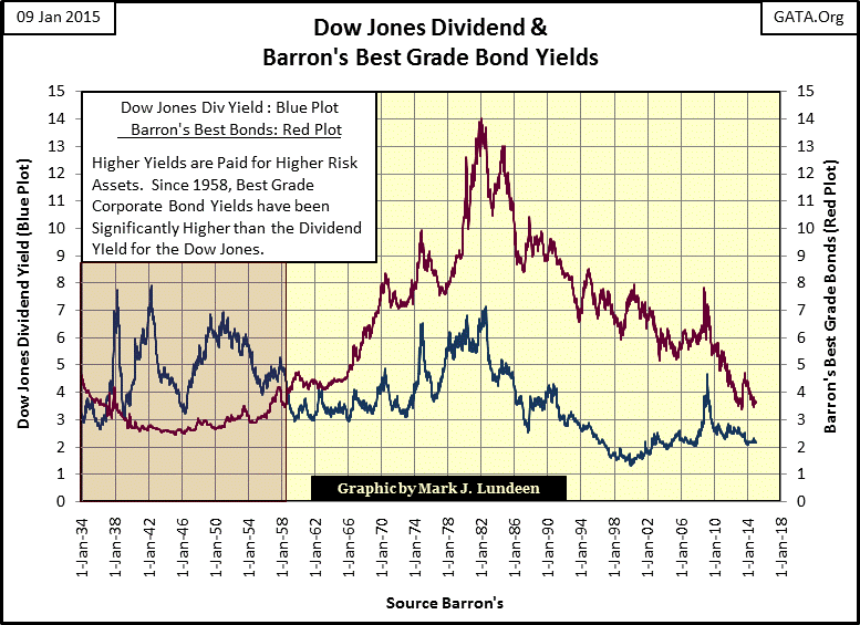
Here we see a chart plotting yields for Dow Jones dividends versus Barron’s Best Grade Bonds from 1934 to present. Seldom remembered today is the market’s old rule-of-thumb that higher risks must be compensated with higher yields. That is still as true today as it was long ago. This chart illustrates a fascinating market fact; since 1958 monetary inflation has made best-grade bonds a riskier (higher yielding) investment than dividend paying blue chip stocks. From 1958 through 1981, when bond yields increased to double digits from less than 4%, the bond market became a slaughterhouse for private wealth. Today, with best-grade bonds once again yielding less than 4%, it would be foolish not to expect a similar catastrophe in the fixed income market when bond buyers once again demand an appropriate, double-digit inflation premium.
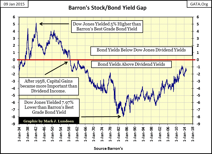
Next is Barron’s Stock/Bond Yield Gap, published for decades in their Weekly Bond Statistics using a ratio of the above two yields. It’s pretty obvious that since 1958 when the Dow Jones’ dividend yield fell below the yield for Best Grade Bonds, investment decisions to purchase blue-chip stocks were driven more by the desire to capture inflationary-capital gains than for dividend income.
The reason for this shift in market strategy, from dividend income to capital gains, becomes obvious when we look at the valuation of the Dow Jones from 1885 to 1959 below. Prior to the creation of the Federal Reserve in 1913, capital gains were never the dominant consideration in the stock market, and wouldn’t be until after the bear market bottom of 1921 (dashed line), the starting point of the inflationary bull market of the 1920s.
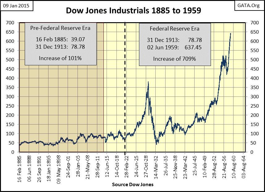
Without a doubt, something changed after 1921 in the stock market; and that something was Federal Reserve “monetary policy.” One could look at the rising valuation in the Dow Jones chart above as wealth created by corporate America. However as far back as 1957 the cost-of-living was rising faster than personal income, and frequently capital gains. This quote from 1957 by George Burns makes the point.
“The real problem with retiring is money. Most people save their whole lives to retire in the same style they enjoyed when they were working, only to realize that they can’t live like they used to even while they’re still working. You see these ads for retirement and they always have fishing boats in the background. That is because for $120 a month, fishing is the only way retired people can feed themselves.
- George Burns: Burns and Allen Show Season 8 Episode 9, 1957
Sixty years ago retirement was possible, if not comfortable, on a mere $120 a month. So is the Dow Jones at 18,000 today really worth celebrating? Well, when one considers just how the Dow Jones managed to reach its current lofty level, any rational person has plenty of reason for concern.
“Thank you, Fed! Stocks have best day of 2014. The Federal Reserve is going to take its sweet time raising interest rates. And the market couldn't be happier.”
- CNN Money: Dec 17, 2014 4:26pm
“Lord, what fools these mortals be!”
- Puck: Shakespeare’s A Midsummer Night’s Dream
Here’s the Bear’s Eye View (BEV) of the Dow Jones data from the chart above. What’s a BEV chart? It’s a technique to remove decades of inflation from a long term data series. Each data point is expressed as a percentage with new all-time highs expressed as Zero%. Daily closes not making new all-time highs are expressed as a percentage decline from the last all-time high. I like to think of a BEV plot as the view Mr Bear has of the market. Mr Bear doesn’t care about new all-time highs; they’re all big fat Zeros to him, he’s only concerned about how many percentage points he can claw back from the bulls. As seen below, the BEV plot beautifully illustrates the changes in the stock market made manifest by the Federal Reserve. After the inflationary 1920s (when for the first time in history daily new all-time highs became routine), came the deflationary 1930’s. After the Great Depression, the Dow Jones would not see another new all-time high until 23 November 1954.
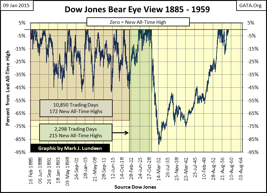
One must compare the Dow Jones BEV chart with the Dow Jones nominal values as published to fully appreciate how drastically the stock market changed after the creation of the Federal Reserve.
Before 1921 we see in the prices as-published chart that bull markets did push the Dow Jones values to new all-time highs, but nothing like the inflationary extremes seen during the 1920s! In the BEV chart (red shaded area), we see that once a bull market began delivering new all-time highs (BEV Zeros) a market decline of over 40% was soon to follow. During the Roaring 1920s bull market (green shaded area) once the Dow Jones began making new all-time highs in December 1924, it made only one correction greater than 15% (April 1926), before advancing another 180% to its bull market peak in September 1929.
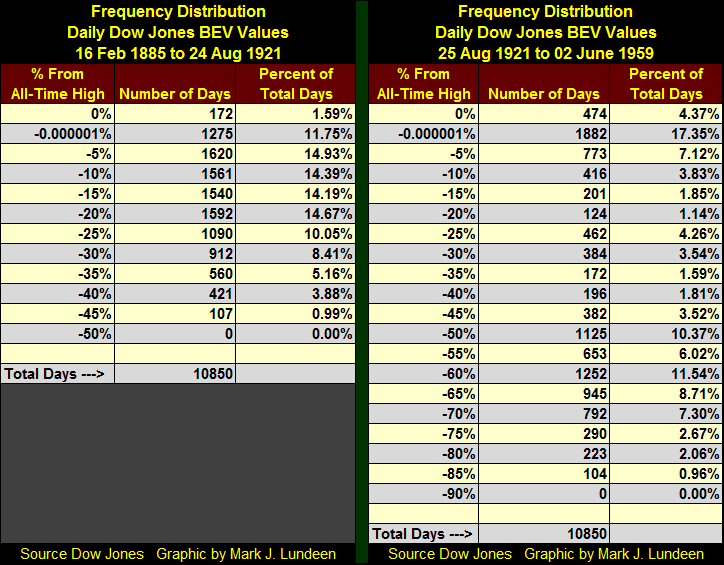
Let’s study the Frequency Distribution of the Dow Jones BEV values in the chart above. The two tables below each cover 10,850 trading days; from February 1885 to August 1921 and from August 1921 to June 1959. The 0% row lists the number of new all-time highs the Dow Jones made in these time blocks. To make the 0% category specific to new all-time highs (0% and nothing but 0%), I included the -0.000001% category, which contains every daily closing just short of being a new all-time high through daily closings just short of -5%. The next row (-5%) contains all daily closings from -5% to just short of -10%, and so on down the table.
The BEV data above and below makes the case beautifully that monetary inflation made the 1920s “roar”, but the consequence was the depressing 1930s. Looking at the chart below, the question I have is that if the “Roaring 20s” bull market (Far Left Circle) resulted in the 90% collapse in the Dow Jones during the 1930s, why didn’t the High-Tech bull market (big circle to right) result in a similar collapse?
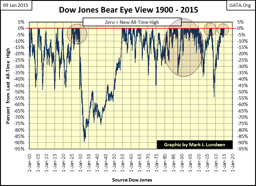
I’m sure it would have, had the idiot-savants managing “monetary policy” not inflated another bubble in the sub-prime mortgage market (next circle). Deflating the mortgage bubble resulted in the second deepest bear market in the Dow Jones since 1885, as is evident in the BEV chart. Had Congress not delivered the Treasury Secretary, Hank Paulson and Fed Chairman, Dr Bernanke a multi- trillion dollar monetary bazooka on live TV to slay the dragon of deflating asset values in 2008, I’m certain that the Dow Jones would have continued its collapse far below its 53% bottom in March 2009. Currently the “policy makers” and their colleagues in Europe and Japan are working on the biggest bubble of all; inflating the valuation of everything traded everywhere; stocks, bonds, and real-estate in a vain attempt to prevent a quadrillion dollars of notional value derivatives from coming into the money.
Their success in manipulating global markets to their own ends has so far been impressive, but some day something will trip them up. That’s when Mr Bear will be clawing back the bulls’ inflationary capital gains in a historic catastrophe that just may dwarf the Great Depression.
Mark J. Lundeen
More from Silver Phoenix 500


