Examining The Stock Market With The Dow Jones Total Market Groups
 share
share
 share
share
 share
share
 share
share
 share
share
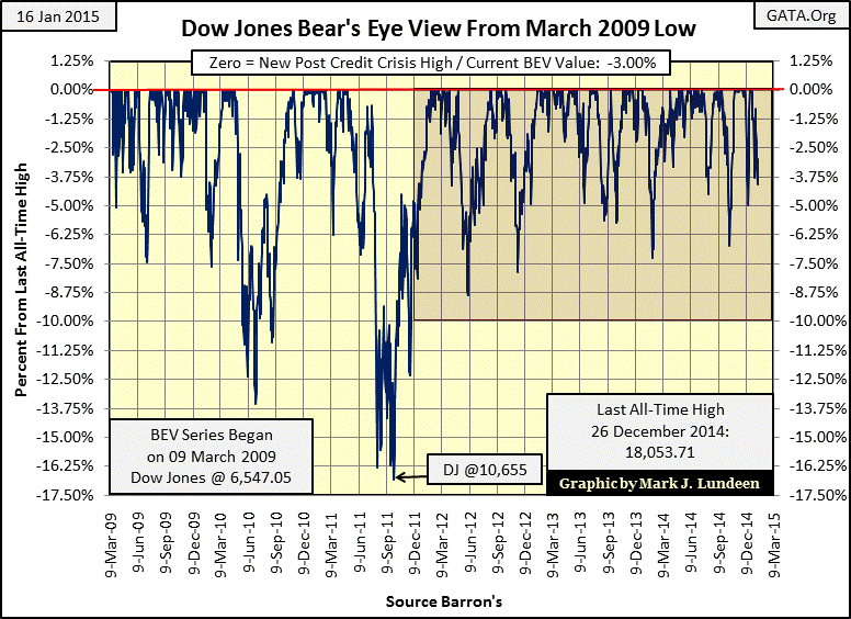
Listening to the financial media this week might lead one to believe that the stock market is in trouble. After all, for years now the “policy makers” have been inflating market valuation far above the point of prudence. Reasonable people really do have good reasons to fear any indication Mr Bear might be returning to savage the market: for instance, a 300 point decline in the Dow Jones. However with the Dow Jones hovering around the 18,000 level, down days of 200 or 300 are not particularly significant.
Consider this: from September 1929 to July 1932 the Dow Jones lost 340 points, an Earth shaking event which wiped out 89% of the Dow’s value. Today a daily decline of 300 Dow points is only about a 1.6% decline. Even after this week’s “big-down days” the Dow Jones still closed the week only 3.00% from its last all-time high. So keep in mind that after decades of inflationary “monetary policy” by the FOMC, a 300 point decline in the market just ain’t what it used to be. Until we see the Dow Jones breaking out of its three year old box below, (a 10% or 1,800 point decline from the Dow Jones’ December 2014 highs: DJ @ 16,250), there is no reason to believe the “policy makers” are losing their grip on the stock market.
That is not to say I’m recommending stocks as a buy. My advice is if you’ve got stocks in your investment portfolio, now’s a good time to sell them while you still can at these levels. Selling stocks and buying gold and silver bullion seems the thing to do in 2015. After you have a core position in actual physical metal (no ETFs), you might want to begin looking at the precious metals miners.
As I’ve said, the stock market may be in trouble. David Stockman certainly sees problems arising in his recent article on Alcoa’s earnings titled: It’s Earnings Season—So Here Come The Crooks, Led By Alcoa. Mr. Stockman’s analysis of Alcoa’s accounting, and the stock market in general is damning. However, Wall Street has foisted duplicitous accounting on a trusting public ever since the “policy makers” first began inflating a bubble in the housing market over two decades ago. Never forget that Washington’s “regulators” did nothing as Wall Street marketed trillions of dollars worth of criminally toxic mortgages as AAA Rated investments for six years, while not one single banker, or government regulator went to prison. In fact Washington’s elected officials bailed the rats out with taxpayer money.
Now, many years later it seems that as long as share prices keep advancing, no one seems to care. And just as we saw during the glory days of the sub-prime mortgage market, today we again find Washington’s “market regulators” and elected officials among the “blissfully ignorant.” But they know what is going on.
Still, the day is soon coming when the market will care. So this seems a good time to lay down some bench-marks of the current stock market bubble using data from the Dow Jones Total Market Group (DJTMG). Barron’s began publishing this data series (weekly closing prices) in October 1988. However there have been so many changes in its format over the past twenty seven years I find my data not exactly the same as in the link above.
In 1988 there were two DJTMG groups for computers, one called “Computers” and the other “Computers without IBM”, but the computer industry group without IBM became invalid by 2000 and computers in general was discontinued sometime after. Not wanting to let decades of good data go to waste, I’ve extended the current group called “Digital Equipment” deep into the past using data from the now defunct “Computers” group. Barron’s purpose is to supply data that reflects the current market, while I’m primarily interested in historic data that spans decades. So if you should compare the group names listed on my tables below with Barron’s current DJTMG data, there are some unavoidable inconsistencies.
The Dow Jones contains only thirty large blue-chip companies. Some people complain that the Dow Jones is an antique, and so prefer the S&P 500 which contains the 500 largest companies trading in the stock market. Although there’s some merit to this, history shows that the Dow Jones will be seen marching in lock step with any bull or bear market tracked by the S&P 500.
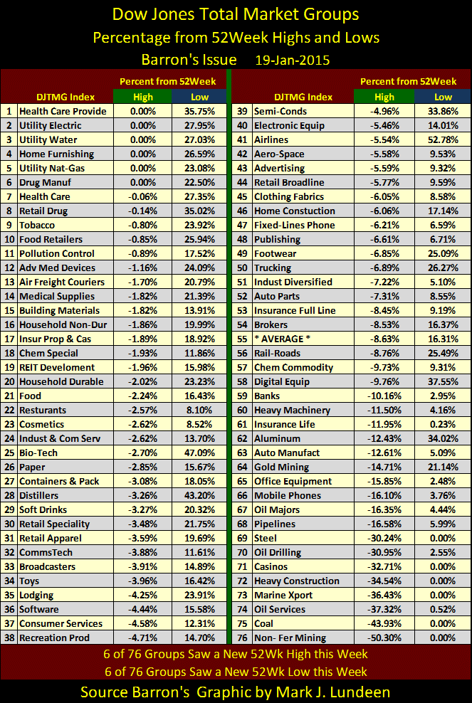
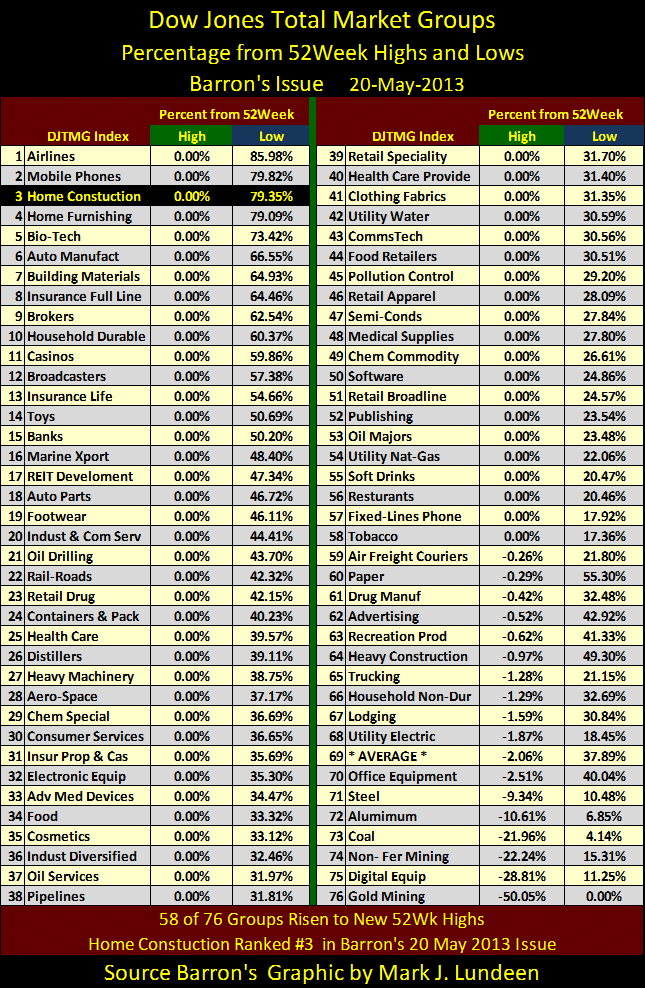
But investors have the same problem with both the S&P 500 and Dow Jones since both attempt to express general market conditions using a specific number calculated and published at the end of the day. The data for the DJTMG slices the stock market (and the economy) into many different groups. Here’s my table for the DJTMG 52Wk Highs and Lows from Barron’s 19 January 2015 issue. We see at the end of this week that 58 of 76 total groups are currently within 10% of their 52Wk Highs, with six groups actually at new 52Wk highs for the week and six making 52Wk Lows.
Although this is not exactly a hot market, we can safely conclude that the “policy makers” are successfully supporting particular market groups to maintain overall market valuations at their inflated values – for now. I also note that the gold miners (#64) are no longer bringing up the rear, as they have been for the past few years. Taking the gold miners old position is Non-Ferrous Mining (#76). This group is currently down over 50% from their 52Wk High and made a new 52Wk Low at the end of the Week.
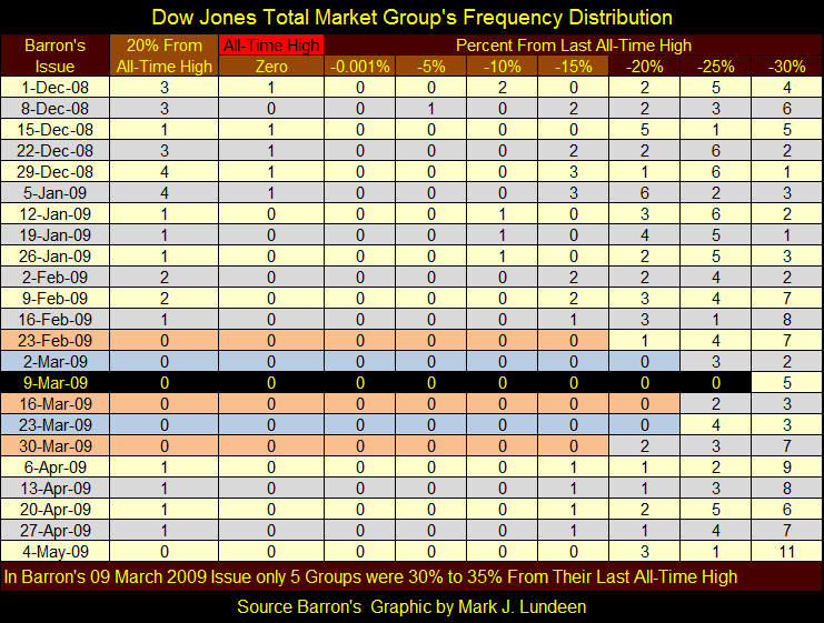
I like analyzing the market with my Bear’s Eye View (BEV) format, which compresses historical data into a range of 100%; 0% for new all-time highs, -100% for a total wipeout in valuation with percentage declines for everything in between. Here’s a table showing the Bear’s Eye View frequency distribution for the 76 groups in DJTMG data since the beginning of September.
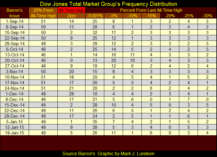
New all-time highs are seen in the “Zero” column, which I’ve plotted in a chart later in this article. New all-time highs are useful as they mark extremes in market optimism, but I believe plotting data found in my “20% From All-Time High” column (the sum of groups spanning from the Zero to -15% columns) is a better indicator of current market psychology. We’ll call this data the “Top 20%.”
The bullishness in the 1990s was remarkable, as seen in the number of groups in the Top 20%. The Red Star marks Alan Greenspan’s December 1996 speech on “irrational exuberance” in the stock market, when he asked how can we know when the market is in a bubble? With the benefit of hindsight, seeing 70 of 74 groups in the DJTMG in the Top 20% seems a good indication of “irrational exuberance.”
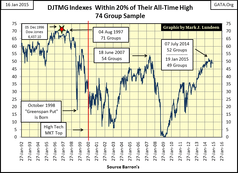
In the autumn of 1997 the number of DJTMG indexes within the Top 20% began collapsing when market bulls began focusing almost exclusively on the high-tech issues and the Top 20% plot would continue its decline until Software and Silicon Chip manufacturers topped out two and a half years later in the Winter of 2000 (Red Line). Note how after the autumn of 1997, stock bull markets would never again be as broad based as they were before.
In the summer of 2007, the housing bull market saw the DJTMG top out with only 54 groups in the Top 20%, a high point that soon collapsed as the credit crisis developed. Here is the frequency distribution for the bottom of the credit crisis where we see a historical first; for six straight weeks there was not a single index in the Top 20%. What a devastating bear market bottom!
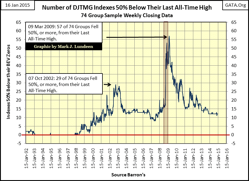
Here’s a chart for what I call the Bottom 50%, or the number of DJTMG indexes declining 50% or more from their last all-time high. Looking at the 09 March 2009 row above, you may wonder where all the groups were; far below the table’s -30% column! Fifty-seven groups had declined 50% or more, and an incredible twenty-four groups were 70% or more below their last all-time high in Barron’s 09 March 2009 issue.
This chart also shows how bullish the Greenspan-bubble years were. For the most part, from 1993 to 1998 there were no indexes in the DJTMG Bottom 50% or more from their last all-time high. Even during the best of times since 2000, that kind of market performance has never been repeated.
The March 2009 market bottom was as unusual as it was devastating. I have daily trading volume data going back all the way to January 1900, and prior to 2000 – ALL – bear markets have occurred on declining trading volume. There’s a reason why prices decline in bear markets; demand for stocks (trading volume) evaporates. Yet since January 2000, bear markets have bizarrely bottomed on historically high trading volume as shown by the Red Plot below. In the Dow Jones’ latest double-digit correction in autumn 2011, it too declined with a spike in trading volume.
If you doubt that the Federal Reserve supports inflated-market valuations during times of market distress, here’s proof in the chart below. How far would the Dow Jones have declined in 2009-10 had the “policy makers” not stepped into the breach and purchased everyone’s unwanted shares at prices no one else was willing to pay with freshly printed dollars? We’ll never know for sure but a market decline in the Dow Jones of over 70% was certainly possible.
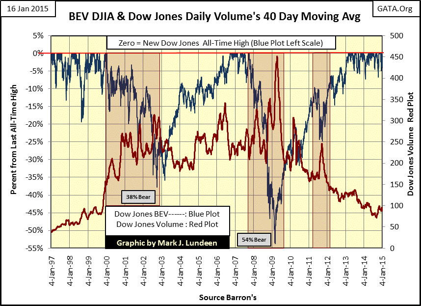
What’s truly alarming in the chart is how the Dow Jones bounced off its second worse bear market bottom in history, (a percentage market decline exceeded only during the Great Depression), to make new all-time highs just a few years later as its daily trading volume collapsed by 75%. No wonder market analysts begin to sweat when the Dow Jones falls a few percentages points from 18,000; the only thing holding this market up is the hot air blowing in from the Fed. It’s a safe bet that when the Dow Jones sees its next double-digit decline we’ll have yet another mysterious spike in daily trading volume as the FOMC “stabilizes” the market one more time.
The next chart plots the number of DJTMG groups making new all-time highs, found in the “Zero” column of my frequency distribution tables. Every bull market eventually reaches its ultimate peak in new all-time highs. Stock indexes such as the S&P500 and Dow Jones may continue to advance for months or even years afterward, but the peak in new all-time highs in the DJTMG marks a turning point in the broad market. That was certainly the case in June 1997 when 51 of the 74 DJTMG indexes made a new all-time high. After June 1997, investments in anything other than high-tech began losing money years before Microsoft and Intel topped out in early 2000.
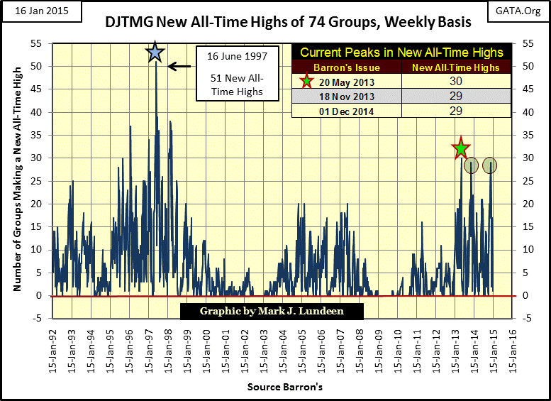
The housing bubble saw its peak DJTMG all-time highs in November 2004 with 20 of 74 indexes at new all-time highs, a sum seen again in March 2005 and June 2007, just one month before the Bear Stearns’ sub-prime hedge fund collapse. It would take six years and more “market stabilization” than the Federal Reserve is willing to admit before the DJTMG once again saw 20 of its indexes at new all-time highs. The most recent peak in DJTMG all-time highs (30) happened in Barron’s 20 May 2013 issue. That same week 58 groups also made new 52Wk Highs. In May 2013, we have to go all the way down to #72 in the table to see groups with double digit 52Wk declines. You may want to compare the 20 May 2013 table below with the 19 Jan 2015 seen above. The gold miners (#76 in May 2013) look like they’ve turned a corner.
One last chart shows the DJTMG’s 52Wk High–Low Ratio, a derivative of the 52 Week High Low data from the table above, except this data also includes the ten broad market categories listed in the DJTMG.
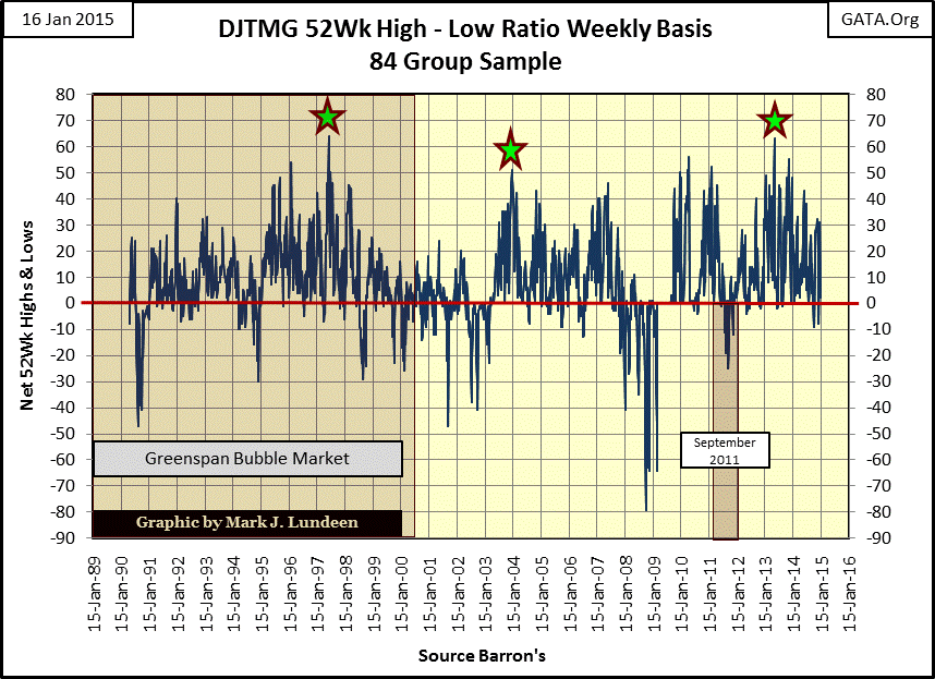
Just as with the new all-time highs, each bull market sees a peak in 52Wk Highs, which for the current bull market also occurred in Barron’s 20 May 2013 issue (far right star). But note that while new DJTMG all-time highs peaked again in December 2014 (one chart up), the 52Wk highs did not. This indicates that we are at the point in our maturing bull market where to make money one has to be in the right market group of the many available, which for the average retail investor is hard to do.
As a student of market history, one of the great lessons I’ve learned is that there are times to cash in your chips and get the heck out of the casino for a few years, and I believe this is one of those times. If you had sold Dow Jones stocks (DIA, the index fund) in September, October, November of 2007 and bought back the exact same stocks in February, March, April of 2009 you would have realized a gain of about 100% (doubled the number of your shares) while your investment funds were sitting safely in cash. If you’d sold on the Dow’s best day in October 2007 and bought back on the worst day in March 2009, you would have gained 150%. If you had done this with the S&P 500 index fund, you would have made even more.
So if you have some capital gains; take them. If you have capital losses, cut your losses and take them too. With the market at a top, and the global banking system still greatly impaired by the residue from the mortgage debacle from several years ago, moving into gold and silver bullion seems the prudent thing to do. And maybe do a little nibbling in the gold and silver mining sector.
share
share
share
share
share
More from Silver Phoenix 500