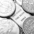
The Historic Dow Jones-Silver Ratio Points To $300 Silver


That’s correct. Going by the historic Dow Jones-Silver ratio, it points to $300 silver. This may seem outlandish or a play on hype, but it isn’t. While many precious metals analysts have forecasted high three-digit silver prices, I didn’t pay much attention to them. However, after I looked at all the data, $300 silver is not a crazy figure at all.
Let me explain. The U.S. economy suffered a fatal blow in the 1970’s as its domestic oil production peaked and inflation soared. To protect against the ravages of inflation, investors moved into gold and silver in a big way. Yes, it’s true that the Hunt’s bought a lot of silver during the 1970’s, but who was buying gold to push its price to $850 in 1980 versus $35 in 1970. Furthermore, who was buying all the oil to push its price up to $36 in 1980 from $1.80 in 1970??
As U.S. oil production and the EROI- Energy Returned On Invested continued to decline in the following decades, the American economy transitioned away from its high-paying manufacturing economy to what I call a LEECH & SPEND SERVICE ECONOMY. Thus, each new decade brought about a new bubble to keep the facade of a growing economy alive.
We had the Department of Defense Military spending Bubble in the 1980’s, the Tech Bubble of the 1990’s, the Housing Bubble of the 2000’s and now we have the Auto, Housing, College, HealthCare, Stock Market, Retirement and U.S. Treasury Bubble. The present highly-leveraged bubble will end all bubbles.
Short Term Silver Market Analysts Can’t See The Forest For The Trees
I wrote about this in my recent article, Must See Important Precious Metal Charts And Data .
Unfortunately, Mr. Weiner’s gold-silver basis charting analysis won't put food on the table when the complex supply chain system disintegrates due to the collapse of U.S. energy production. However, owning physical gold and silver at this time could help considerably.
Mr Keith Weiner and Dan Norcini both view the precious metals with blinders on. I would imagine both of these trading analysts have no idea of the future negative impacts of energy market or the ramifications of the Falling EROI – Energy Returned On Invested. Thus, they continue to make short-term forecasts as if the world will continue growing for the next century.
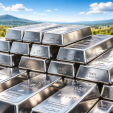
Unfortunately, most Americans have their wealth tied into financial products that have no future. Furthermore, the Auto & Real Estate Market will crash to a level that will take the breath away from even the most bearish analysts. Thus, there will be very few worthy physical assets to own at this time. The two physical assets I value the most are gold and silver.
The Historic Dow Jones-Silver Ratio Points To $300 Silver
If we look at the Dow Jones-Silver chart, we can see we are nowhere close to the 25/1 ratio of 1980:
You really can’t see the 25/1 Dow Jones-Silver ratio in 1980 as it is a small blip on the bottom left-hand portion of the chart. In Feb 1980, the Dow Jones traded at 865 points while silver traded at $35. Can you imagine that??? The Dow Jones Industrials trading at 865 points?
Then when silver reached a high of $49 in April 2011, the Dow Jones-Silver ratio fell to 250/1 from a high of 2,500/1 in June 2001. Note: I am using round numbers here showing the Dow Jones-Silver ratio. So, from 1980 to 2001, the Dow Jones-Silver ratio increased 100 times from 25/1 to 2,500/1. Then it fell 10 times to 250/1 in 2011. Currently, the Dow Jones-Silver ratio is 1,015/1.
We all know the broader markets are being propped up by the Fed and U.S. Government Plunge Protection Team. However, at some point the markets will finally resume their crash lower. If we assume that Dow Jones falls to 7,000 points, a 25/1 Dow Jones-Silver ratio would suggest a $300 silver price (rounded figure).
Unfortunately, I don’t believe the Dow Jones Index will stop at 7,000. It will likely fall much lower.
Now, why would the value of silver rise as the Dow Jones falls in value? This has to do with the massive amount of debt in the system. Here is a chart of total U.S. debt from my article linked above:
You will notice the debt remained flat in the early 1970’s but started to move up in the latter part of the decade. In the first quarter of 1980, total U.S. debt stood at $863 billion when the price of silver traded at $35. Today, the current U.S. debt is $19.2 trillion while the price of silver is less than half at $17.30. The total amount of U.S. Debt has increased 22 times while the value of silver is less than half.
Now, I labeled the chart as ENERGY DEBT because it takes the burning of energy to create “PROFITABLE” economic activity to pay back the debt. Investors need to understand it takes “Profitable” economic activity to pay back debt. We really haven’t had profitable economic activity for at least the past decade as U.S. debt would have been declining. We must remember, profitable economic activity allows debt to be repaid.
So, the Fed and U.S. Government have continued the official policy of printing money and increasing debt to continue business as usual. This has given the ILLUSION of growth and an increase in the Dow Jones Index. However, if we take a look at the Dow Jones Index below, we can see something is seriously wrong:
I have mentioned this before. However, the Dow Jones Index has been rising since the crash in 2009 on lower volume. Furthermore, the reason the Dow Jones Index has increased from 865 points in Q1 1980 to 17,663 recently was due to the massive increase of U.S. Debt from $863 billion to $19.2 trillion during the same time period. The Dow Jones Index increased 21 times while total U.S. Debt increased 22 times.
THIS IS NO COINCIDENCE!!!
Now, let’s take a look at the silver price chart over the same time period:
Not only has the current silver price fallen in half from its high in 1980, its trading volume continues to trend higher. What has happened here is this, the U.S. Government and Wall Street funneled American’s funds into financial instruments such as Stocks, Bonds and Retirement Accounts over the past 3-4 decades. These supposed financial products are nothing more than debts masquerading as assets.
Let me present the next chart on the increase in U.S. Retirement Assets:
When the price of silver traded at $35 in 1980, total U.S. Retirement assets equaled $991 billion. By the end of 2014, the total U.S. Retirement market increased 25 times to $24.5 trillion. Thus, during the time period when total U.S. debt increased 22 times, the Dow Jones Index jumped 21 times and the U.S Retirement Market ballooned 25 times.
Unfortunately, the majority of Americans are holding onto financial assets that are backed by U.S. debt that is 22 times higher than it was in 1980. There lies the RUB.
So, why will the price of silver jump as financial instruments implode? Because investors will move into physical silver in a big way as is not backed by debt. This is the same as saying, “silver doesn’t have any counter-party risk.” The counter-party risk in most financial assets is the massive debt. Here is a chart comparing a (1 oz) silver coin versus the U.S. Retirement Market:
The economic energy value of a physical one ounce silver coin is stored in it, whereas the value of the U.S. Retirement Market is based on a massive amount of ENERGY DEBT. Unfortunately, we will not have the cheap and available energy supply in the future to pay back this ENERGY DEBT.
Thus, the collapse of financial assets will occur as the value of gold and silver rise to unimaginable levels. Why? Because gold and silver will be the only few liquid stores of economic energy in the entire market.
I conclusion, I don’t know what the Dow Jones-Silver ratio will fall to. However, I can tell you it will likely fall lower than the 25/1 ratio set in 1980.
********
Check back for new articles and updates at the SRSrocco Report.
More from Silver Phoenix 500