A Long-Term View Of Silver Forecast


 Conclusion: On the long term chart of the monthly closing price of silver, the price has bottomed at the end of the five-year bear market in January and has started to reverse higher into a new long term bull market.
Introduction
Briefly, the existence of preferred gradients enable very accurate analysis of market prices over any time scale, but this works very well for really long term charts. Since prices tend to change direction at a preferred gradient, these preferred gradients that are inherent in all market prices can be used, with proper analysis, to anticipate where a price could reverse direction at some point in the future.
An analysis that confirms that the price has already reached a level where a reversal is expected, is however easier to perform and easier for readers of the chart to grasp and understand the implications. In order to do so, the reader has to understand some few basic features of preferred gradients and how they are used in an analysis.
- A preferred gradient can be made visible by drawing a trend line through some significant trend reversals; however, not all such trend lines identify a preferred gradient; a candidate line must be validated before it can be accepted
- There are many different preferred gradients in ant market price
- Different occurrences of the same preferred gradient (PG) form a set of parallel lines; if these lines are correctly located to identify a valid PG, there spacing will be in accordance with some fixed ratios
- Most common ratios are when a channel pair (which is formed by three parallel trend lines) have an even ratio of 500:500. Other common ratios are 382:618, the Fibonacci ratio and also 400:600 and 300:700. When a channel pair has a different or ‘strange’ ratio, the trend lines have to be validated by finding one or more other channel pairs with the same ratio
- Different preferred gradients are related through the Fibonacci ratio; when the gradient of a know PG is either increased or decreased by the Fibonacci ratio, the resulting gradient is also a PG
The method of analysis is to begin with a search for a master gradient, a strong PG that is validated by its ability to generate derived trend lines that also fit the chart very closely through key trend reversals. ALL other trend lines in the analysis are then derived from the master gradient. Doing so adds credibility to the analysis as this method requires good discipline from the analyst.
While a master gradient is defined between two points on a chart, derived lines are generated from a single point as origin, with a gradient calculated from the master.
Chart 1.
It has become clear over many years of study that a pattern that has been named a ‘bifurcated top’ that looks like an ‘M’ (or a low ‘W’) acts an important sign post to a strong preferred gradient. In the monthly chart below, the master gradient is drawn between the centre points of two very steep and extended bifurcated tops (x).
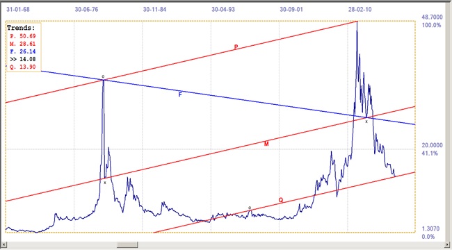
Chart 1: Silver Monthly closing London fix: Last = $14.08 (Jan. 2016)
Master gradient M is defined between the two lows marked with an ‘x’. The origins of the other trend lines are indicated with an ‘o’ and lines P and Q are parallel to line M. With lines P and M located at such prominent reversals, line Q as situated where the channel ratio of channel pair PQM fitted one of the known ratios. In this instance, the ratio is exactly the known 400:600 ratio, which implies that line Q has been located correctly and not simply to act as support near the end of the chart.
As it happens, the line has a value of $13.83 at the end of December 2015, when the last fix for the month was at $13.80, for an error of 0.025%, 213 months after the origin of line Q at the end of March, 1998.
Line F is the shallower Fibonacci derivative of line M. Its origin is the same as that of line P and line F then passes by the midpoint of the second steep bifurcated top wit an error of 0.04%. Percentages are relative to the vertical scale of the chart – not to the absolute values of the price at those points. This enables comparison between percentages across different charts with different time scales and prices.
The whole construction of the chart confirms that the pattern consists of important preferred gradients. All gradients associated with the same master gradient form a ‘family’ of gradients. Not all families exercise the same degree of influence over the behaviour of the price and not all derived in a family are the same. However, when a set of strong derived lines confirm the importance of the master gradient, these gradients tend to have significant influence over a long period of time, as happens to apply here for silver, with this master gradient defined between two key points.
Chart 2
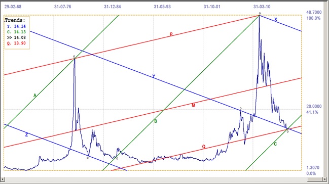
Chart 2: Silver Monthly closing London fix: Last = $14.08 (Jan. 2016)
Channel PMQ is the same as in Chart 1, with line F removed and three new channels added. The points of origin of the new lines are indicated. The ratios of the channels are: ABC: 497:503 and XYZ: 499:501. Both the channels are very close to being evenly divided, with a 50:500 ratio.
Observe that the outer two trend lines of each of the new channels span the history of the chart since the first top 26 years ago in February 1980. The accuracy of the channel ratios, with, for both channels, the origins of two trend of the lines located in unique trend reversals, implies that the third line of each channel, lines Y and C, are also correctly located.
Line C has the December low in the price at $13.80 as origin. The Trends table has a value of $14.13 for line C; the Table contains the line values for one period after the close, which in this case will be the fix prices for end of February. At the end of January, the fix was $14.08 and the value of line C was $13.98.
The future
Nothing in markets is ever 100% certain. Strange and unexpected things can crop up to upset any prediction that is made. Here, though, it is possible, given the clear and substantial evidence that silver now enjoys very firm support, to anticipate with perhaps better than 90% confidence that the bear market ended in December 2015 and that silver is to enjoy a new bull market for an extended period of time. Given the time scale of the chart, spanning some 48 years, one can speculate the new bull market may well continue for the next decade.
(C) 2016 daan joubert All rights reserved
********
More from Silver Phoenix 500