A Look At The US National Debt


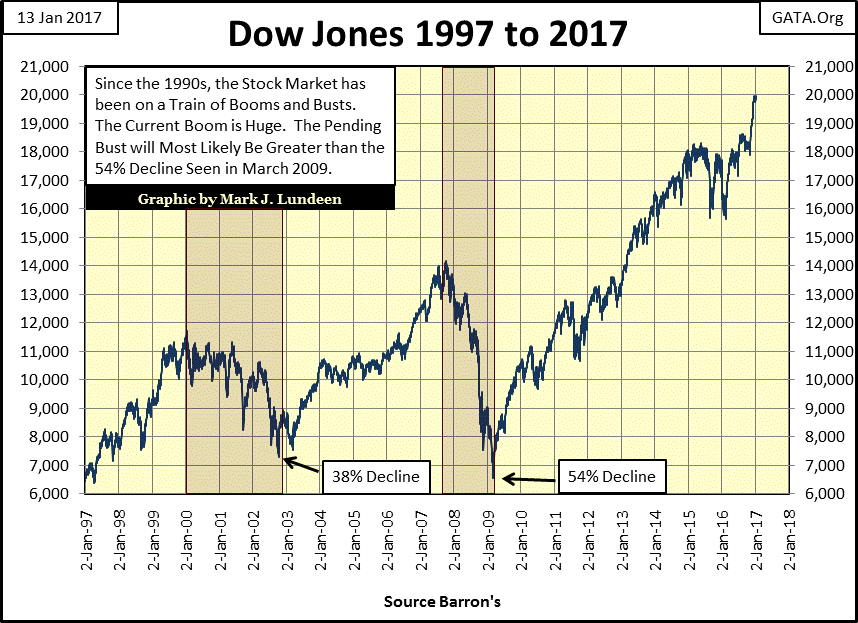
The Dow Jones is currently at historic levels, but will history record that it broke above 20,000 sometime in 2017? It certainly should.
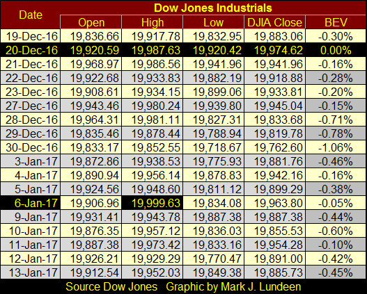
The table below gives the Dow Jones’ daily Open, High, Low and Closing prices from Mid December to the close of today. The Dow’s last all-time high closing price was on December 20th. On that day another 26.40 was all it would have taken to get the job done. Then on January 6th the daily high came within 0.38 points to clear 20K. Heck, one can’t buy a candy bar for 0.38 Dow points, but the bulls couldn’t make that happen?
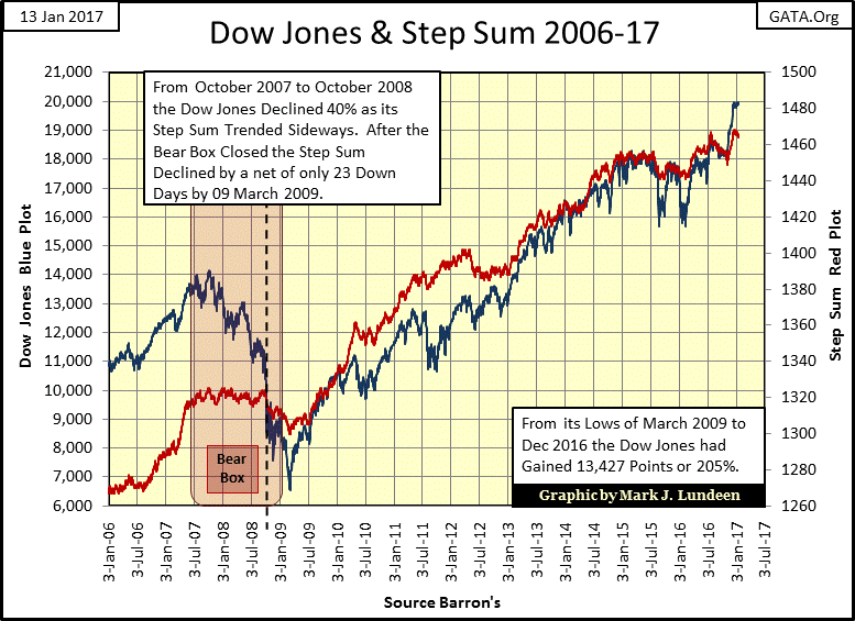
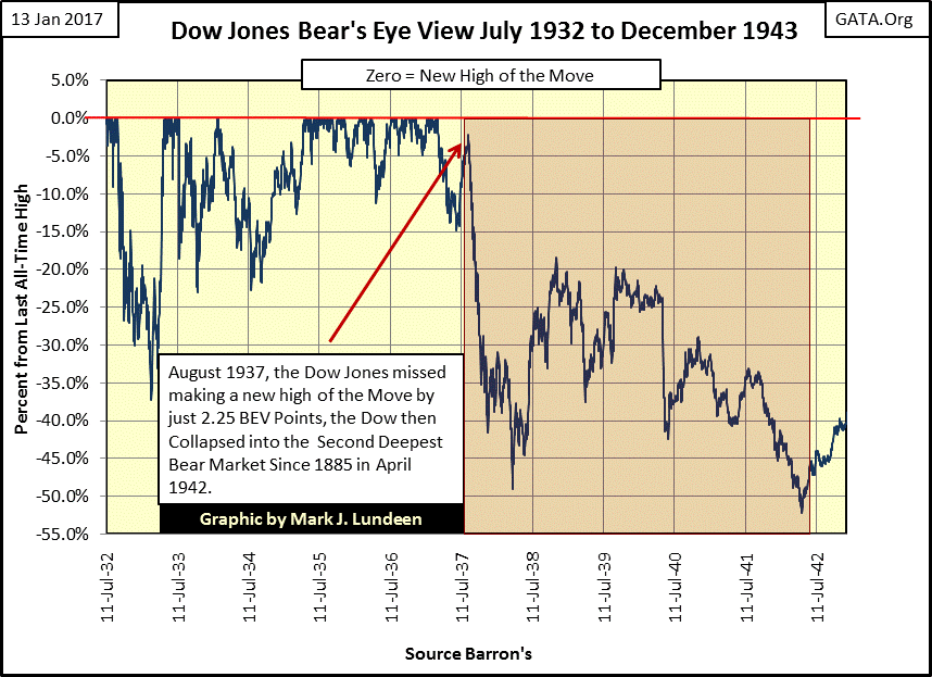
The current stock market reminds me of the Dow Jones from 1932 to 1937, the five years during the Great Depression that saw a terrific little bull market that took the Dow Jones up 372% from its 89% bottom of July 1932. Its last high of the move (or Terminal Zero in the BEV chart below) was in March 1937. The Dow Jones then saw a normal 15% correction in July 1937, before it resumed its advance. A month later in August, the Dow Jones came within 2.25% of making a new high of the move, but then failed to do so in the days and weeks that followed. At which point Mr Bear returned, taking the Dow Jones down 49% in March 1938, and again down 52% in April 1942.
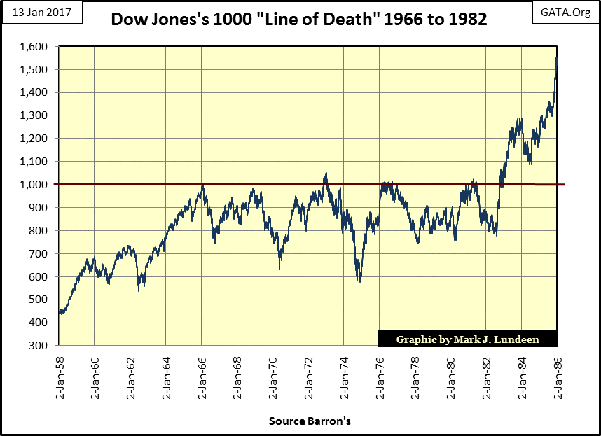
And then there was the Dow Jones’ 1000 Line of Death, where from 1966 to 1981 (fifteen years), seeing the Dow Jones at 1000 ultimately inspired only fear and loathing in the hearts of market bulls.
I’m not making any predictions here. But as someone who has studied the Dow Jones for decades, I know that historically there are times when the bulls ultimately become stymied when the Dow Jones approaches, but somehow fails to break above certain levels. This is how all bull markets end. Failure to see the Dow Jones decisively break above 20K in 2017 may become such an episode in market history.
Oh come on now! Look at the chart below!! How much more do you think this eight year advance has to offer the bulls? The Dow Jones at 21K is only 5% more. The Dow Jones at 22K is only a 10% gain from here, and optimism like that usually only occurs at market tops. Since March 2009, the Dow Jones has advanced 13,427 points, or 205% from its credit-crisis bottom. How much more do you believe this market has to offer the bulls?
With 2017 opened for business, I don’t care. I’m thinking of the potential for downside from here. This market is completely unnatural; as valuations in all financial assets is only a central banker’s day dream. Since the Japanese stock and real estate bubbles began deflating in the late 1980s and early 1990s, what’s been the financial media’s narrative when reporting on the many market mishaps of the past three decades? That the Bank of Japan, Federal Reserve or ECB has the situation under control.
Well they don’t. All they’ve done was to plug the holes in the market, and re-inflated market values by “injecting liquidity” into it. They have only compounded the problem many times over the past few decades as no one today really knows what the free, unfettered price is for an ounce of gold, or for the Dow Jones anymore.
Actually, asking what does a price of anything mean today isn’t an illogical question. When Ron Paul asked both Alan Greenspan and Dr. Bernanke what exactly was a US dollar in congressional testimony they declined to answer. Though they insisted money was no longer gold, and won’t be for anytime in the foreseeable future. Greenspan even told the Congress that the Fed would use oxen as a medium before it would consider gold.
“If fiat money falters, we may have to go back to oxen as our medium of exchange. In that event, I trust, the Federal Reserve will have an adequate inventory of oxen.”
- Alan Greenspan
You better believe that the price of gold and silver are being suppressed far below their free market values by the banking system.
Back to the Dow, here’s what I’m thinking; ultimately the lows of March 2009 seen in the chart above will be broken, and not by a small margin. That would be a decline in the Dow Jones of 67% at a minimum from its current levels. However, when is the big question I don’t have an answer for.
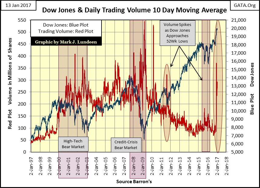
Below is the same chart of the Dow Jones above, but with daily trading volume. Before January 2000 trading volume trended higher during market advances, and trended lower on market declines. It’s the old law of supply and demand. Then starting with chairman Greenspan in January 2000, “monetary policy” superseded the natural laws of economics.
Look at the Dow Jones (Blue Plot) bear market lows for the high-tech and real estate bubbles. Both occurred on historic high trading volume (Red Plot) as the FOMC began “injecting liquidity” into the stock market with an enema bag. And since 2012, the latest advance in the Dow Jones occurred on declining volume. This is all wrong!
Now, beginning in early December, after seventeen years we finally see the Dow Jones advancing with rising volume. Is this a good omen, or a portent of coming market mayhem? I give up as I haven’t a clue of what is going on, but whatever is going on, it won’t go on forever.
Gold and its step sum are looking up. Exactly like last year, they bottomed in December and began rising in January. I was looking at the failed bull box I have marked from last March to June of last year. I marked it as failed as the price of gold broke below a threshold I set, but then took off the next day. So it failed, but looking at the price of gold and its step sum rising smartly upwards in early July, it really didn’t.
But that was last summer. In January of 2017, I could actually push that bull box out to late September. Then in early November both gold’s price and step sum trends began to collapse. Without doubt this is a bull box that didn’t succeed in predicting higher future prices.
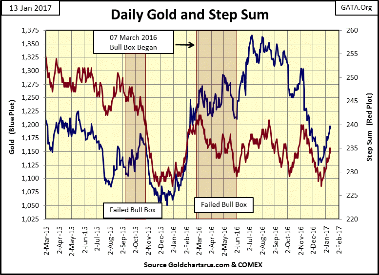
Whether a box is a bull or bear box depends on the price trend. If the price trend is rising, but the step sum trend is going down, or sideways, it’s a bull box. In step sum box analysis, one assumes the price trend is a superior predictor of the future than is the step sum trend. The step sum trend is an indicator of market sentiment, the hopes and fears of the market, while the price trend is an indicator of market reality. Seeing market sentiment out of tune with market reality, bet on the price reality, not the sentiment. But as we see above; it doesn’t always play out that way.
The bull box above began in March 2016, as the price trend was clearly bullish from March to October, while the step sum peaked last March, and as of today has yet to exceed those highs. From last summer to October I was watching to see if the price of gold would take off, pulling its step sum plot up with it. That’s how these bull boxes typically play out. Instead in early November the price of gold broke down with its step sum, resulting in the failure of a seven month bull box in the gold market. But seeing both trends having bottomed together in December, and now going up with some enthusiasm for the past month is a strong indication that the bottom is, and we should see higher prices in the months to come.
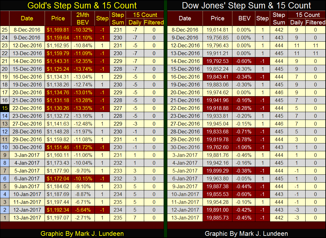
Below is the step sum and 15 count table for gold and the Dow Jones. The selling the gold market had been struggling with has subsided. Its step sum is finally rising and its 15 count has moved from -7 to +7 in the past month. Don’t expect to see gold’s 15 count remain at +7 for the next few weeks. If it just remains positive that’s good enough. Good reasons to be optimist about the price of gold in the months to come.
Now it’s the Dow Jones struggling with a preponderance of declining days. I note the Dow’s step sum on Dec 8th was the same as on Jan 13th: 442, yet it’s advanced several hundred points. It seems the Dow Jones is attempting to form a bull box. But unless a box matures for a few months, I don’t take them seriously.
With the Trump inaugural a week away, the US national debt will soon break above $20 T. As you can see below, the Community Organizer & Chief from Chicago almost doubled the debt since his inaugural in January 2009. And as frequently mentioned by many, president Obama increased the national debt as no president had before him. In fact, Obama oversaw an increase larger than the combined increases in the national debt by all the presidents before him. True enough, but in January 2009 the same could be said of the eight years of George Bush.
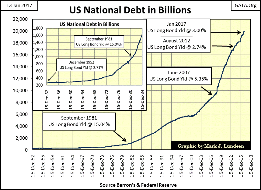
But is that so? When measured in dollars; yes it is. But as you can see in the table below, the national debt when expressed in percentage increases, the eight years of Obama was no worse than the eight years of Bush. And what was this money spent on? Mostly on war, buying votes and political influence; so a pox on both their houses.
And speaking of houses in need of the pox, let’s keep in mind that it’s the House of Representatives that control the Federal Government’s purse strings. The House’s Ways and Means and Appropriations Committees to be exact. If there are billions and billions of federal-tax dollars spent on university research to discover among other thing why children fall off of tricycles, or on the biggest fraudulent research program of them all – Global Warming - it’s funding must first be approved by the House, and then the Senate before the President signs the budget. So if the national debt has been out of control for the past few decades, our Presidents have had lots of help from members of congress in running the nation’s finances hard aground.
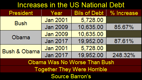
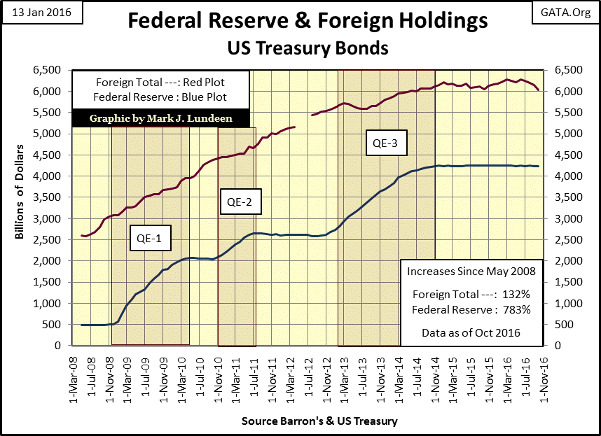
So who cares? Not the Federal Reserve, our central bank who uses the Congress’s unpaid bills (Treasury Debt) as monetary reserves for its monetary system (Blue Plot below). In the aftermath of the 2007-2009 credit crisis, the Fed has been “monetizing” lots of Treasury debt to “stabilize” the banking system and economy.
Since the termination of its QE3 in December 2014, the Fed’s holdings of the US national debt has stabilized at 4,250 billion dollars. But when Mr Bear returns to once again feed on over inflated market values in the stock, bond and real estate markets, you can be sure the blue plot below will once again increase to levels that can only be described as shocking.
The Federal Reserve isn’t the only central bank using the US Treasury market for its monetary reserves. In fact all central banks do. Much has been made of Nixon terminating the Bretton Woods Monetary Accords in August 1971, if only that was true.
In 1945 the Bretton Woods Monetary Accords created the World Bank and the International Monetary Fund (IMF), and they’re still around. Staffed with meddling bureaucrats, we’d be better off had they too been shut down in 1971. The Bretton Woods Accords also placed the US dollar at the heart of the global monetary system, and that has never been truer than today.
The fact is, President Nixon in August 1971 only terminated the Bretton Woods $35 gold peg, the one Bretton Woods’ clause that protected honest commerce and individuals from the ravages of unchecked dollar inflation we see in the charts above. If you’re now servicing a $500K mortgage on a house that cost $20K to build in 1960, you now know why.
Unknown to most Americans, in the aftermath of the NASDAQ High-Tech bubble, it wasn’t just the United States that experienced a real estate bubble followed by a horrific crash beginning in 2007. Much of the world did too, and for the same reasons.
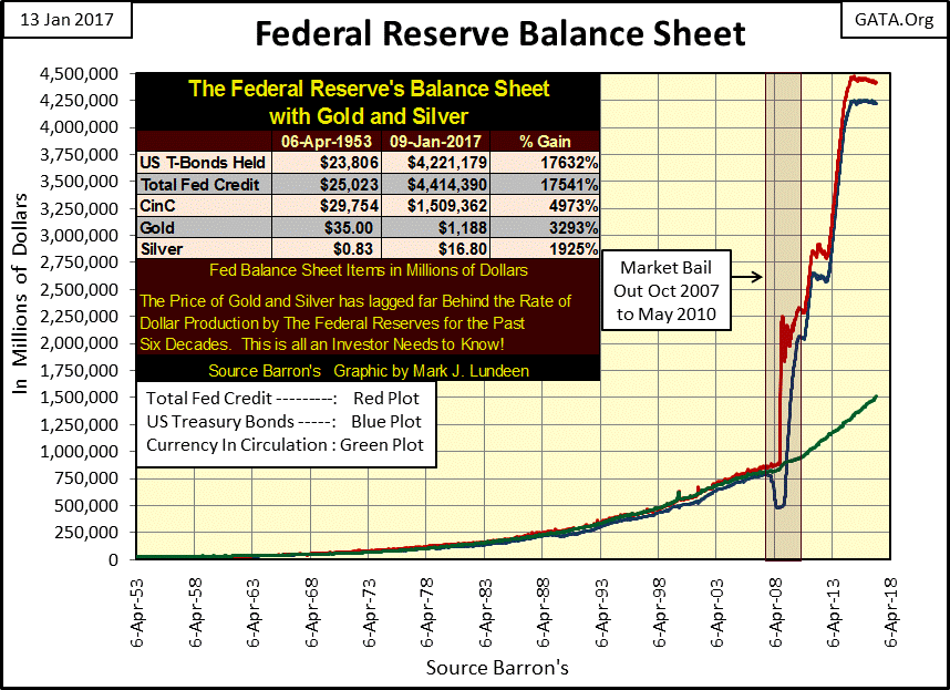
Below we see two plots. The blue plot is the US Treasury holdings of foreign central banks held at the NY Federal Reserve; the red plot is the holdings of T-Debt by the Fed itself. Beginning in 2002, the global central banking cartel developed a huge appetite for US Treasury debt. These central bank purchases were intended to revitalize the global economy then suffering from the deflation of the high-tech bubble.
All central banks purchased T-debt by inflating their money supplies, exactly as the Federal Reserve does, creating bank reserves in their domestic economies that were funneled into mortgages at “attractive” low rates.
The vertical dashed line identifies July 2008, when the crash in the real estate market began to accelerate. Before the 1913 creation of the Federal Reserve, the financial system would have been forced to renegotiate loans, or completely write off bad debt, thus freeing the economy of the burden of excessive debt creation by the banking system. That would have been a bitter pill for all to swallow, but at the end of the process the economy would have recovered, and everyone would have seen true economic growth.
But in 2007-09, that would have resulted in the bankruptcy of the elite’s banking establishment; and Washington couldn’t allow that. So the response by central banks everywhere was the same; “monetize” even more Treasury debt to keep their banking systems from collapsing. But this action wasn’t a long term solution to the problem of expanding credit creation by a banking system above the ability of the underlying economy to service it.
But it did get Washington’s political establishment past two presidential-election cycles without having to face the consequences of its “policy making.” But will Mr Bear allow them to get past a third in 2020? Obviously President Trump is hoping he will.
By November 2012, these foreign central banks had had enough. In one week their holdings went from a new all-time high to -11.63% in the Bear’s Eye View chart below. Interesting, it was about this time the Federal Reserve instituted its third bout of quantitative easing, which in the chart above more than made up for the selling by these foreign central banks.
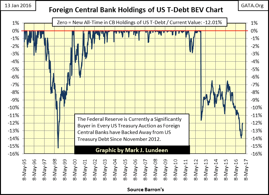
Which central bank (s) sold their T-bond in November 2012? As the data from the NY Fed (published in Barron’s) only gives the data in aggregate format, I don’t know. But the US Treasury also publishes data on foreign holdings of US T-debt (Red plot below), which I suspect also includes the central banks above plus overseas insurance companies and pension funds.
In the early years of the 21st century, demand for US Treasury debt was strong. But all good things must pass. Demand for T-debt peaked in late 2014, and for the past two years the foreign totals as reported by the US Treasury have remained above six trillion dollars.
Below is the national break down of who holds Congress’s unpaid bills, and how much of their money they’ve let Congress spend for them. The data is sorted on the orange tab, and October 2016 is the latest data from the Treasury. The next two tabs list the maximum and minimum values these countries have held since May 2008.
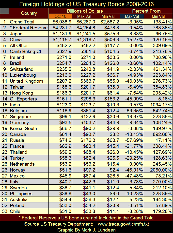
But the interesting data is to be found under the blue tab; the percentage decline from the maximum. China (#4) has reduced its holding of T-debt by 15.27%, Japan (#3) by 8.83%. Are they sending a message to Washington? Maybe. Then again they may just need the money, so they sold these T-notes and bonds.
But the question I have is who is buying their T-debt? Looking at the data from the Federal Reserve (Blue Plot chart above), it’s not the Fed. But I’m not so sure that’s true. The Federal Reserve has never been audited. After 104 years I think we’re due one.
Mark J. Lundeen
More from Silver Phoenix 500