Money And Markets Infographic Shows Silver Most Undervalued Asset


Silver remains severely under owned and under-valued asset
– Entire silver market worth tiny $100 billion shown in one tiny square
– “All of the World’s Money and Markets in One Visualization”
– Must see ‘Money and Markets’ infographic shows relative size of key markets: silver bullion, gold bullion, cryptocurrencies/ bitcoin, largest companies, 50 richest people, Fed balance sheet, currency, stocks, property, cash, debt and derivatives
– Small allocation by investors and world’s richest will see silver surge like bitcoin
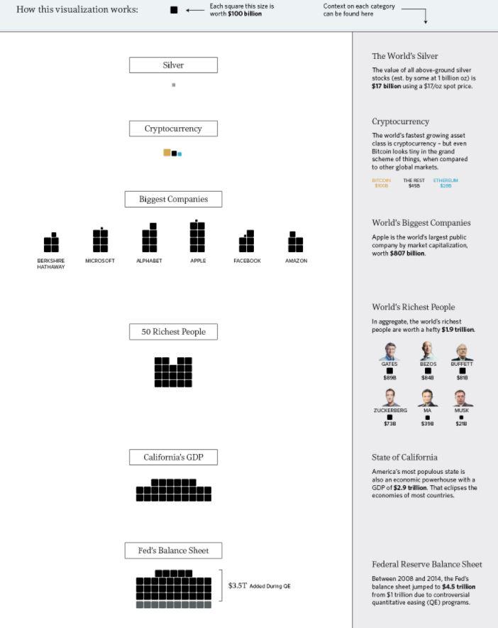
Click to enlarge. Source: Visual Capitalist
Millions, billions, and trillions…
When we talk about the giant size of Apple, the fortune of Warren Buffett, or the massive amount of global debt accumulated – all of these things sound large, but they are actually extremely different in magnitude.
That’s why visualizing things spatially can give us a better perspective on money and markets.
HOW MUCH MONEY EXISTS?
This infographic was initially created to show how much money exists in its different forms. For example, to highlight how much physical cash there is in comparison to broader measures of money which include saving and checking account deposits.
Interestingly, what is considered “money” depends on who you are asking.
Are the abstractions created by Central Banks really money? What about gold, bitcoins, or other hard assets?
A NEW MEANING
However, since we first released this infographic in 2015, “All the World’s Money and Markets” has taken on a different meaning to us and many others. It’s a way of simplifying a complex universe of currencies, assets, and other financial instruments in a way that people can understand.
Numbers represented in the data visualization range from the size of the above-ground silver market ($17 billion) to the notional value of all derivatives ($1.2 quadrillion as a high-end estimate). In between those two extremes, we’ve added many other familiar measures, such as the GDP of California, the value of equities, the real estate market, along with different money supply metrics to give perspective.
The end result? A visually pleasing, but enlightening new way to understand the vast universe of global assets.
All of the World’s Money and Markets in One Visualization via Visual Capitalist
*********
 Mark O'Byrne is executive and research director of www.GoldCore.com which he founded in 2003. GoldCore have become one of the leading gold brokers in the world and have over 4,000 clients in over 40 countries and with over $200 million in assets under management and storage.We offer mass affluent, HNW, UHNW and institutional investors including family offices, gold, silver, platinum and palladium bullion in London, Zurich, Singapore, Hong Kong, Dubai and Perth.
More from Silver Phoenix 500


