Short-, Medium- & Long Term Technicals For Gold & Silver
We now have a Bullish Extreme in the USD. Over the last 5 years, Bullish extremes have been very good indicators that a top was within a hand's reach.

Chart courtesy sentimentrader.com
On top of the Bullish extreme in the USD, we also have a Bearish Extreme in Gold sentiment. Bearish extremes have been good indicators that a bottom was near.

Chart courtesy sentimentrader.com
Silver Sentiment is also very depressed at the moment, with only 29.70% bullishness. However, sentiment hasn't pierced the "standard deviation bands" yet, and thus has more downside potential…

Chart courtesy sentimentrader.com
All this Dollar-bullishness/Gold-Bearishness has caused mining companies to sell off BIG TIME. Some of them are now 75-80% below their top, and when you look at their charts, it looks like the world is coming to an end for those companies.
That being said, the BPGDM index from stockcharts, which shows the % of mining stocks that have a BUY signal on the Point&Figure chart, is very depressed at 10.71% at the moment. In late 2008, this index reached 0% for a very short time. Funny to see that that time, the mining stocks had set a higher low. The HUI index has now dropped below the 50% Fibonacci Retracement level from the bottom of 2008 to the top of 2011, so the next target would be the 38.20% level, which comes in slightly below 350. My expectations are that we might get close to this level over the next couple of days, followed by a very sharp rebound (possibly as high as 450, which is the 61.80% level). What happens then is still unknown, but as I pointed out, the severe underperformance of the HUI stocks to Gold is very similar to 2008, which means that the decline might not be over yet, even though a sharp bounce is overdue now with the extreme bearishness…

Chart courtesy stockcharts.com
Let's have a look at the weekly charts. Gold is ready to set a tripple bottom. However, if that attempt fails, look out below (especially below $1,450). The MACD has just turned negative, which doesn't look well…

Chart courtesy stockcharts.com
When we have a look at the following chart, which is a weekly chart from 1980, we can notice a similar pattern:

Chart courtesy stockcharts.com
When the MACD just turned negative in 1980, Gold was trading above $500 per ounce. It fell all the way to $300 in the next 1.5 years or so.

Chart courtesy stockcharts.com
Silver is also at a critical point right now. If this level holds, then we have a tripple bottom. If not, look out below…

Chart courtesy stockcharts.com
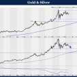
Now over to the monthly charts: Gold's MACD is extremely stretched, and we have negative divergence between price and RSI. Since this is on a monthly basis, this is not a good sign for the future.

Chart courtesy stockcharts.com
Silver's MACD looks set to drop lower (potentially much lower). First support comes in around $19-$20:

Chart courtesy stockcharts.com
The Quarterly chart for silver shows an extremely stretched MACD, and an RSI that is still hovering around overbought levels:

Chart courtesy stockcharts.com
The situation is even worse for Gold:

Chart courtesy stockcharts.com
When we finally look at the Yearly chart, we can see that Silver has set a bearish reversal candle last year, which we have commented on late last year. On top of that, the yearly RSI is still OVERBOUGHT!

Chart courtesy stockcharts.com
Last but not least, the comparison between Silver Now and the Nasdaq is still very accurate:

Chart courtesy stockcharts.com (Nasdaq Bubble)

Chart courtesy stockcharts.com (Silver "Bubble"?)
An overlay of the two charts speaks more than a thousand words:

For those of you who want to call me an "idiot" who doesn't look at fundamentals, Martin Armstrong wrote in his latest report:
"Fundamentals really mean little. The whole fiat reasoning means nothing since gold declined for 19 years from 1980 when it was still fiat. The same is true in stocks when the price can decline on good news and it is explained by saying the market was expecting results "better" than that. Markets trade technically because they are influenced truly by everything. Each market is interlinked to everything else so it becomes a delicate dance of comparison and capital flows like water to the lowest cost for the greatest gain. Focusing upon just one market exclusively ensures failure."
For more analyses and Trading Updates, visit www.profitimes.com and follow us at Twitter.com


