Silver Price: A Long-Term Perspective


I would like to show you a couple of long term charts for Silver that puts where silver is currently trading into perspective. We can look at the hourly charts or even the daily charts for the short term patterns, but if you really want know where a stock is relative to its history we need to look at the long term view. The more history a stock has the more relative the current price action is.
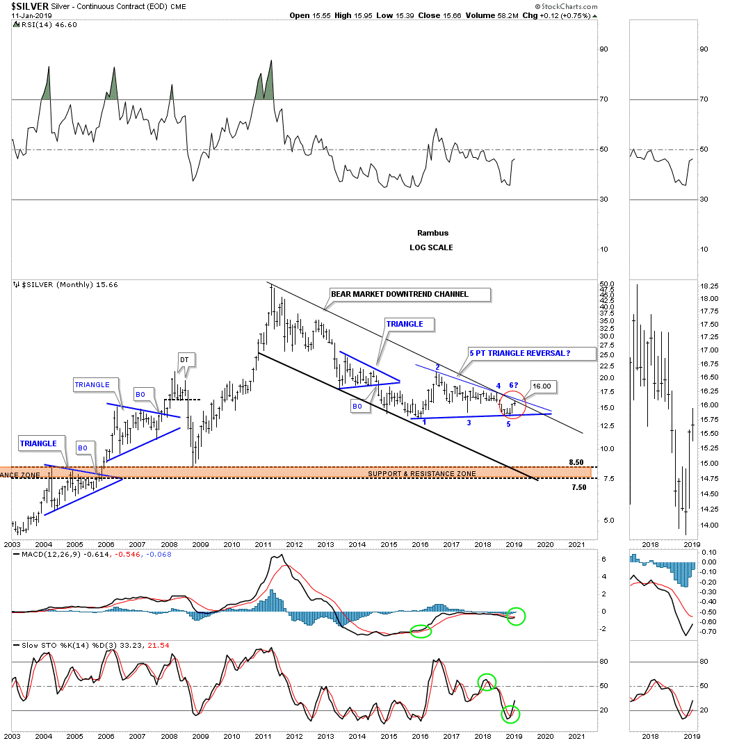
Lets start with a 16 year monthly chart for silver which seems like a long time but in the big picture it only shows us a small part of its history. The dominate chart pattern is the 2011 bear market downtrend channel which is almost perfectly parallel. I purposely left the top rail of the 2011 downtrend channel and the top rail of the 2016 triangle thin so you can see the critical area silver is now trading at, red circle. So far this month silver has traded as high as 15.95 which puts it right against the top rail of the 2011 bear market downtrend channel and the top rail of the 2016 triangle.
I have viewed the 2016 triangle as a halfway pattern to the downside for well over a year or so but with the price action hitting the top rail this month that completed the 5th reversal point which now puts the triangle in the reversal category. I can now take the question mark off of reversal point #5 and add it to the possible reversal point #6. All this means is that we now have 5 reversal points in place to create a reversal pattern if the bulls can punch through the top rail. If they can’t and silver begins to decline all the way down to the bottom rail then a consolidation pattern will be in the picture again. An odd number of reversal points creates a reversal pattern and an even number of reversal points creates a consolidation pattern. The bottom line right now is that we have a triangle reversal pattern in place until it is negated if silver trades backdown to the bottom rail.
This next chart shows you why the more history a stock has the better perspective one gets when it comes to really big chart patterns. This chart is one of the very first charts I ever posted publicly back in the old days before Goldtent was born. There is a website named Gold Eagle where I posted this chart for the first time which was probably around the 2004 – 2005 timeframe. At the time I showed this massive 25 year H&S bottom that was building out that was showing some nice symmetry. The double neckline looks similar to the double necklines we’v been following on some of the US stock market indexes which I hope will give us the same results as this 25 year double neckline H&S bottom.
Note the blue bullish rising wedge which formed between the two necklines which gave silver the energy it needed to finally break free from 25 years of resistance. Neckline #2 also came in handy during the 2008 crash which gave me a place to look for initial support.
Our 2011 bear market downtrend channel doesn’t look so daunting when compared to the rest of this 50 year chart. As I mentioned earlier when we looked at the monthly chart above for silver that I was looking at the 2016 triangle to be a consolidation pattern to the downside until we just completed the 5th reversal point. As I’ve said so many times during this bear market, it’s now up to the bulls to take out the top rail of the 2011 bear market downtrend channel and the top rail of the 2016 triangle trading range. It is a trading range because neither the upper or lower trendline has been broken. We are close but no cigar just yet.
Sir Plunger will be doing the Weekend Report so stay tuned as his reports are always filled with a lot of history and well thought out objective analysis. Have a great weekend and all the best…
*********
 Rambus Chartology is Primarily a Goldbug TA Site following the precious metals markets. Chartology is the Unique Blend of Technical Chart Pattern Identification and Market Psychology, Developed by Rambus During the Tech Mania of the late 1990s. His Early Training came the old fashioned way...Reading Edwards and McGee's Bible of Technical Analysis and spending years with a sharp pencil graph paper and ruler refining his skills and accuracy. Visit the Rambus Chartology website at http://rambus1.com/.
More from Silver Phoenix 500