Silver Price OMG


The price of silver spiked massively from Wednesday through Friday. It ended the week about $2 higher than the previous week. The last time we recall silver price action like this was about three years ago in August 2013. That one week, the price rose about $2.50. Before that was a week in August 2012 with a price gain of about $2.70. Previously, January 2012, +$2.50. Earlier was Oct 2011, +$4. The biggest was in April 2011, +$4.20.
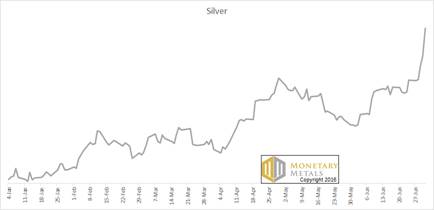
Looking beyond this week, the whole of year 2016 looks like a parabola to us.
Silver Price Parabola, 2016 YTD
The price of gold moved up, but it was not unusual at all. +$26.
Especially in the context of the British referendum to leave the EU, it is easy to project onto others one’s own distrust of profligate governments, massive public debts, an opaque banking system, and central banks who are desperately and visibly trying to debase their currencies.
However, we would suggest taking a step back and looking at this more calmly. The price moved up. If we set aside the natural tendency towards recent bias, this price move is not so exceptional. Indeed, we have several examples of moves this large or greater. None of those presaged the End of the Monetary World as We Know It. Actually, they presaged further price declines.
We have seen headlines on Friday about the “goldwagon to $10,000”, “$360 silver”, and other hyperbolic assertions. It’s never good for your wealth to go into the casino to place your bets based on this kind of information.
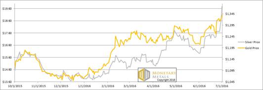
Let’s look at the only the only true picture of the supply and demand fundamentals for silver, and of course gold too. But first, here’s the graph of the metals’ prices.
The Prices of Gold and Silver
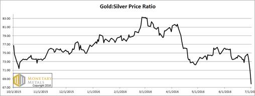
Next, this is a graph of the gold price measured in silver, otherwise known as the gold to silver ratio. The ratio had a mini-collapse this week.
The Ratio of the Gold Price to the Silver Price
For each metal, we will look at a graph of the basis and cobasis overlaid with the price of the dollar in terms of the respective metal. It will make it easier to provide brief commentary. The dollar will be represented in green, the basis in blue and cobasis in red.
Here is the gold graph.
The Gold Basis and Cobasis and the Dollar Price
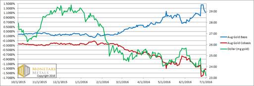
Look at that. The price of the dollar dropped (i.e. the price of gold, measured in dollars, rose) almost half a milligram. At the same time, the abundance of gold (i.e. the basis, the blue line) fell from 1.4% to 1.1%. 1.1% is still a high yield for a two month carry trade. But it’s less than it was.
Other months did not move so greatly. What could cause the basis of the near month to fall as it nears First Notice Day, the deadline for speculators without the cash to stand for delivery to exit the contract? These speculators, every one of them, must sell. There is downward pressure on the August gold contract, and upward pressure on the October gold contract.
It’s no surprise that our calculated fundamental price of gold is up. But not that much, $50. The market price is up $26, so it’s still far above the fundamentals. But this week, about $205.
Now let’s turn to silver.
The Silver Basis and Cobasis and the Dollar Price
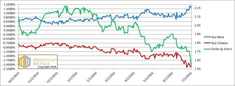
In silver, as the price of the dollar rose / dollar price of silver, the abundance rose.
The fundamental price is up about $1.35. However, the market price gained about $2, increasing the fundamental-market spread another 65 cents, to just under $3.
© 2016 Monetary Metals
 Dr. Keith Weiner is the CEO of Monetary Metals and the president of the Gold Standard Institute USA. Keith is a leading authority in the areas of gold, money, and credit and has made important contributions to the development of trading techniques founded upon the analysis of bid-ask spreads. Keith is a sought after speaker and regularly writes on economics. He is an Objectivist, and has his PhD from the New Austrian School of Economics. His website is www.monetary-metals.com.
More from Silver Phoenix 500


