Quarterly Report Stock Market: A Secular Bull Market For The Ages


In this last post for the Quarterly Report I would like to update some very long term charts for some of the US stock markets and other areas to see how this secular bull market has been progressing since the 2009 crash low. It is easy to forget the secular bull market when you see a black swan or an act of God event that totally changes the dynamics on the shorter term time scale. It is these long term charts which keeps one focused when all hope appears to be lost.
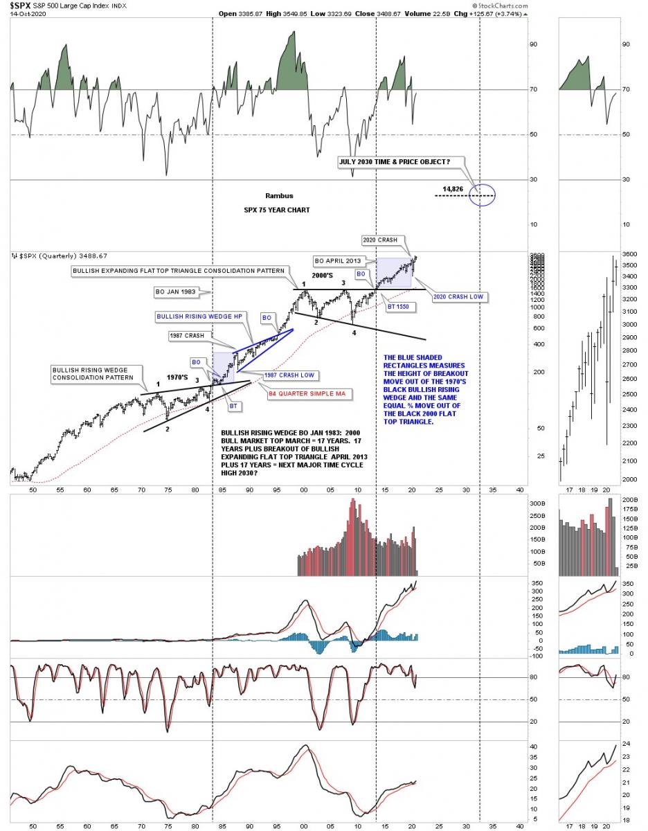
So what does a secular bull market look like? Below is a 75 year quarterly chart for the SPX we’ve been following since the breakout from its massive flat top triangle consolidation pattern in 2013 when just about every other US index and world stock markets broke out of their respective massive consolidation patterns. This big picture look shows no signs of ending anytime soon. We just experienced one of the biggest crashes in the history of the stock market and still the SPX is trading not to far off of its all time highs.
For those that haven’t seen this chart before you can see the last massive consolidation pattern, the bullish rising wedge, which formed as a resting area for the previous secular bull market. Note the blue shaded areas that formed during the 1987 crash and the current one that shows the 2020 crash. The blue shaded areas measures the height only and not time. The initial rally out of the 1970’s bullish rising wedge to the top in 1987, just before the crash, is almost identical to the height of of the 2020 high before our recent crash that many believe we are still in. If we are truly in a secular bull market, which is where my money is, we won’t see the 2020 crash low ever again.
The breakout from the 1970’s black bullish rising wedge took place in January of 1983 and ran until the top in 2000 which took 17 years. The breakout from the 2000’s flat top expanding triangle took place almost 30 years later and shows no sign of failing. If our current secular bull market as measured from the April 2013 breakout point should last at least 17 years that would put the time component to around the 2030 area. For now that is a rough estimate which we can fine tune as time goes on. Note how the red 84 quarterly moving average was only breached 2 times in the last 70 years, once during the formation of the 1970 massive bullish rising wedge and the 2nd time during the formation of the 2000’s flat top expanding triangle.
As long as a scenario is working there is no need to change anything. Since the breakout from the 2000’s flat top expanding triangle in 2013 nothing has changed in order for me to reconsider the possible long term scenario. Even the 2020 crash which was one of the strongest and quickest correction in the history of the stock markets wasn’t able to change the big picture in any meaningful way.
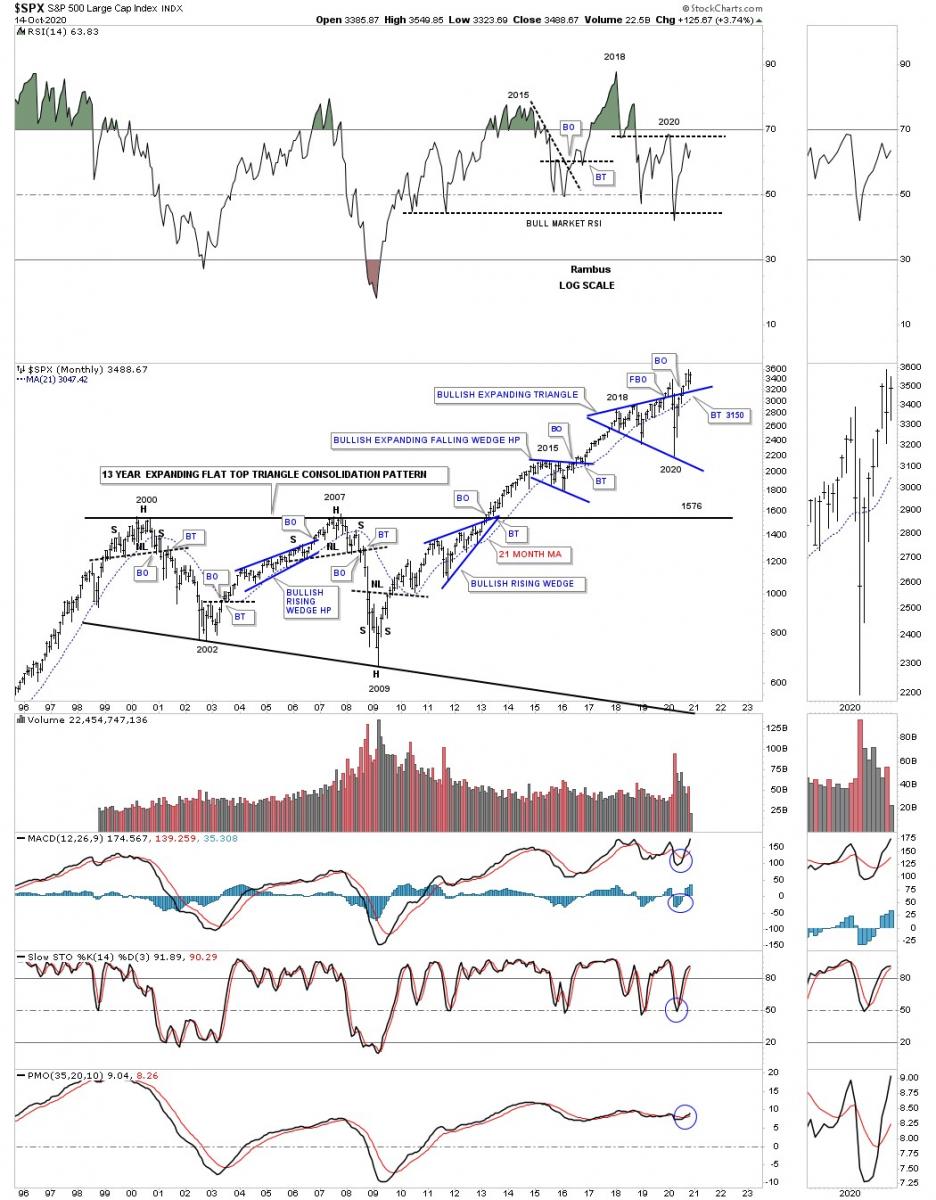
This next chart is a 25 year monthly chart for the SPX which shows the internal structure of that 2000’s flat top expanding triangle along with the 21 month ema. I often show how big consolidation patterns can be made up of smaller reversal patterns at the reversal points. This chart shows you a classic example of how it looks. Another piece of Chartology I often discuss is that many times when a stock reaches an important resistance line it will form a small consolation just below it to build up the energy it needs to finally take out that overhead resistance line. Here you can see the blue bullish rising wedge that formed just below the top rail which led to the breakout into new all time highs back in 2013. The next thing I’ll be looking for is for the SPX to make a new all time high which will be confirmation that the next impulse move is continuing after the backtest was completed.
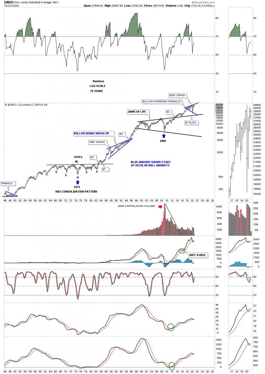
Next is the 75 year quarterly chart for the INDU which shows its secular bull markets. Back in the late 1960’s and 1970’s the INDU built out a beautiful and symmetrical H&S consolation pattern which launched the secular bull market that came to an end in 2000. You can even see the perfect backtest to the neckline after the breakout. After that nearly 25 year secular bull market that ended at the 2000 high it was time for the INDU to consolidate all those massive gains which formed the Jaws of Life. Note how close the price action came to touching the top rail of the Jaws of Life consolidation pattern during the 2020 crash. A breakout above the top rail of the blue expanding triangle will usher in the next important move higher in the secular bull market that began at the 2009 crash low.
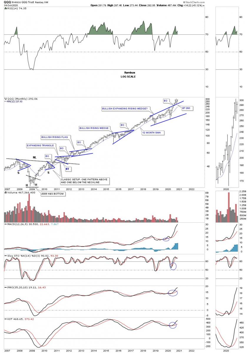
The QQQ’s secular bull market began with a very symmetrical H&S bottom at its 2009 crash low. We’ve discussed in the past that when you see one consolidation pattern form below the neckline, right shoulder, and then one just above the neckline that is a very bullish setup. What I find interesting right now is that QQQ broke out from the bullish expanding rising wedge 4 months ago and this is the biggest consolation pattern of the entire secular bull market.
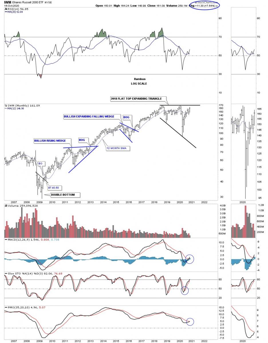
The IWM, small caps, has also enjoyed a strong secular bull market since its 2009 crash low. This index has been lagging a bit but it’s playing catch up and is approaching the top rail of its 2018 flat top expanding triangle. It’s important to look at the impulse moves between each consolation pattern to understand how markets work. You can’t have a strong impulse move if there is no consolation pattern to launch it, rinse and repeat.
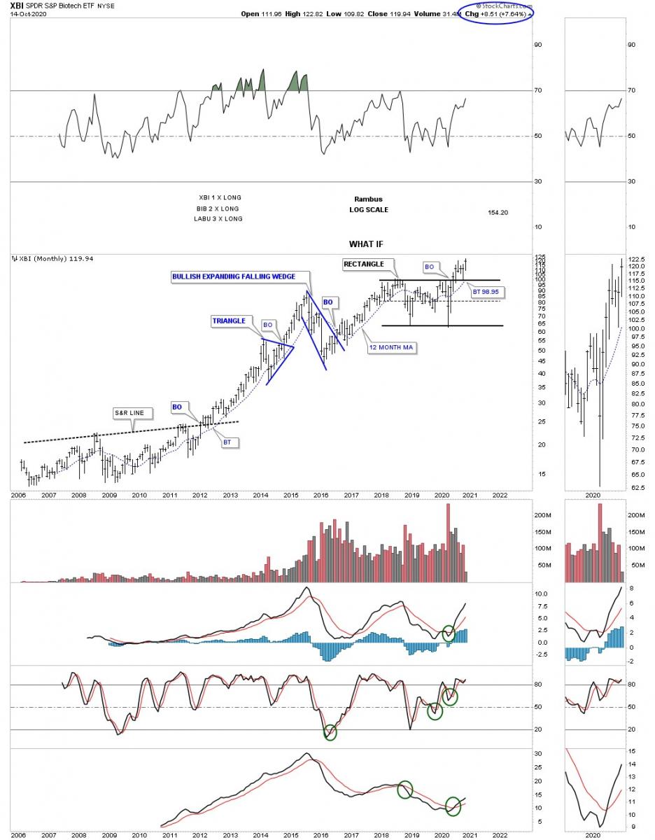
Lets look at a few sectors that make up the stock markets to see if they can help confirm the secular bull market is still alive and well. One of my favorite sectors has been the XBI, biotechs, which has broken out and backtested the top rail of its 2018 rectangle consolation pattern and is trading at a new all time high this month.
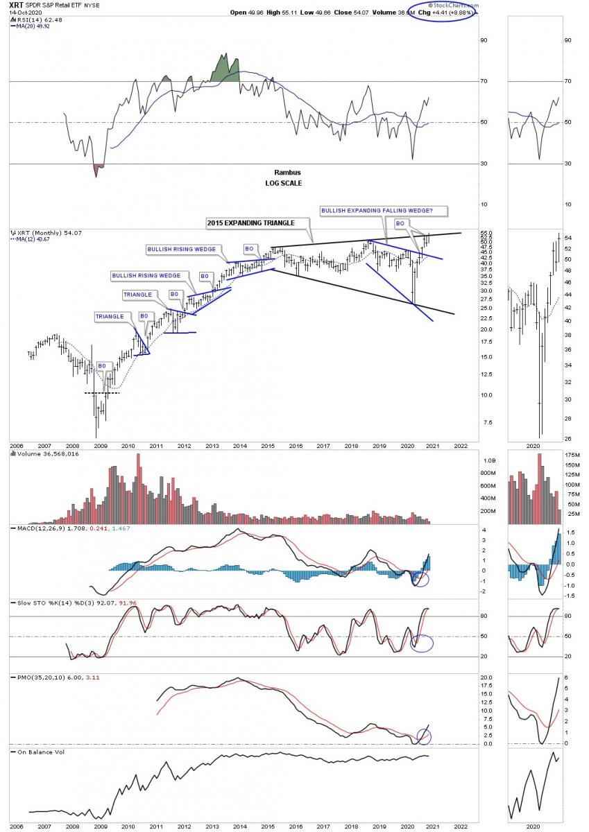
Another very strong sector is the XRT, retail etf, which is trading at new all time highs and is attempting to breakout from its 2015 black expanding triangle. Wha is so bullish about the Chartology is that the price action has already broken out from the smaller blue expanding falling wedge which is strongly suggesting the top rail of the 2015 expanding triangle is going to give way.
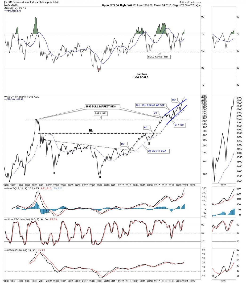
One of the strongest sectors in the markets right now is the SOX, semiconductor index. This 25 year monthly line chart shows a massive base with the blue bullish rising wedge forming on top of it. Note how the high made back at the 2000 bull market high reversed its role to support when the SOX broke out above that 17 year S&R line.
You can’t have a secular bull market without the Transportation Average participating. Below is a weekly chart which shows the price action breaking out from the 2018 bullish expanding falling wedge complete with a backtest to the top rail. You can also see the Transportation Average is trading at a new all time high.
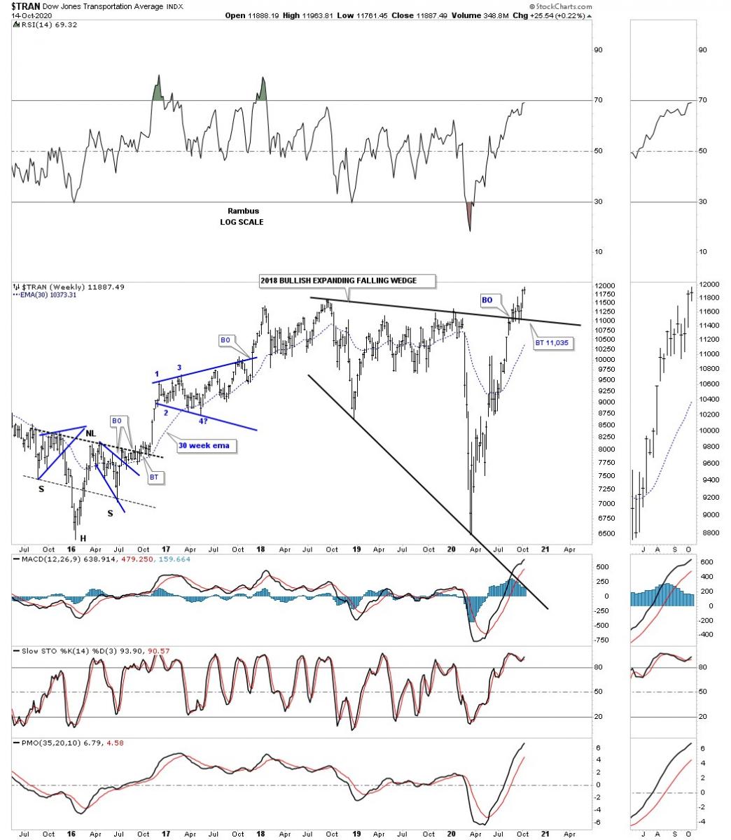
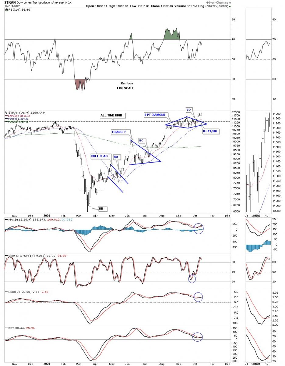
This daily chart for the Transportation Average shows the blue diamond that is sitting just above the top rail on the 2018 bullish expanding falling wedge on the chart above.
This last chart is the 100 year quarterly chart for the Transportation Average which shows all of its important consolation patterns through the years. If you look at the right sidebar you can see the price action is trading at a 100 year high.
If one can empty their head from all the fundamental reasons why the stock markets can’t go up you might surprise yourself by what you actually see with the price action alone. I’ve said this so many times in the past that I sound like a broken record, ” we are playing a game of psychological warfare more than anything else. If 2020 doesn’t make you question your beliefs in fundamentals then nothing will. The US stock markets have been in a secular bull market since the 2009 crash low and not even a worldwide pandemic can stop it. That should tell you all you need to know.
*********
 Rambus Chartology is Primarily a Goldbug TA Site following the precious metals markets. Chartology is the Unique Blend of Technical Chart Pattern Identification and Market Psychology, Developed by Rambus During the Tech Mania of the late 1990s. His Early Training came the old fashioned way...Reading Edwards and McGee's Bible of Technical Analysis and spending years with a sharp pencil graph paper and ruler refining his skills and accuracy. Visit the Rambus Chartology website at http://rambus1.com/.
More from Silver Phoenix 500